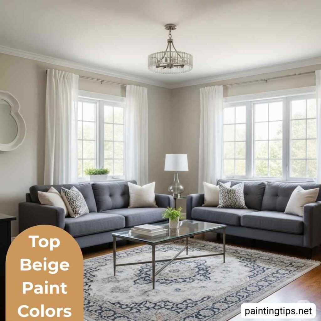
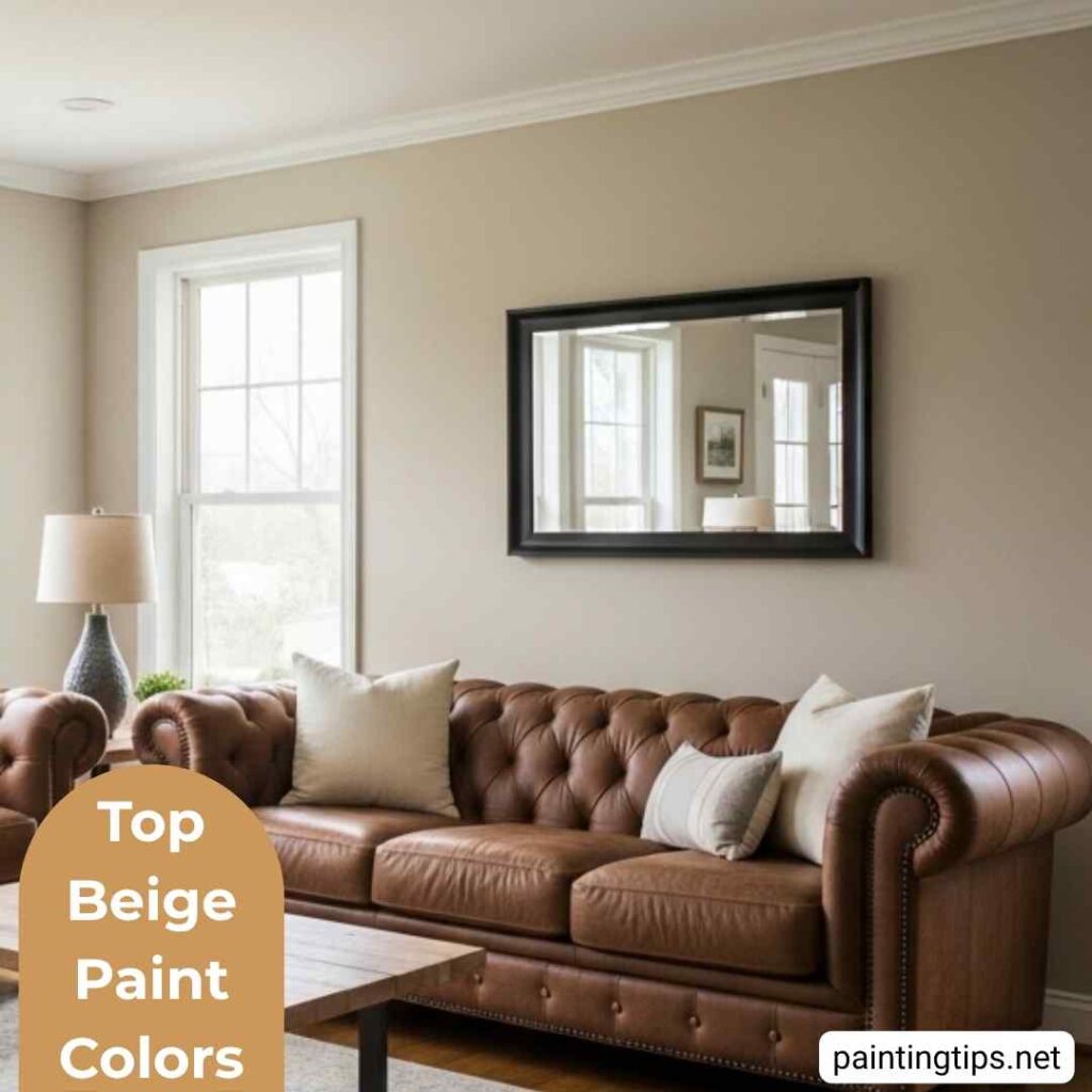
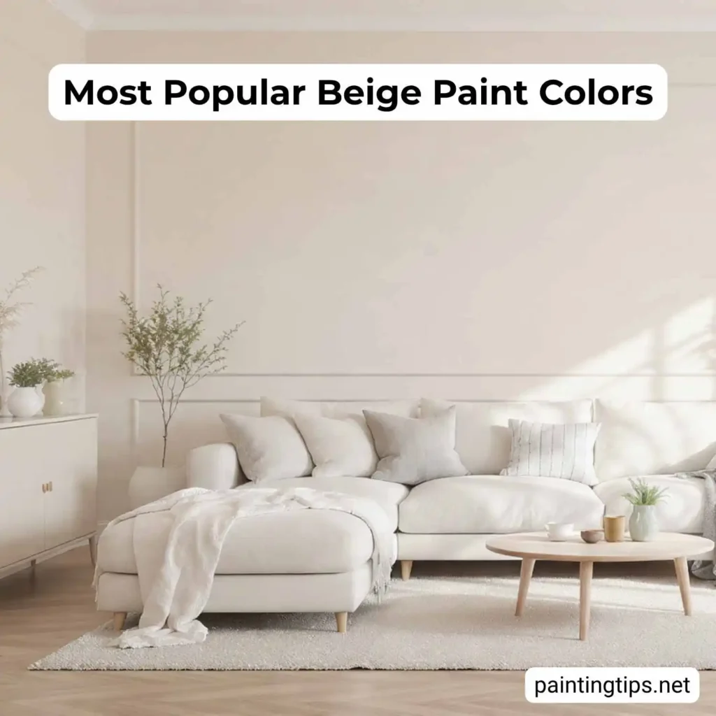
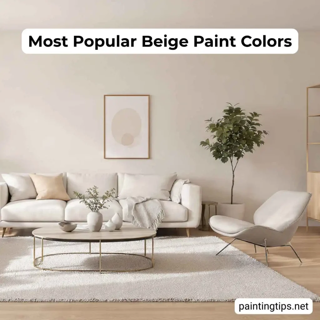
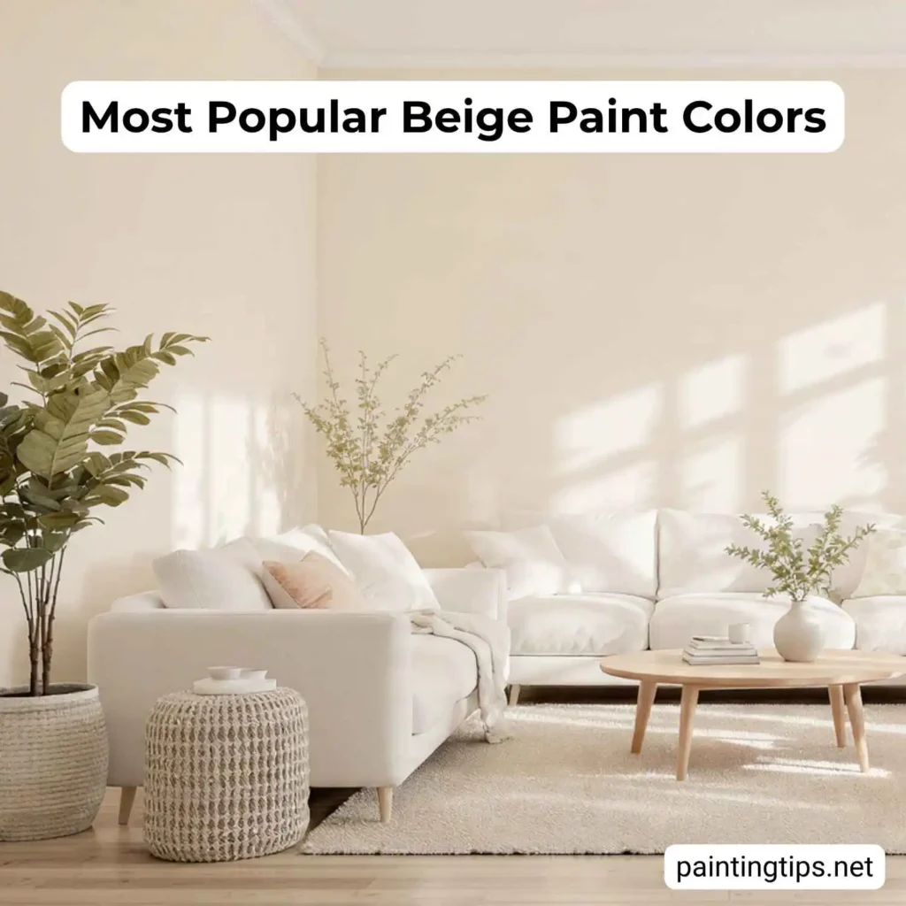
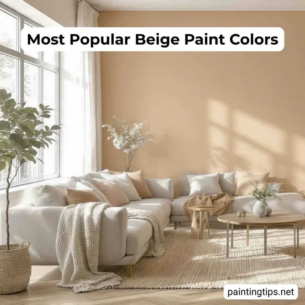
Walk into almost any well-decorated home in America, and there’s a good chance the walls are beige — not the dull, builder-grade beige of the early 2000s, but a refined, intentional shade that makes beige color on walls feel warm, grounded, and anything but ordinary. Across Sherwin-Williams, Behr, Benjamin Moore, and Valspar, beige-family colors consistently dominate best-seller lists year after year. If you’re trying to figure out which shade is right for your home, this guide covers the most popular interior beige paint colors from each major brand — along with the practical knowledge you actually need to choose wisely.
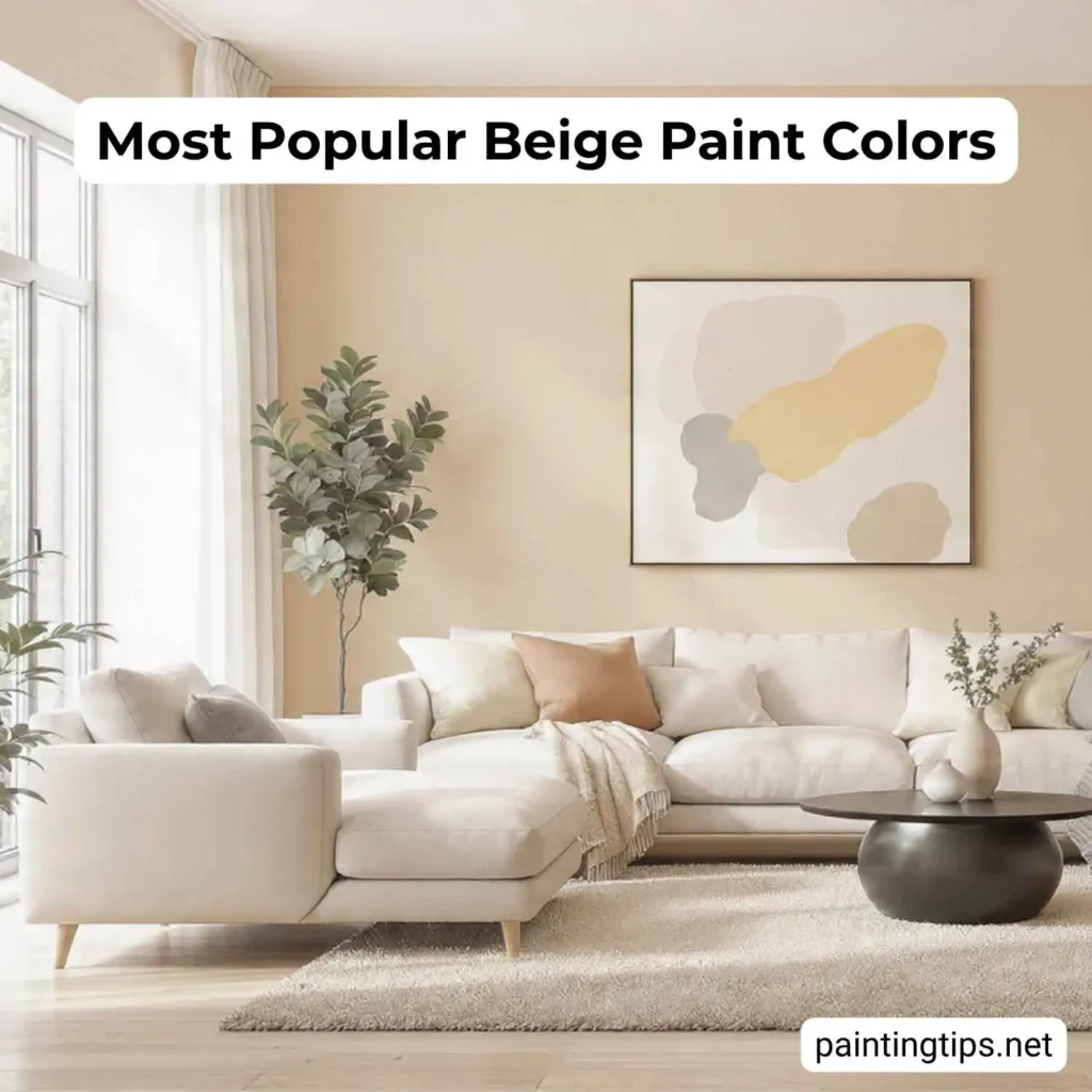
Most Popular Beige Paint Colors

Choosing the right beige comes down to three things: the undertones of your existing finishes, the direction your windows face, and the mood you’re after. A beige that looks warm and inviting in a south-facing showroom can read flat or even slightly gray in a north-facing room at home — which is why sampling on your actual wall, and observing it at different times of day, is something we always recommend before committing. With that in mind, here are the most proven options from the leading brands in the U.S.
Most Popular Beige Paint Color Sherwin-Williams
Sherwin-Williams arguably owns the beige conversation in American interior paint. Their formulas in this color family are exceptionally well-balanced, with tightly controlled undertones that keep them from swinging too yellow, too pink, or too gray. These are the colors that appear on their Top 50 best-seller list year after year.
Accessible Beige SW 7036 | LRV: 58
Accessible Beige is the single most popular beige paint color from Sherwin-Williams and one of the best-selling interior paint colors in the United States overall. What makes it so enduringly relevant is the balance it strikes between warmth and restraint. It reads as a true beige — soft and inviting — but its subtle gray undertone keeps it from looking dated or overly golden.
It works in virtually every room of the house and holds up well as a whole-home color. It pairs best with warm wood floors in the medium-brown range, off-white trim such as SW Alabaster, and fixtures in brushed gold or aged bronze. For accent colors, muted blues, deep greens, and terracotta all sit naturally against it without competing for attention. “For more information, read the article on Sherwin-Williams – Accessible Beige“
Kilim Beige SW 6106 | LRV: 57
Kilim Beige is the choice for those who want their beige to actually feel like beige. It’s warmer and more saturated than Accessible Beige, with noticeable orange-pink undertones that give it an earthy, almost artisan quality — like unbleached linen or natural wool. It is a Sherwin-Williams Top 50 color and a longtime favorite in traditional, transitional, and warm-contemporary interiors.
It excels in living rooms, dining rooms, and family rooms where warmth and welcome are the design priority, and it deepens particularly well in rooms that catch afternoon western light. One firm caution: avoid pairing it with cool gray furnishings or flooring. The contrast between its warm orange undertones and anything cool-toned creates visual tension that no amount of accessories will resolve.
Natural Linen SW 9109 | LRV: 66
Natural Linen sits on the lighter end of the spectrum — airy and soft, with a warm orange-beige undertone that keeps it from veering into cold-white territory. It appears on the Sherwin-Williams Top 50 list as one of the most-referenced warm neutrals and earns that position through genuine flexibility across room types.
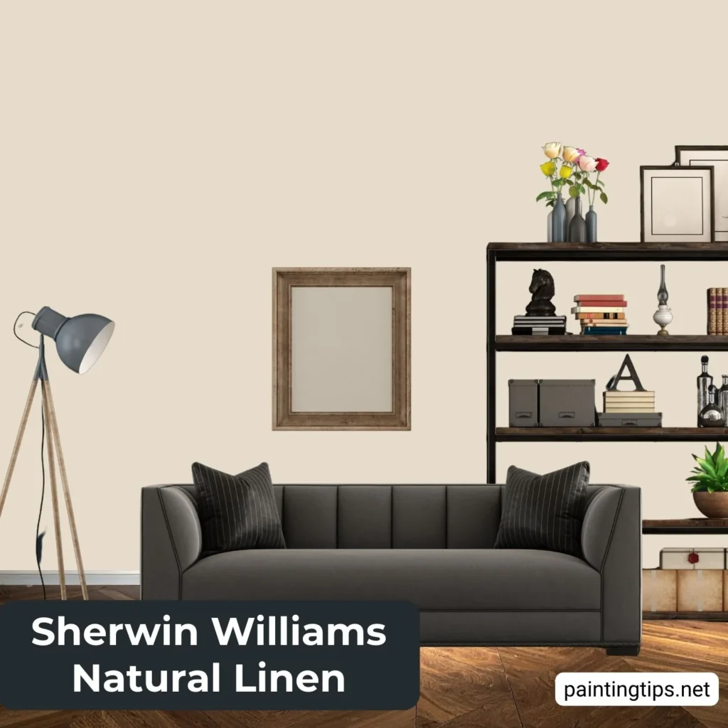
It performs especially well in primary bedrooms, bathrooms, and farmhouse or organic-modern interiors where its softness aligns with natural textures. In a well-lit living room, it brings a freshness that heavier beiges can’t quite achieve. SW Pure White on trim is the natural pairing, with deep forest green or muted navy as accent choices when contrast is needed. “For more information, read the Sherwin-Williams Natural Linen article.”
Neutral Ground SW 7568 | LRV: 63
Neutral Ground is a light beige with a green-gray undertone that quietly modernizes its warmth — the right call for homeowners who want a beige that doesn’t immediately read as traditional. It sits comfortably alongside light to medium brown hardwood floors and off-white cabinetry, where its slight coolness keeps the overall palette from going too warm.
Where it gets complicated is in homes with conflicting finishes — cool-gray cabinetry next to warm flooring, for instance — because those opposing surfaces can pull the color in opposite directions. More than most on this list, it rewards careful sampling in the actual space before any decision is made.
Balanced Beige SW 7037 | LRV: 52
Balanced Beige is a deeper, richer choice with brown and tan undertones that give it more presence on the wall than most of the lighter options above. Its lower LRV means it absorbs more light, creating a cozier, more intimate feel — best suited to dining rooms, primary bedrooms, and home offices where depth matters more than brightness.
It works particularly well alongside dark-stained wood furniture and warm brass hardware, where the richness of both elements reinforces each other. In larger rooms it carries all four walls without feeling oppressive; in tighter spaces, a single feature wall is the smarter application.
Most Popular Beige Paint Color Behr
Behr is the go-to brand for millions of American homeowners thanks to its wide availability at The Home Depot and consistently strong quality across its Marquee and Dynasty lines. Their beige lineup has evolved significantly in recent years — away from flat, builder-grade neutrals and toward more refined shades that hold up in modern interiors.
Even Better Beige DC-010
Even Better Beige is Behr’s standout performer in the beige category and one of their most-sold colors in recent years. It’s a medium-tone beige with subtle sand and limestone undertones — sophisticated without being loud. Behr’s own color team describes it as giving walls “quiet substance without heaviness,” which is an accurate read.
It performs especially well in north-facing rooms, where lighter neutrals tend to feel cold and flat, and makes a reliable choice for living rooms, dining areas, and entryways with limited southern exposure. On kitchen islands or built-in shelving alongside a lighter whole-home color, it adds just enough depth to read as a considered accent rather than an afterthought.
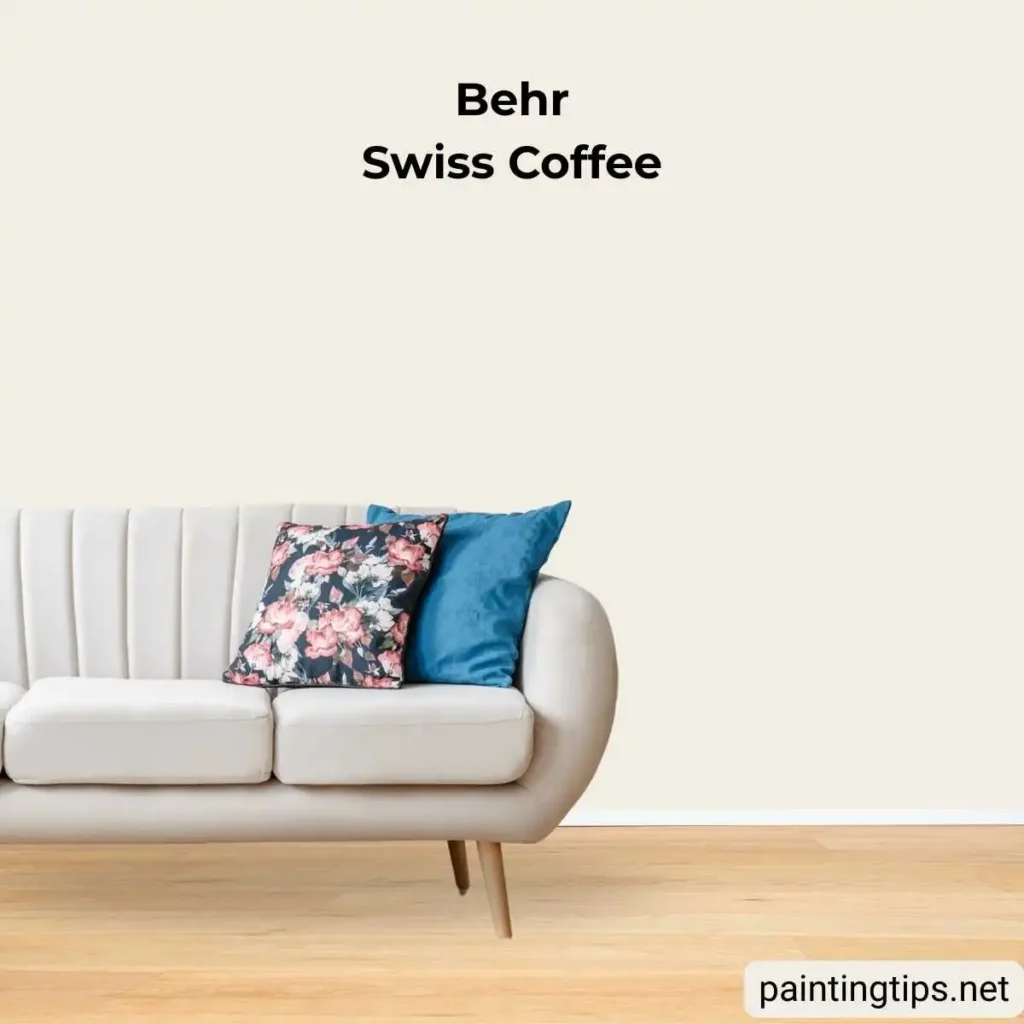
Swiss Coffee W-F-7 | LRV: 84
Swiss Coffee is Behr’s warm white with beige roots. Its LRV of 84 puts it firmly in the white category by reflectance, but its creamy, milky undertone reads closer to a very light beige in warm-lit rooms — a quality that makes it one of Behr’s most consistent best-sellers.
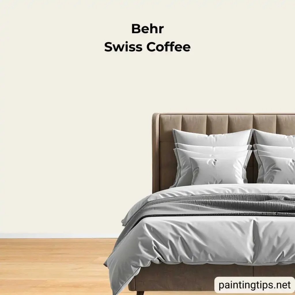
Few colors on this list are as truly multi-purpose. It works equally well on walls, trim, ceilings, cabinetry, and exterior surfaces, and it bridges both warm and cool furnishings without pulling in either direction. In strong natural light it reads almost as a true white; in lower light, the beige comes forward just enough to keep things from feeling stark. “For more information, read the Behr Swiss Coffee article.”
Wheat Bread 720C-3 | LRV: 56
Wheat Bread is a warm, medium-depth beige with golden-brown undertones that give it a natural, lived-in quality. It occupies a comfortable middle ground — more color than Swiss Coffee or Blank Canvas, but without the richness of a true deep beige — which makes it an approachable choice for homeowners who want warmth without committing to a darker tone.
It works well in family rooms, stairways, and transitional spaces where a welcoming, unpretentious atmosphere is the goal. Its golden quality harmonizes naturally with olive green, warm cream upholstery, and brass or bronze hardware. Pair it with an off-white on trim to keep the palette feeling light despite the added depth.
Blank Canvas W-F-800
Blank Canvas is a soft warm white with a faint sunlit-cream quality — lighter than Swiss Coffee, warmer than a cool pure white. It works across full walls as well as on trim and molding, where it feels tailored rather than sharp.
Its real strength shows in homes with cool-toned flooring or gray cabinetry, where the cream undertone softens those cooler elements without fighting them. As a whole-home color in open-concept spaces, it connects rooms with different accent colors without asserting itself in any one of them.
Casual Khaki N300-3
Casual Khaki is a medium-depth beige that leans toward tan territory, with warm gold-brown undertones that feel earthy and grounded. It’s a less talked-about color than the others on this list, but a consistent performer for homeowners who want a beige with real presence on the wall rather than something that blends quietly into the background.
It reads particularly well in rooms with significant natural wood — light oak and dark walnut both sit comfortably alongside its golden undertones. Deep teal, burnt orange, and warm ivory are strong accent pairings, leaning into the earthy, organic-modern aesthetic that continues to gain ground in American interiors.
Most Popular Beige Paint Color Benjamin Moore
Benjamin Moore occupies a particular place in the beige world. Their colors tend to run richer and more golden than Sherwin-Williams’ more muted options, making them especially appealing in traditional, transitional, and classic American interiors. Colors like Manchester Tan and Muslin have maintained devoted followings for decades.
Revere Pewter HC-172 | LRV: 55.51
Revere Pewter is one of the most iconic beige paint colors in America and has been a household name in interior design for well over two decades. It’s a light greige — sitting precisely between gray and beige — with warm undertones that shift noticeably depending on the light source. In rooms with warm artificial lighting, the beige comes forward; under cooler natural light, the gray takes over.
This chameleon-like quality is both its strength and its limitation. In rooms with varied lighting throughout the day — living rooms, hallways, and open-concept kitchens — Revere Pewter creates a dynamic, layered feel that many homeowners find endlessly livable. It pairs beautifully with white trim, medium-toned wood furniture, and black accents, which sharpen its greige quality without fighting it. In rooms with exclusively cool or north-facing light, sample carefully — it can occasionally read cooler and flatter than expected.
Manchester Tan HC-81 | LRV: 63.24
Manchester Tan is Benjamin Moore’s most popular beige and has held that position for many years. It’s a light-to-medium beige with warm yellow-green undertones that give it a sunny, almost golden quality in good natural light. This is not a color that hides — it shows up on the wall as a clear, confident beige that fills a space with brightness and warmth.
It performs strongest alongside warm wood tones, particularly oak floors and cabinetry, and delivers well in living rooms, kitchens, and dining rooms where a welcoming atmosphere is the primary goal. Benjamin Moore’s Simply White or White Dove on trim are the classic partners. One firm caution: Manchester Tan is sensitive to purple-undertoned wood floors and cool-toned cream finishes — if those exist in your space, sample carefully before committing.
Muslin OC-12 | LRV: 67
Muslin is the softer, lighter alternative to Manchester Tan — with more balanced undertones that keep it from reading too yellow or golden. Its faint orange-beige quality delivers warmth without aggression, and in brighter rooms it approaches the character of an elevated off-white.
We consider it one of the most genuinely versatile beige colors on the market. It adapts well across room types and lighting conditions, and its higher LRV makes it particularly effective in smaller or north-facing spaces that need to feel lighter and more open. For living rooms, it provides enough warmth to feel inviting without committing the space to a traditional aesthetic.
Shaker Beige HC-45 | LRV: 54
Shaker Beige is a warmer, more saturated choice from Benjamin Moore’s Historic Colors collection. Its soft red and orange undertones anchor it firmly in the warm-traditional camp, making it a perennial favorite in classically decorated homes, craftsman-style interiors, and spaces with significant natural woodwork.
Its lower LRV gives it more depth than Muslin or Manchester Tan, making it the stronger call when coziness is the primary goal. It handles richer accent colors particularly well — deep blues, burgundy, and forest green all work against it without conflict. Benjamin Moore’s White Dove on trim is the pairing that consistently holds up across different room configurations.
Pale Oak OC-20 | LRV: 69.89
Pale Oak sits at the lighter, cooler end of Benjamin Moore’s beige spectrum. It’s often described as a greige because its gray and beige undertones balance so evenly, but in warm-lit rooms it settles into a soft, organic beige that reads as anything but gray.
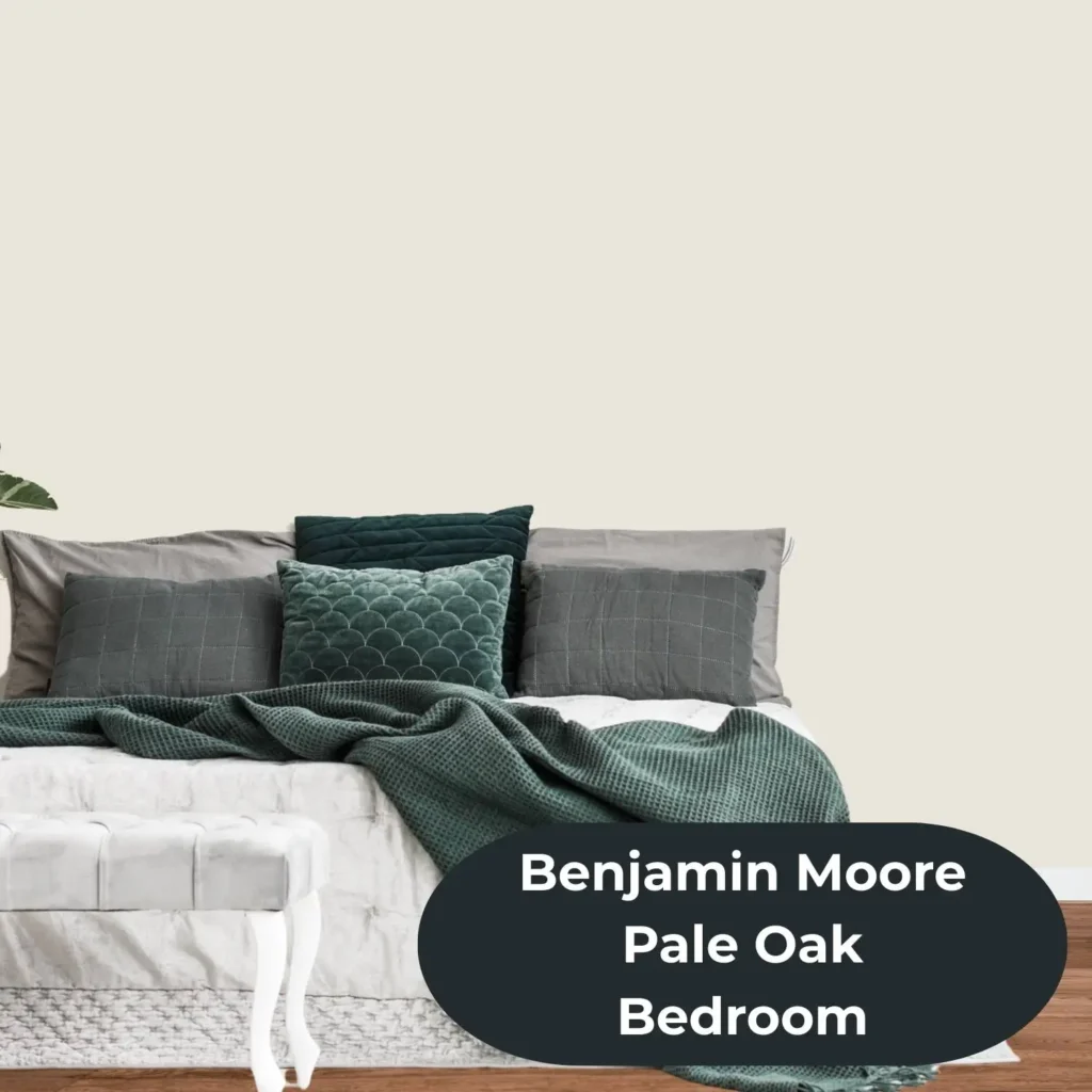
Its real advantage is in homes with mixed warm and cool finishes — a situation that most straight beiges struggle to resolve gracefully. Pale Oak reads cleanly alongside both warm oak floors and cooler gray cabinetry without amplifying either, which is precisely why it has earned a devoted following among designers working on whole-home projects. “Related post: Edgecomb Gray vs Pale Oak“
Grant Beige HC-83 | LRV: 56
Grant Beige is a refined, mid-depth beige with a hint of gray-green that gives it a quiet, measured quality. It reads cooler than Shaker Beige and more neutral than Manchester Tan — landing in a space that suits homeowners who want beige warmth without any golden dominance pulling the room in a particular direction.
It earns its place most reliably in living rooms and dining rooms where artwork or a gallery wall is part of the design, since its balanced neutral quality doesn’t compete with what’s on the walls. For a tone-on-tone approach, pairing it with a lighter beige like Muslin on trim or built-ins creates a layered, considered result that reads well in person and photographs cleanly.
Most Popular Beige Paint Color Valspar
Valspar may not carry the same name recognition as Sherwin-Williams or Benjamin Moore in design circles, but their beige lineup is quietly strong — particularly for homeowners looking for reliable, warm neutrals at a competitive price point. Available at Lowe’s, their colors are formulated for consistent coverage and hold up well across a range of interior applications.
Oatbran 6005-1A
Oatbran is a soft, earthy beige with subtle brown undertones that give it a natural, almost organic quality. It sits in the light-to-medium range — warm enough to feel genuinely cozy, yet restrained enough to work as a whole-room color without becoming visually heavy. In rooms with warm artificial lighting, its brown base deepens slightly, creating a snug, settled atmosphere that works particularly well in the evening.
It’s one of the stronger Valspar options for guest rooms, dining rooms, and spaces with a rustic or vintage aesthetic, where its earthy warmth harmonizes with linen fabrics, aged wood, and dark metal accents. It’s not a color that tries to modernize beige — it leans into tradition and does so confidently. Pair it with a warm off-white on trim and keep accent colors grounded: deep olive, burgundy, and matte black all sit well against it.

Frequently Asked Questions
What Is the Most Popular Beige Paint Color in the US?
Sherwin-Williams Accessible Beige (SW 7036) is widely regarded as the most popular beige paint color in the country. It consistently tops best-seller lists through genuine versatility — it works in nearly every room, under most lighting conditions, and alongside a wide range of furnishings and finishes.
What Is the Best Beige Paint Color for a Living Room?
For living rooms, the most reliable performers are Sherwin-Williams Accessible Beige (SW 7036) and Kilim Beige (SW 6106), Behr’s Even Better Beige (DC-010), and Benjamin Moore’s Manchester Tan (HC-81) and Muslin (OC-12). The best choice depends on your room’s natural light and existing finishes. Lighter living rooms can handle the golden warmth of Manchester Tan or Kilim Beige; rooms with limited light tend to respond better to Muslin or Accessible Beige, which hold their warmth without darkening under low light.
What Beige Paint Color Makes a Room Look Bigger?
Higher-LRV beiges — those above 65 — are the most effective for creating a sense of space. Benjamin Moore Pale Oak (OC-20) and Muslin (OC-12), Behr Swiss Coffee (W-F-7), and Sherwin-Williams Natural Linen (SW 9109) all reflect enough light to open up a room visually. Pairing any of these with white or off-white trim on molding and ceilings amplifies the effect further.
Will Beige Ever Go Out of Style?
Beige has proven itself to be one of the most enduring color families in interior paint — not because it plays it safe, but because it genuinely functions well. It bridges warm and cool palettes, ages gracefully alongside changing furniture and décor trends, and creates the kind of livable warmth that stark whites and cool grays often struggle to deliver. The specific shades that lead in popularity evolve from decade to decade, but the category itself has never truly disappeared.
What Accent Colors Work Best With Beige Walls?
The most reliable pairings depend on the undertone of your specific beige. Warm beiges with orange or golden undertones — like Kilim Beige or Manchester Tan — sit naturally next to deep navy, forest green, and terracotta. Cooler beiges with gray undertones, like Pale Oak or Even Better Beige, handle more contemporary accents like slate gray, dusty teal, and matte black without conflict. Crisp white or off-white trim works across all of them.
Is Beige a Good Color for Walls?
Beige is one of the most practical and proven choices for interior walls. It adapts to virtually every design style — from modern and minimalist to traditional and farmhouse — and holds up well across different lighting conditions throughout the day. Its warmth creates an inviting atmosphere without the visual weight of darker colors, and its neutrality makes it one of the easiest backdrops to build a cohesive room around.
Beige rewards patience and careful sampling. Always test at least two or three options on large swatches — ideally 12 inches square or larger — and observe them at different times of day before committing. The colors on this list have earned their popularity through decades of real-world performance, and any one of them is a solid starting point. The right choice ultimately comes down to the light in your rooms, the finishes already in place, and the atmosphere you’re working toward.