Sherwin Williams Tradewind is a soft, hazy blue-gray that looks effortless on a wall but behaves differently depending on light, flooring and the colors around it. This guide explains what Tradewind really is, how its undertones read in a real room, and how it differs from close neighbors like Rainwashed, Sea Salt, Sleepy Blue and Tidewater. You’ll also find the best white, neutral and accent pairings, a room-to-room palette, and honest advice on using it in a bathroom or a bedroom.
Sherwin Williams Tradewind

Sherwin Williams Tradewind (SW 6218) sits right between blue and gray. At first glance it looks like a blue, but a soft, dusty one, and the gray base becomes obvious once it covers a full wall. There’s a faint green behind it too, though you really have to look for it. This is not a sky blue and not a spa aqua. With an LRV of about 61 it bounces back a good amount of light, yet it still has enough pigment to read as a real color instead of a tinted white.

We see it used most in bathrooms and bedrooms, and it works well in nurseries, home offices and laundry rooms too. On the outside of a house, a porch ceiling or front door is where it makes the most sense. Next to Rainwashed it’s the bluer one, and “Rainwashed Sherwin Williams” is worth reading if you’re still deciding between the two.
What Color Is Tradewind?
People search for “trade wind paint color,” but the name on the can is Tradewind, written as one word, with the code SW 6218. In practice it behaves like a muted blue that’s easy to live with. It has too little saturation to dominate a room, so furniture, artwork and fabrics keep their place. Against a bright white it looks crisp and coastal, and next to warmer neutrals it settles into something more traditional. Always confirm the code before buying, since other brands use similar names for different shades.

Is Sherwin-Williams Tradewind Green or Blue?
Blue. That’s the first impression most people get, and it’s the right one. The color sits between blue and gray, and the gray only softens it. The green appears under certain conditions, and that’s where color descriptions online start to disagree: some call it a blue-green gray, others a blue with a hint of green. Both come from the same wall seen under different light.

Daylight sets the baseline. A north-facing room tends to push Tradewind toward blue-gray, while sunny south and west rooms give it a slightly warmer, greener look. Evening bulbs matter just as much. Yellow bulbs soften it and bring out the green, while white or daylight bulbs make it look bluer and cleaner. Check a sample in the morning, at midday and under your evening lamps before committing.
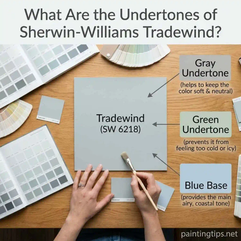
What Are the Undertones of Sherwin-Williams Tradewind?
The undertones of Tradewind are gray first, then a touch of green, with blue over both. That ranking explains how the color behaves. The gray keeps it muted, the green keeps it from feeling icy, and since nothing warm or violet is hiding in there, it doesn’t turn lavender in the evening the way some pale blues do. If you ever see a purple cast on a sample, it’s usually coming from a neighboring color or a bulb, not from Tradewind itself.
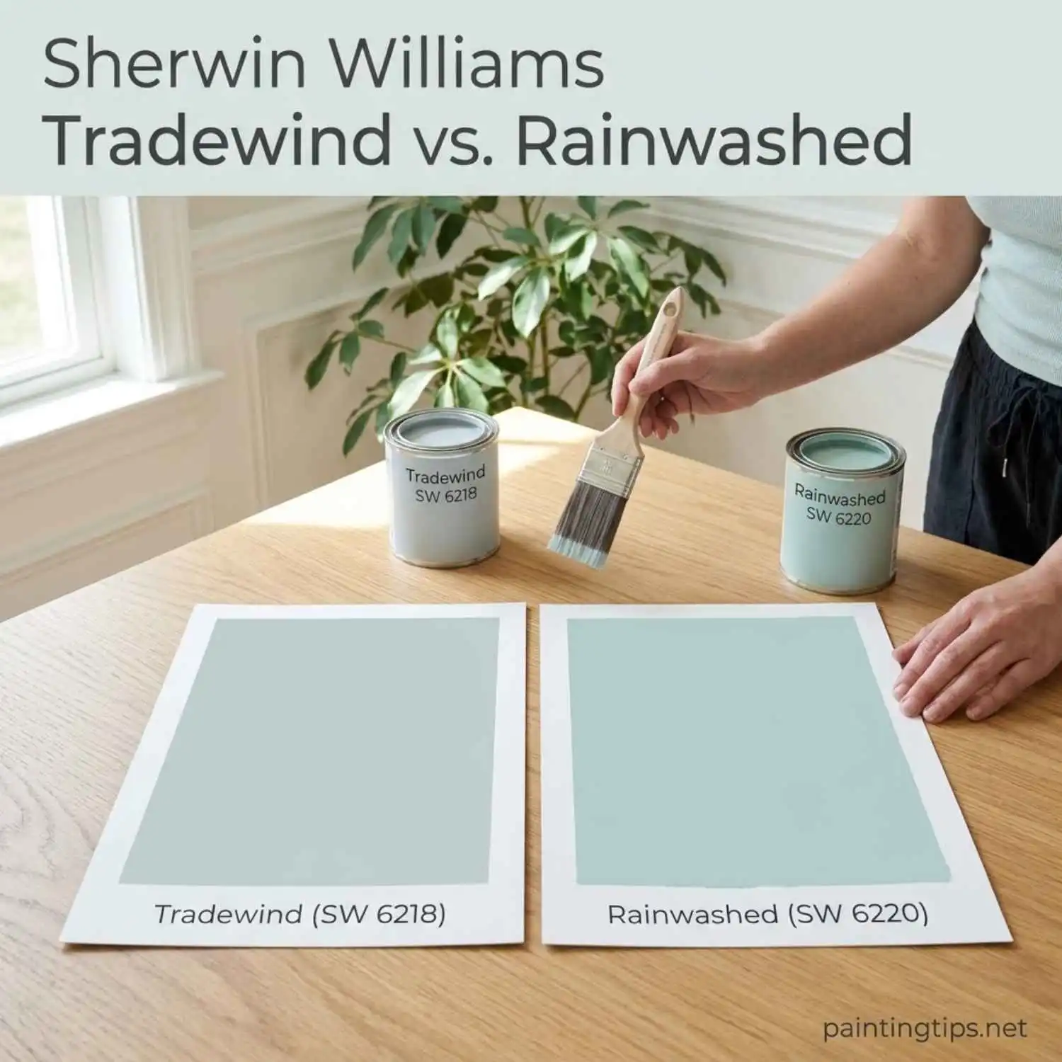
Sherwin Williams Tradewind vs. Rainwashed
Hold a Rainwashed (SW 6211) chip next to Tradewind and the green stands out right away. Rainwashed leans aqua, so it reads fresher and a bit brighter. Tradewind stays on the blue side, which makes it feel steadier. The difference is small on a chip but clear across a whole wall. If the room already has warm tones, Rainwashed fits easily. If it has crisp white trim and cooler finishes, Tradewind looks better.
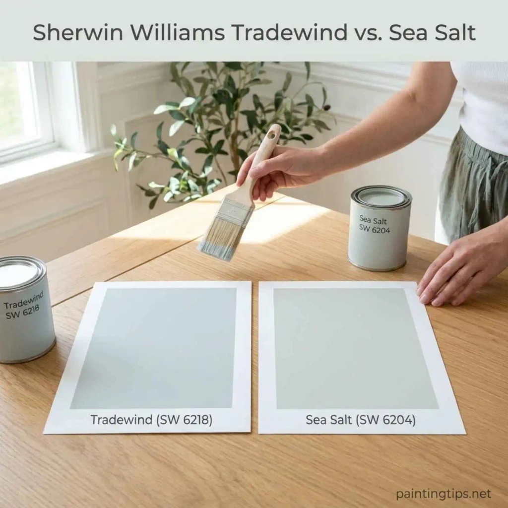
Sherwin Williams Tradewind vs. Sea Salt
Sea Salt (SW 6204) is a chalky gray-green, warmer and a little sun-bleached. Tradewind is cooler and reads blue. If you want a wall that quietly blends with beige and warm neutrals, Sea Salt is the easier pick. If you want something that feels crisp next to white, go with Tradewind. Tape both samples beside the same white board and the gap shows up immediately. “Sea Salt Sherwin Williams” goes deeper into how Sea Salt behaves in different rooms.
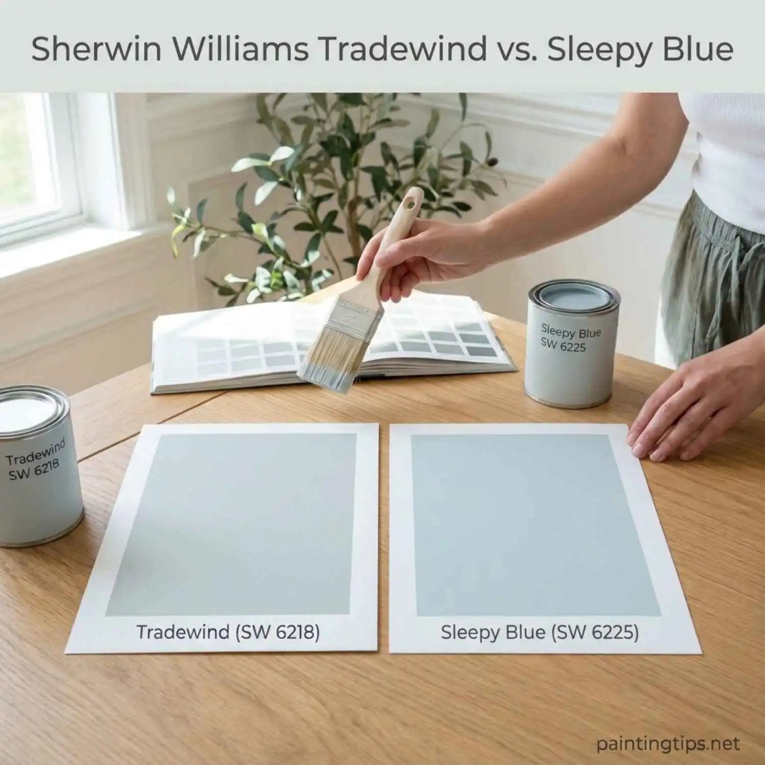
Sherwin Williams Tradewind vs. Sleepy Blue
Sleepy Blue is the one you choose when you want people to say “that room is blue.” It reads clearly as a light blue from the moment it dries. Tradewind is the more restrained choice, because its softened, grayed blue never looks like a theme. Use Sleepy Blue when the wall should be the star, and Tradewind when the room’s furniture and fabrics should lead.
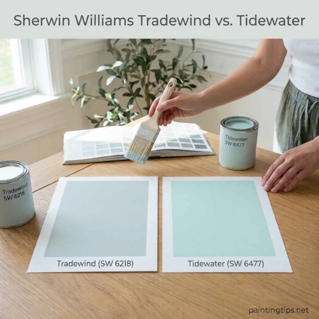
Sherwin Williams Tradewind vs. Tidewater
Tidewater (SW 6477) is lighter and greener. Its LRV is 65, a few points above Tradewind’s roughly 61, and its stronger green undertone pushes it toward a pale, watery turquoise. Next to it, Tradewind looks calmer and more serious. That difference decides placement. A small bathroom with little daylight gets more from Tidewater’s extra brightness. A bedroom or living room, where you spend long hours, usually suits the softer blue of Tradewind better.
What Colors Go with Tradewind?
Tradewind is easy to pair because it works with every white, including a plain bright white, so the choice of white comes down to the mood you want. For depth, go darker in the same family: a deeper blue or navy sits naturally beside it. Warm beiges and greiges take the chill off, and gray-greens like Sea Salt and Silvermist can run through nearby rooms. Pale oak, linen, white marble and a touch of brushed brass all look right against it.

Sherwin Williams Tradewind Coordinating Colors
For trim, Alabaster gives a soft, slightly creamy edge, while Snowbound is the sharper, brighter option. Any white will work, but those two are the safest starting points. Before you commit, we’d recommend reading “Sherwin-Williams Alabaster 7008” to see how Alabaster behaves in different light.
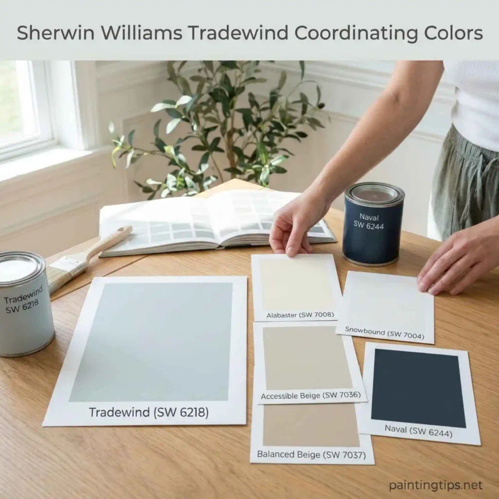
For warmth on neighboring walls, built-ins or cabinetry, Balanced Beige and Accessible Beige are the two to try. “7036 Accessible Beige” shows why Accessible Beige is such a popular choice.
For a deep accent, Naval is the strongest partner, whether on a door, a vanity or a bedroom wall. We recommend checking “Naval by Sherwin Williams” first, so you know exactly how dark it goes before it’s on the wall.
Sherwin Williams Tradewind Palette
Think of the palette as a route through the house. Tradewind covers the main walls, a white of your choice frames doors and trim, and the ceiling stays a step lighter than the walls. In the hallway or the next room, Accessible Beige gives the eye a warm pause. Navy or a deeper blue appears only once or twice, on a door, a vanity or the bedroom’s feature wall, so the whole palette feels planned and not crowded.

Tradewind Sherwin Williams Bathroom
Bathrooms are where Tradewind is chosen most often, and it makes an especially good choice for a small one. It brightens the walls without the cold, clinical look some blue-grays have, and it works with every white, which makes tile, vanity and trim choices easy. If the bathroom has no window, artificial light can push Tradewind toward gray, so check it under your vanity lights at night, and consider Tidewater if more brightness is needed. A satin or semi-gloss finish handles moisture better than flat paint.

Tradewind Sherwin Williams Bedroom
Tradewind is a popular bedroom color, but covering every wall with it can become dull over time. There are two better ways to use it. The first is to pair it with a few other colors in the room. The second, and the one we prefer, is a feature wall: paint the wall behind the bed in a deeper blue or navy, then use Tradewind on the opposite wall and the side walls. The dark wall anchors the bed, and the lighter walls keep the room open and calm. Paint a large sample of both and check them in the morning and just before bed.

More Paint Color Guides to Read Next
If Tradewind is going into a bedroom, these three guides will help you narrow things down: “light blue paint colors for bedroom” for softer blue options, “calming bedroom colors” for restful shades beyond blue, and “best wall colors for bedroom” for a wider look at what works on bedroom walls. Planning a smaller space? “best wall color for a small bathroom” covers the shades that keep a compact bath bright. And if you’re considering a porch ceiling, “haint blue sherwin williams” explains the traditional blue-green approach.
