Picking a neutral paint isn’t as simple as grabbing a nice color from a swatch. You’ve got to think about the lighting, the undertones, what the room’s actually for, and even what else is in the space. Here, we’re digging into Sherwin-Williams Accessible Beige (SW 7036). We’ll talk about its undertones, how it reacts to different kinds of light, and how it looks in spots like the living room, bedroom, kitchen, bathroom, and entryway. I’ll also share some colors that go well with it, ideas for accents, and real-world lighting tips, so you can figure out if Accessible Beige works for your place.
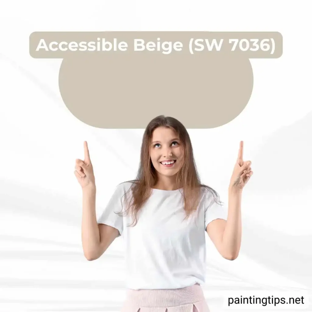
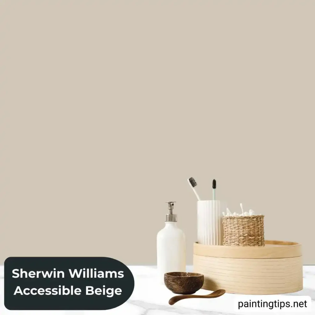
Accessible Beige (SW 7036)
Accessible Beige isn’t just another color from Sherwin-Williams—it’s a favorite, and honestly, it’s easy to see why. This shade sits right in that sweet spot between warm beige and a hint of greige, so it gives you a soft, welcoming vibe without taking over the whole room. Stark whites can feel chilly, and cool grays sometimes look a bit harsh, but Accessible Beige brings warmth while still fitting right in with modern styles.
What really sets this color apart is how it plays with light. If you’ve got a north-facing room, where daylight tends to be cooler, Accessible Beige picks up on its gray side, which keeps things feeling fresh instead of flat. In sunny, south-facing spaces, it turns warmer and cozier—perfect for making a room feel inviting. That’s probably why it works so well in open-concept homes, where you need one color to look good everywhere.
It’s not just a passing trend either. Accessible Beige keeps turning up on best-seller lists across the country. Both designers and homeowners love how it blends with pretty much any style—classic or modern. Pair it with sharp white trim, darker wood, or even simple, clean décor, and it always looks right. Instead of fighting with your furniture, this color just quietly pulls everything together.
The Undertones
Accessible Beige stands out because of its layered undertones. It isn’t one-note—you actually see it shift depending on what’s around it.
At its core, you get a warm beige with a touch of yellow. But in cooler light, a soft gray sneaks in and takes the edge off. There’s also a whisper of green underneath it all. That’s the secret ingredient. The green stops the color from drifting into orange or pink territory, so it doesn’t end up looking dated or too golden.
Honestly, that balance is what makes Accessible Beige work so well. If you’ve ever painted a room and watched the beige slowly turn yellow or peach as the day goes on, you know the struggle. This color just stays steady—it’s reliable and modern, right from the first brushstroke.
Accessible Beige Living Room
Accessible Beige really shines in living rooms. It brings in a cozy, inviting vibe that helps everyone unwind, but it never takes over or feels heavy. There’s a gentle warmth to it, but those gray undertones stop things from getting too old-fashioned. That’s why it works in both fancy sitting areas and the spots where everyone kicks back. If you’ve got a leather sofa—cognac or dark brown—it pops against this shade. Or, if you stick with light linen or other neutral furniture, the whole room stays bright and open.
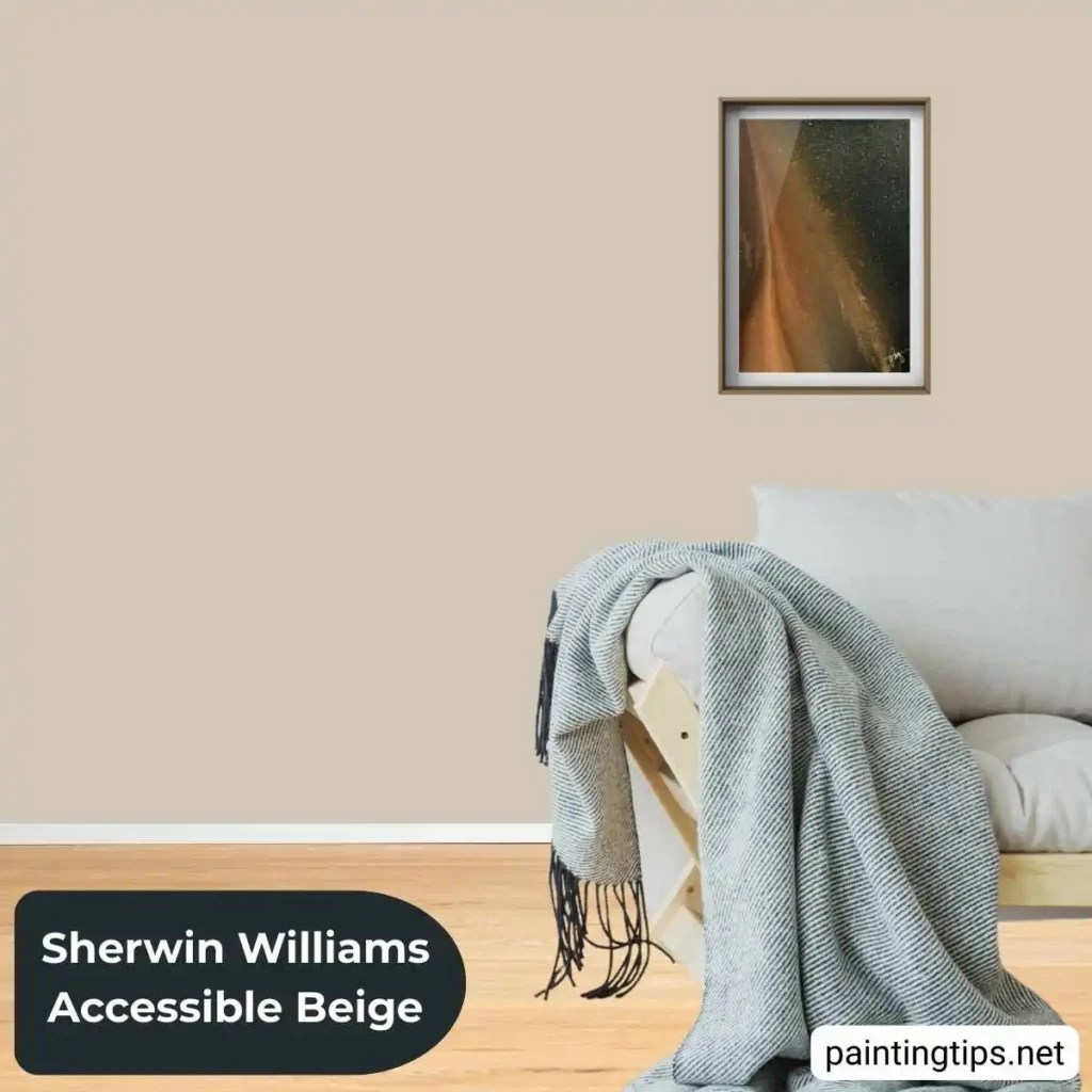
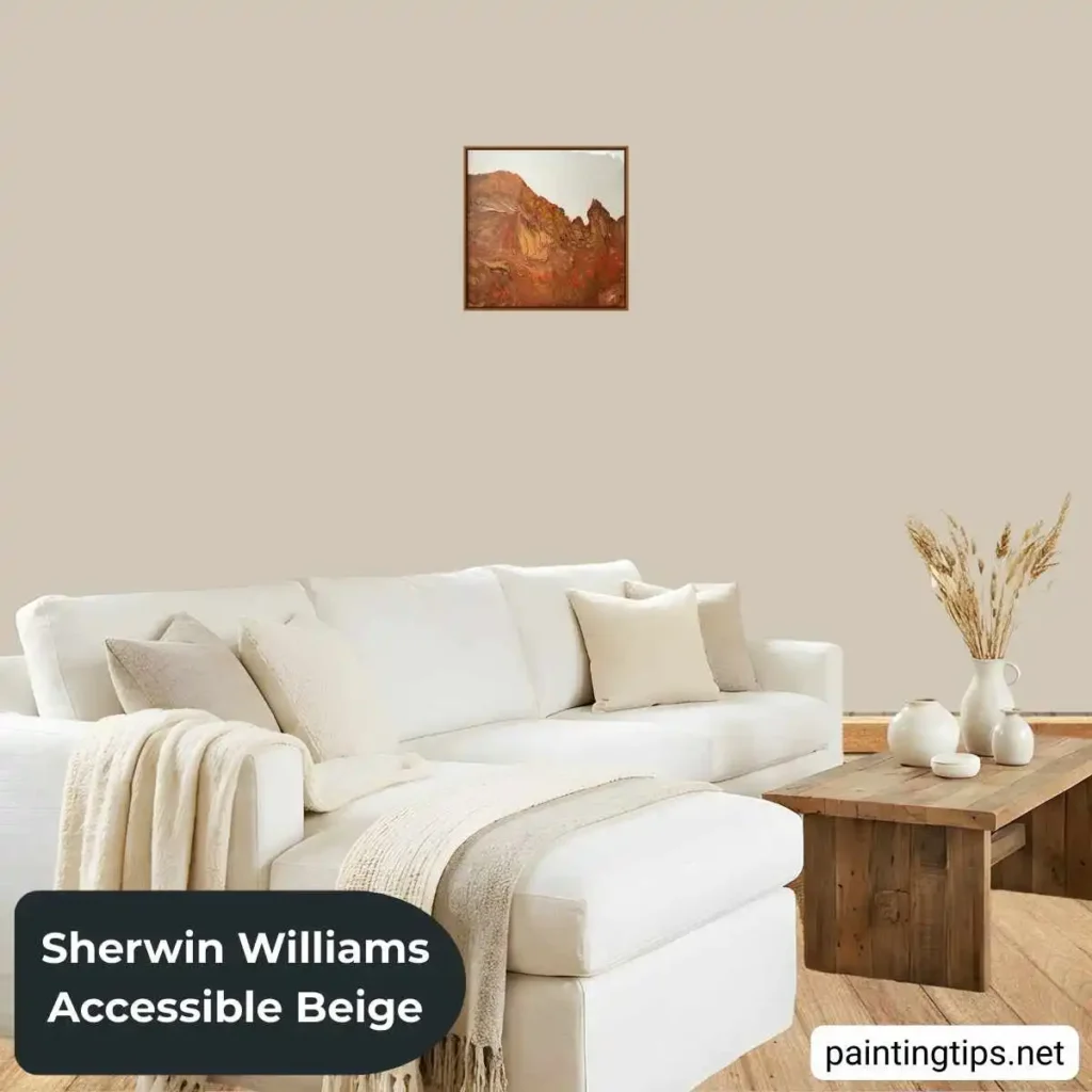
Accessible Beige sets the stage for your favorite art and decor to shine without stealing the spotlight. Try it with crisp white crown molding or wainscoting if you want a bit of classic detail. Or, leave the trim plain and sharp for a modern vibe.
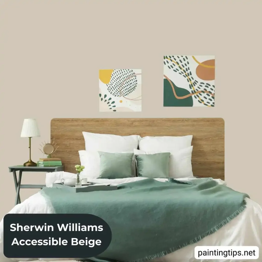
Accessible Beige Bedroom
In the bedroom, Accessible Beige just feels restful. The warmth wraps around you, making the space cozy and inviting, but it still keeps things light and airy—never stuffy or closed in.
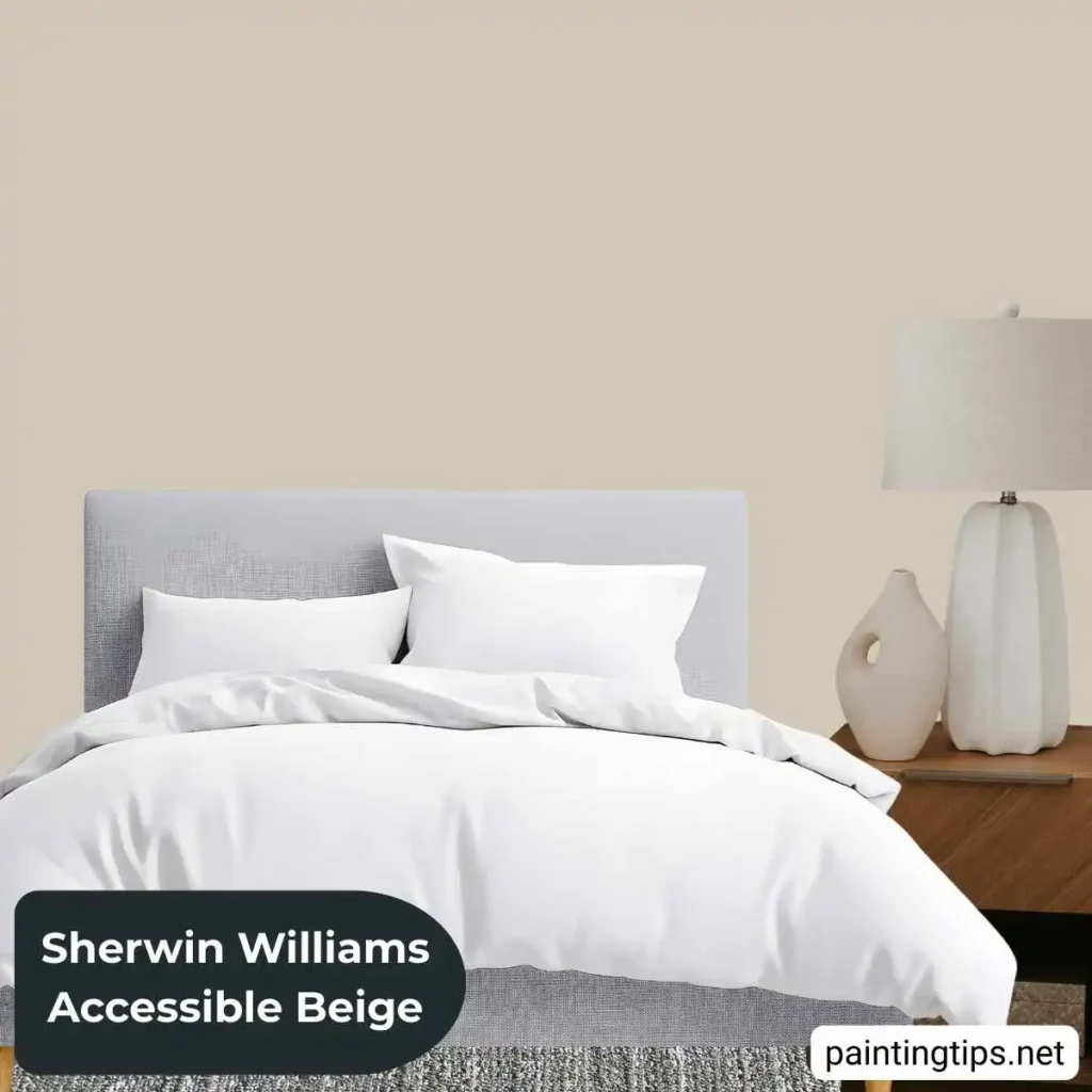
In a primary bedroom, this color brings a calm, hotel-like vibe. It works really well with white bedding, natural wood pieces, and a few metallic touches. Since it’s neutral, you can swap out accent colors whenever you feel like it—new pillows, throws, or artwork fit right in, and there’s no need to repaint.
Accessible Beige works well in kids’ bedrooms because it grows with them. The color feels playful when they’re little, but it doesn’t look out of place as they turn into teenagers—just add some new colors or textures, and the room feels fresh again.
Accessible Beige Kitchen
In the kitchen, Accessible Beige adds a bit of warmth, which helps keep the space from feeling cold or too utilitarian. It’s a soft, neutral background that fits with almost any style of cabinets or countertop you pick.
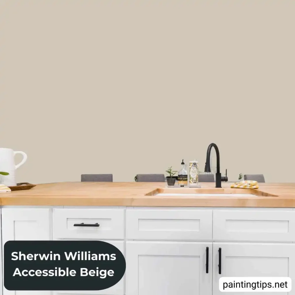
It works great with white or cream cabinets, giving them more depth but never looking harsh. If you’ve got darker cabinets—think espresso, charcoal, or navy—it adds contrast and still keeps the space warm and pulled together. You’ll also find Accessible Beige goes easily with popular countertop choices like white quartz, gray granite, or butcher block.
In open kitchens, Accessible Beige pulls everything together. It links the kitchen with the living or dining area, so the whole space just flows.
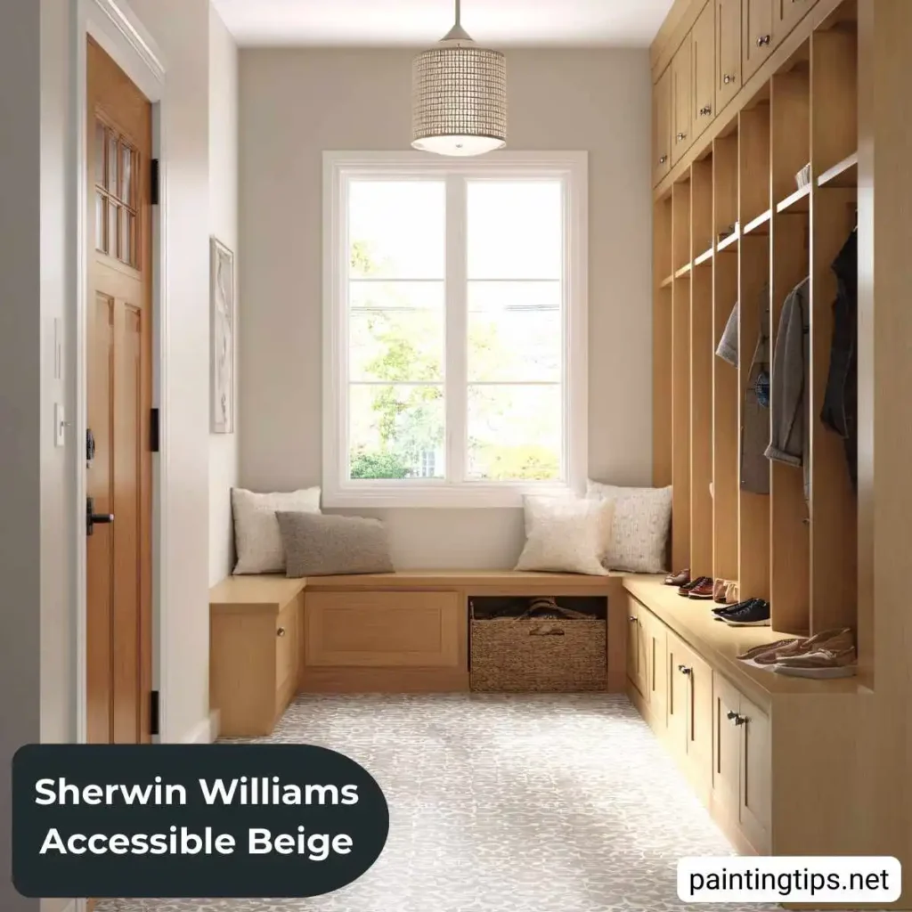
Accessible Beige Entryway
Your entryway sets the tone the moment you step inside. Accessible Beige gives it a warm, polished vibe that feels inviting, even when there’s not much natural light. The color bounces light around, so narrow or small entryways seem bigger. It’s a great backdrop for mirrors, console tables, and cool lighting. Crisp white trim makes it look classic, and if you throw in a bold runner or some eye-catching art, they pop without taking over.
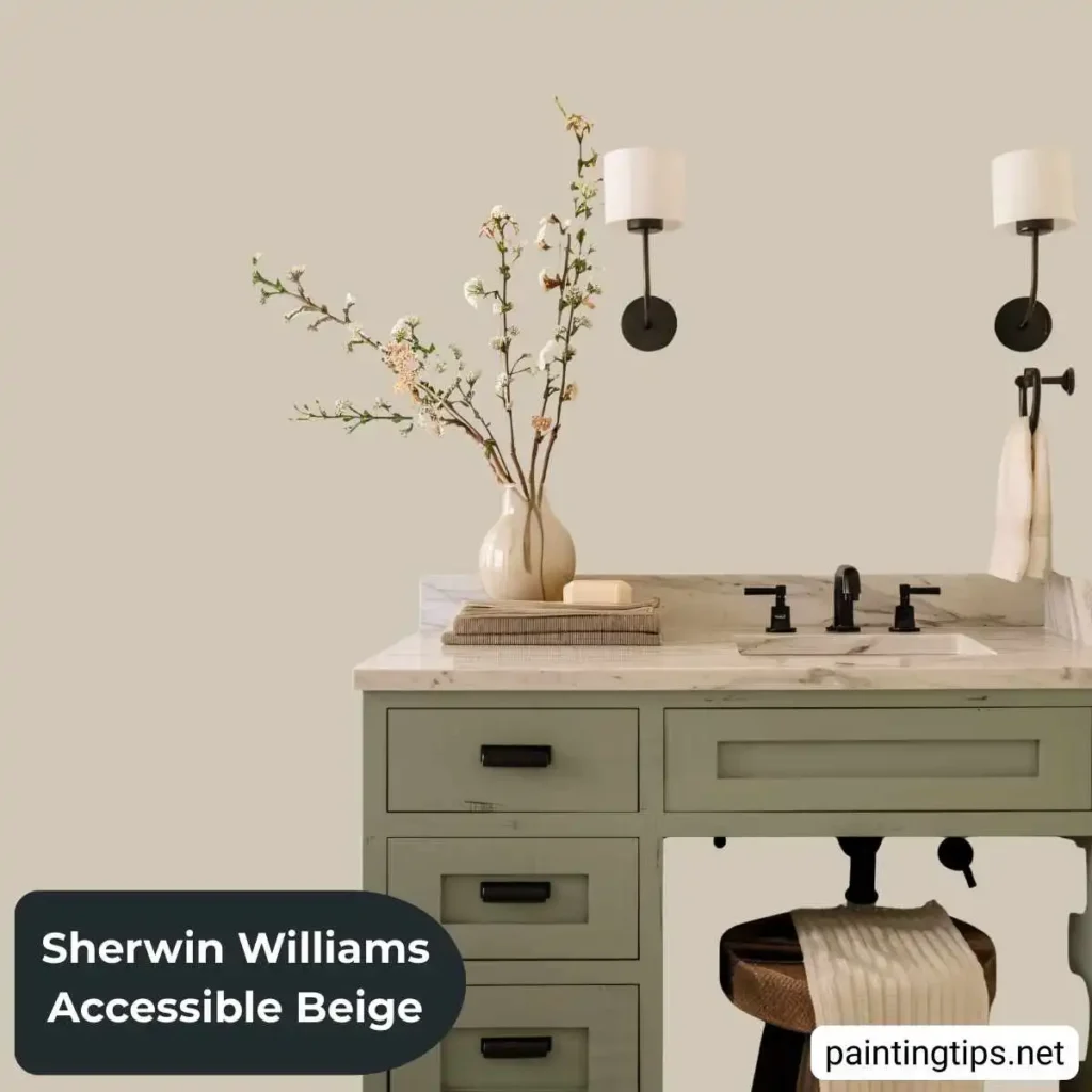
Accessible Beige Bathroom
Accessible Beige brings a gentle, spa-like warmth to bathrooms. It makes the space feel clean and inviting, whether you’re dealing with a cozy powder room or a big primary bath.
This color works really well with white fixtures, tile, or vanities. You get a soft contrast that never looks harsh. And if your bathroom doesn’t get much sunlight, Accessible Beige keeps things from feeling chilly or cramped.
Go for a satin or semi-gloss finish—those hold up best, especially where there’s lots of moisture. Add some plush white towels and a few touches of natural wood, and you’ve got a bathroom that feels calm, polished, and just a little bit luxurious.
Accent Colors That Work
Accessible Beige plays well with all sorts of accent colors, so you can really make a space your own.
- Navy blue brings that timeless, polished look—great if you’re into traditional or coastal vibes.
- Sage green blends with the subtle green undertones, giving everything a fresh, earthy feel.
- Warm terracotta pulls out the cozy warmth in the beige, which works perfectly if you love a Southwestern or Mediterranean style.
- Charcoal gray adds some sleek contrast, keeping things modern and still neutral.
- Soft blush pink softens the whole look, making a bedroom feel calm and a little romantic.
Coordinating Room Colors
If you’re using Accessible Beige as your main color, consider these Sherwin-Williams colors for adjoining spaces:
- Repose Gray (SW 7015): A cooler transition for bathrooms or utility rooms
- Kilim Beige (SW 6106): A slightly warmer, richer option for dining rooms
- Agreeable Gray (SW 7029): A slightly cooler alternative that still coordinates beautifully
Pairing Colors with Accessible Beige
If Accessible Beige is your go-to, here are some Sherwin-Williams shades that work well in nearby rooms:
- Try Repose Gray (SW 7015) for bathrooms or utility spaces—it brings in a cooler touch and keeps things feeling fresh.
- Go with Kilim Beige (SW 6106) for dining rooms if you want something warmer and a bit richer.
- Agreeable Gray (SW 7029) is another great pick. It’s a little cooler but still blends nicely with Accessible Beige. If you’re curious, there’s a whole article on Agreeable Gray paint.
Lighting Considerations
Lighting makes a big difference in how Accessible Beige looks. In the morning, natural light brings out its warmth. Later in the day, you start to notice more of those beige and yellow tones. If your room faces north, the color leans a bit grayer. South-facing rooms, though, really show off that classic beige vibe.
The kind of light bulbs you use changes things, too. Warm white LEDs (around 2700K to 3000K) make the space feel cozier. Go for neutral white bulbs (3500K to 4100K) if you want to see the color as it really is. Super cool bulbs (anything above 5000K) tend to wash everything out and make the gray or green hints a lot more obvious.
Why Accessible Beige Works in Any Home
Accessible Beige just gets it right. It feels modern but doesn’t scream for attention, stays warm without feeling old-fashioned, and somehow never turns boring—even though it’s so easygoing.
You’ll see it everywhere: cozy farmhouses, sleek city apartments, classic houses, or retro-inspired spaces. This color slips in and fits right in, no matter the style. Paint one accent wall or go all-in and do every room—Accessible Beige always gives you that steady, polished look.
If you’re serious about it, grab some big paint samples and try them out on a few different walls. Check them morning, afternoon, and evening. Let the paint dry completely, and live with it for a couple of days. It’s the only way to see how the color really feels in your home—photos just can’t capture the whole story. If you’re curious about other great beige options, you’ll find more in the article on beige wall paint colors.