Some paint colors look promising on a chip and fall flat on the wall. Sherwin Williams Rainwashed does the opposite. This guide covers the color’s character, how to build a palette around it, which rooms it suits best, and the coordinating colors that bring out the most in it.

Sherwin Williams Rainwashed
Rainwashed is a soft blue-green with gray undertones, officially catalogued by Sherwin-Williams under the green color family as SW 6211. But calling it simply “green” undersells it. The color carries a noticeable blue presence alongside its green base, and the gray undertone keeps both from reading too bright or too saturated. The result is a shade that feels cool without feeling cold — calm, clean, and quietly distinctive.

Its LRV (Light Reflectance Value) sits at 59, which places it in the medium-to-light range. In practical terms, that means it reflects enough light to brighten a room without disappearing into a near-white. There’s real color on the wall, but it never crowds a space.
What makes rainwashed sherwin williams particularly useful is how it responds to different light conditions. In rooms with cool northern exposure, the blue undertones take the lead and the color reads more like a muted seafoam. In south-facing rooms with warmer afternoon light, the green asserts itself and the overall effect becomes softer and more nature-inspired. Under warm incandescent bulbs in the evening, the gray steps forward and the color settles into something almost neutral. That range of behavior is why we see it used in so many different room types and design styles — from coastal cottages to transitional suburban homes.
Rainwashed SW 6211 fits comfortably within coastal, farmhouse, traditional, and French Country interiors. It’s less natural in very warm or heavily rustic spaces where earthy ochres and deep browns dominate, since the cool blue-green can feel at odds with that palette.
Sherwin Williams Rainwashed Color Palette
The Rainwashed color palette is built around three undertones: green, blue, and gray. Green is the dominant note, blue is the strong supporting character, and gray is the quiet third element that prevents the color from reading as overly vivid or pastel.
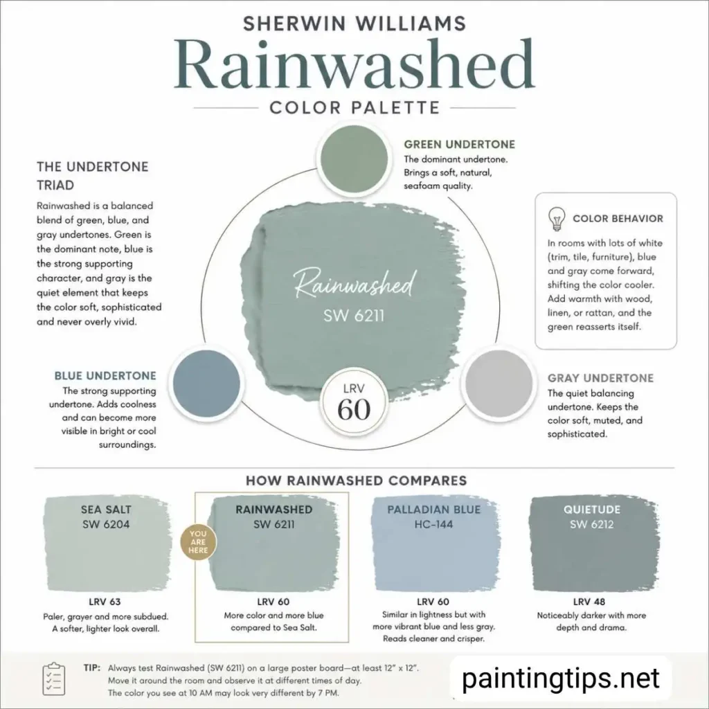
Understanding how those undertones interact is more useful than simply knowing the color’s name. In rooms with a lot of white — trim, furniture, tile — the blue and gray undertones become more visible, and the color can shift toward a muted blue-gray on the wall. Introduce warmer elements like wood tones, linen, or rattan, and the green reasserts itself. That sensitivity to surroundings means the palette you build around sw rainwashed paint matters as much as the color itself.
For comparison, Sherwin Williams Sea Salt (SW 6204) is a close relative but sits at a higher LRV of 63 — it’s paler, grayer, and more subdued. Rainwashed holds more color and more blue by comparison. Benjamin Moore Palladian Blue is another common reference point; it’s similar in lightness but carries more vibrant blue and less gray, so it reads as cleaner and crisper. Sherwin Williams Quietude (SW 6212) shares some of the same family but is noticeably darker at LRV 48, giving it more depth and drama.
If you’re sampling sw 6211 rainwashed, we recommend testing it on a large poster board — at least 12 by 12 inches — and moving it around the room at different times of day before committing. The color you see at 10 in the morning may look meaningfully different by 7 in the evening.
Sherwin Williams Rainwashed Coordinating Colors
Building a palette around rainwashed sherwin williams paint requires colors that share its cool character rather than fight it. Sherwin-Williams officially lists three coordinating colors for SW 6211: Window Pane (SW 6210), First Star (SW 7646), and Pewter Cast (SW 7673). Window Pane is a lighter blue-green pastel that creates a tonal, layered effect when used alongside Rainwashed. First Star is a cool white with a faint gray cast — clean and precise without adding any warmth to the palette. Pewter Cast brings a cool neutral gray with slight purple undertones, which provides contrast without pulling the room in a different direction.
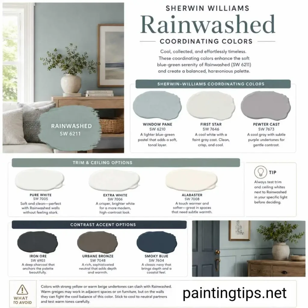
For trim and ceilings, Pure White (SW 7005) is our first recommendation alongside Rainwashed. It’s soft enough not to feel clinical against blue-green walls but clean enough to define the room’s edges crisply. When a sharper, more contemporary contrast is the goal, Extra White (SW 7006) does that job well. Alabaster (SW 7008) is the right call in spaces where a fractionally warmer trim suits the overall aesthetic — just sample it alongside the wall color first, since its creamy undertone can occasionally read slightly yellow against SW 6211.
For stronger contrast accents — a door, a built-in, a single piece of furniture — deep charcoals and rich browns work naturally with Rainwashed. Iron Ore (SW 6903) and Urbane Bronze (SW 7048) both anchor the lightness of the color without pulling the palette somewhere conflicting. Navy in the range of Smoky Blue (SW 7604) is another reliable option, particularly in coastal or transitional rooms where a deeper blue accent feels at home.
One thing we’d steer clear of: coordinating colors with strong yellow or warm beige undertones. Warm greiges can work in adjacent rooms or on furniture, but placed directly alongside Rainwashed on the walls they tend to clash rather than coordinate. This color wants partners that are cool to neutral — anything that runs warm needs to be tested carefully before committing.
Rainwashed Sherwin Williams Bedroom
The bedroom is where SW 6211 has built most of its reputation, and with good reason. The combination of its cool temperature, moderate LRV, and that subtle gray grounding makes it genuinely restful to live with. We’ve seen a lot of trendy bedroom colors that look impressive in photos and feel exhausting after six months. Rainwashed isn’t one of them.
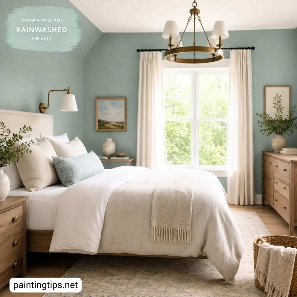
It works especially well in primary bedrooms with north or east-facing windows, where the cooler natural light plays to the color’s strengths. In those rooms, the blue undertones stay present throughout the day and the overall effect is consistently calm. In south-facing primary bedrooms with strong afternoon sun, the green becomes more dominant — which isn’t a problem, but it does shift the room’s character noticeably toward a more nature-inspired, slightly energized feel.
For pairing with bedroom furniture, natural wood in medium tones — walnut, white oak, teak — works well with rainwashed sherwin williams paint. Upholstered pieces in linen, warm gray, or soft cream keep the room feeling layered without pulling it in a different color direction. Brass hardware and light fixtures add warmth that balances the cool walls without fighting them.
“Before you pick up a brush, it’s also worth thinking about what type of paint for bedroom walls makes the most sense — finish choice has a real impact on how Rainwashed reads once it’s up and dry.”
The color also performs well in guest bedrooms and kids’ rooms. In those spaces, white furniture lets SW 6211 carry the color story on its own. In nurseries, it reads as gentle and airy rather than bold, which suits the room’s function perfectly.
For smaller bedrooms, we recommend painting all four walls and keeping the ceiling white. The LRV is high enough that all-over color doesn’t make the room feel smaller — it actually gives the space more definition than a safe neutral would. Rainwashed is a strong choice for smaller rooms, but it’s not the only one — if you want to see how it stacks up against other small bedroom paint colors before making a final call, we’ve put together a comparison worth looking at.
Sherwin Williams Rainwashed Bathroom
Rainwashed sherwin williams paint color might perform better in the bathroom than anywhere else in the house. The combination of cool blue-green tones, the gray undertone, and the overall lightness of the shade creates exactly the kind of atmosphere that makes a bathroom feel considered and restful rather than purely functional.
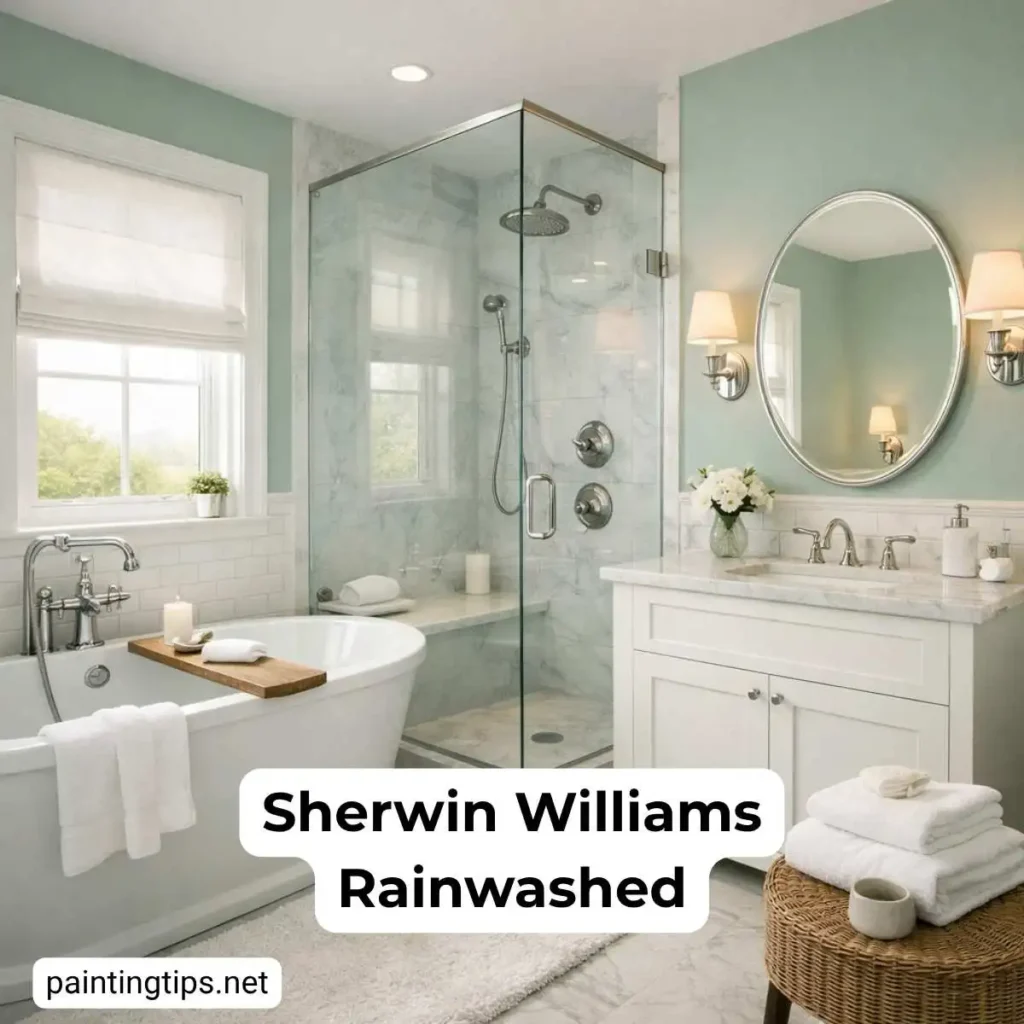
White porcelain fixtures, chrome or brushed nickel hardware, and subway tile or marble surfaces all coordinate naturally with SW 6211. The color doesn’t fight any of those materials — it frames them. In larger master bathrooms with soaking tubs and natural stone, the effect is genuinely spa-like without requiring expensive finishes to achieve it. The color is doing real work in those spaces.
In small powder rooms, the LRV of 59 keeps things from feeling closed in, and the personality of the color makes a strong impression in a compact space. One well-chosen mirror and good light fixtures, and a powder room painted in sw rainwashed paint becomes a room people notice and remember.
“Powder rooms are where Rainwashed really surprises people, but if you’re not fully sold on blue-green for a tight space, we’ve rounded up the best paint colors for a small bathroom across a much broader spectrum.”
The one variable worth managing in bathrooms is artificial light. Under cool white LED bulbs, the blue undertones in Rainwashed become more pronounced, which can make the room feel slightly clinical. Warm white bulbs in the 2700K to 3000K range bring out more of the green and gray, and the color settles into something much more inviting. If you’re planning a bathroom renovation and considering SW 6211, the lighting choice matters almost as much as the paint.
“Not every homeowner wants color on the bathroom walls — if you’d rather keep things neutral, a gray bathroom theme delivers the same restful quality with fewer decisions to make around tile and fixture pairings.”
Rainwashed Sherwin Williams Kitchen
Kitchens tend to be the room where homeowners hesitate most about using color, but rainwashed sw paint handles the space well. The key is understanding where in the kitchen it works best and where it needs support.
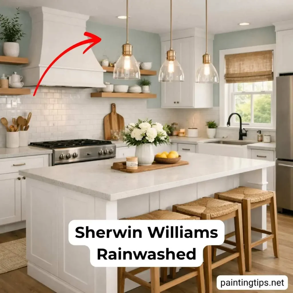
On kitchen walls, Rainwashed pairs most naturally with white or off-white cabinetry. White shaker cabinets against SW 6211 walls give the room a clean, slightly coastal feel that’s become genuinely popular in transitional homes over the past several years. The blue-green walls soften what would otherwise be a bright, high-contrast kitchen and give the space a sense of warmth that all-white kitchens often lack.
Light gray or white countertop materials — quartz, honed marble, or light concrete — work well with sw 6211 rainwashed because they share its cool-neutral character. Warm wood open shelving is a useful counterpoint; it prevents the kitchen from reading as too cold and grounds the space visually. Hardware in matte black or warm brass both coordinate without issue.
Where rainwashed sherwin williams doesn’t perform as well in kitchens is when it’s paired with warm wood cabinetry — honey oak, golden maple, or similar — where the cool blue-green of the walls and the warm orange-brown of the wood tend to work against each other rather than together. If your cabinets run warm, there are better color choices than SW 6211 for the walls.
“If Rainwashed doesn’t feel quite right for your kitchen’s existing finishes, our guide to finding a nice color for kitchen walls walks through a broader set of options across different cabinet and countertop combinations.”
The style fit for Rainwashed in kitchens is coastal, farmhouse, and transitional. In a strictly contemporary or industrial kitchen, the softness of the color can feel slightly out of place, though it’s never jarring.
Is Sherwin Williams Rainwashed Good for the Living Room?
Rainwashed works in living rooms, but it asks more of the space than it does in bedrooms and bathrooms. The bedroom and bathroom reward a single mood — rest, calm, retreat. Living rooms have to handle conversation, entertainment, daily traffic, and a wider range of furniture and textiles, which means the color has more to contend with.
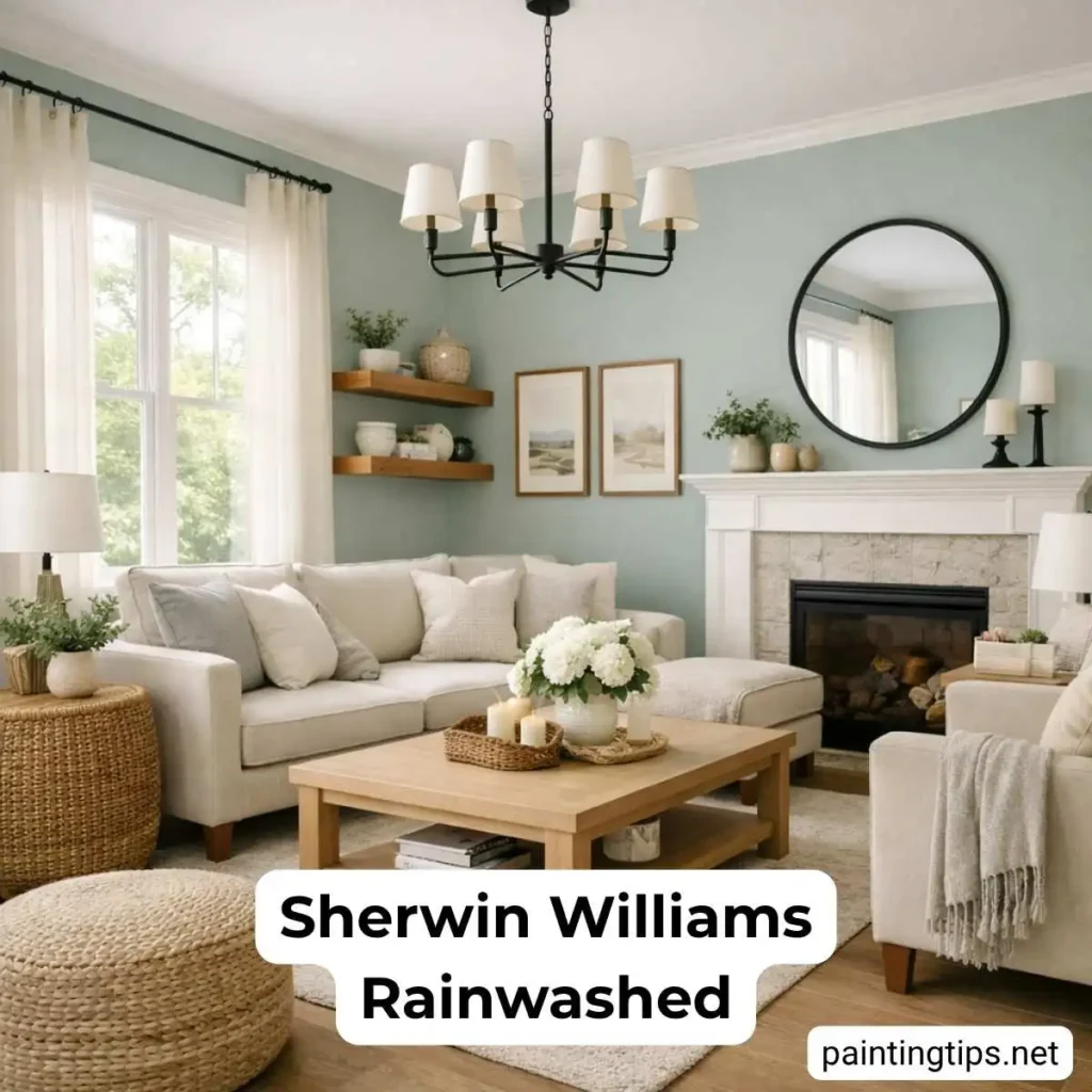
In living rooms with generous natural light and neutral furniture — soft grays, warm whites, natural linen — SW 6211 creates a room that feels fresh and composed without being overly decorated. It reads well in open-plan spaces where it has room to breathe alongside adjacent rooms painted in white or soft greige.
In darker living rooms or those with warm-toned wood floors and heavier furniture, the gray undertones in rainwashed sherwin williams can become dominant under artificial lighting, and the room can feel slightly flat in the evening. This is where sampling matters most. Paint a large board, live with it for a few days across different times of day, and look at it under your actual lighting conditions before deciding.
“While you’re making that call, it’s worth thinking through what type of paint for living room walls suits the space — sheen level affects both durability and how the color behaves under different lighting conditions.”
One caution we’d offer: using SW 6211 as a whole-house color throughout every main living space can feel limiting over time. The cool blue-green restricts future furniture and décor choices in ways that a more neutral wall color wouldn’t. We’d use it selectively — one or two rooms where it can do its best work — rather than as an all-encompassing palette throughout the home.
Is Sherwin Williams Rainwashed Blue or Green?
It’s both, with green as the dominant foundation and blue as a strong supporting note. Sherwin-Williams classifies SW 6211 under the green color family, and on the wall, green is typically what reads first. But the blue is pronounced enough that in certain lighting — particularly cooler, north-facing rooms or under cool artificial light — Rainwashed can look more blue than green. The gray undertone plays referee between the two, keeping the color balanced rather than letting either take over completely.
What Colors Go Well With Rainwashed?
Pure White (SW 7005) and Extra White (SW 7006) are the most reliable trim companions. For accent colors, deep charcoals like Iron Ore (SW 6903), rich browns like Urbane Bronze (SW 7048), and deep navies like Smoky Blue (SW 7604) all work well. For a lighter, tonal palette, Window Pane (SW 6210) and First Star (SW 7646) keep things cohesive. Natural wood tones, warm brass hardware, and linen textiles round out most palettes built around Rainwashed without effort.
Is Rainwashed a Warm or Cool Color?
Rainwashed is a cool color. The green, blue, and gray undertones all sit on the cool side of the spectrum, and the color reads that way on the wall. That said, it’s a softly cool color rather than an icy one — the gray prevents it from feeling clinical or stark. In warmer light conditions it shifts closer to neutral territory, but it never crosses into warm. If you’re looking for a cool-toned blue-green that doesn’t feel aggressive or overpowering, SW 6211 Rainwashed is one of the more dependable options on the Sherwin-Williams palette.