Picking between Accessible Beige and Agreeable Gray feels like choosing between two people who look like twins but have completely different personalities. On a sample chip, the difference is almost invisible. On your wall, under your light, next to your floors — it becomes obvious fast. Both are Sherwin-Williams greiges, both are perennial best-sellers, and both work beautifully in American homes. But they are not interchangeable, and choosing the wrong one can throw off an entire room. Here’s everything you need to know before you open a can.
Accessible Beige versus Agreeable Gray
Both colors are greiges — that gray-beige hybrid that took over American interiors and never really left. But they land on opposite sides of the spectrum: Accessible Beige is a beige that uses gray as a moderator, while Agreeable Gray is a gray that uses beige to stay warm and approachable. If your space calls for warmth and coziness, Accessible Beige is your color. If you want a flexible, slightly more modern neutral that works across a wider range of finishes and lighting conditions, Agreeable Gray is the answer. Everything else — undertones, LRV, room suitability — flows from that core difference.
If you’re drawn to the warm side of the spectrum, our guide to beige paint colors covers the full range of options worth considering. For the gray end, our roundup of light gray wall paint is a good place to start.
Undertones
Accessible Beige (SW 7036) sits firmly on the warm side of the greige spectrum. “We’ve covered SW 7036 Accessible Beige in full detail — undertones, best rooms, and everything in between — if you want to go deeper on this color alone.” Its base is sandy and earthy, moderated by a gray undertone that keeps it from drifting into dated yellow-beige territory.
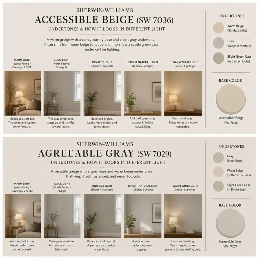
That gray is what makes it feel current. In warm light — west-facing windows, evening lamps, or 2700K bulbs — the beige quality comes forward and the color reads as a soft tan. In cooler or indirect light, the gray steps up and the whole thing shifts toward taupe. Under certain artificial lighting, a faint green cast can appear, which tends to surprise people who tested their sample only in daylight.
Agreeable Gray (SW 7029) works from the opposite direction. “For a full color review, our Sherwin-Williams Agreeable Gray guide covers everything from lighting behavior to coordinating colors.” Its base is gray, warmed by beige undertones that prevent it from ever feeling cold or institutional. It’s not a gray that announces itself — it’s the kind of gray that makes people say “is that even gray?” when they see it on the wall. Like Accessible Beige, it can show a subtle green undertone in bright natural light. Both colors share this quirk, and it’s worth knowing before you fall in love with either one under store lighting.
LRV
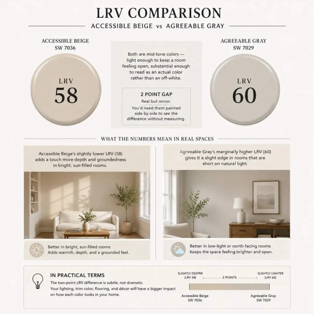
Accessible Beige has an LRV of 58. Agreeable Gray comes in at 60. Both are mid-tone colors — light enough to keep a room feeling open, substantial enough to read as an actual color rather than an off-white. The two-point gap is real but minor; you’d need them painted side by side to see the difference without measuring. In practical terms, Agreeable Gray’s marginally higher LRV gives it a slight edge in rooms that are short on natural light, while Accessible Beige’s slightly lower LRV adds a touch more depth and groundedness in bright, sun-filled rooms.
Flooring, Curtains, and Furniture
With Accessible Beige, warm wood floors are a natural fit — oak, walnut, hickory, and cherry all look cohesive alongside it. Curtains in ivory linen, warm white, or soft camel reinforce the palette’s earthy quality without competing with the walls. For furniture, warm walnut, natural rattan, and cream or off-white upholstery work well. Brass, bronze, and oil-rubbed bronze hardware pull the look together. What to avoid: cool gray or charcoal furniture pieces, which create a tonal conflict that makes the wall color look muddy rather than warm.
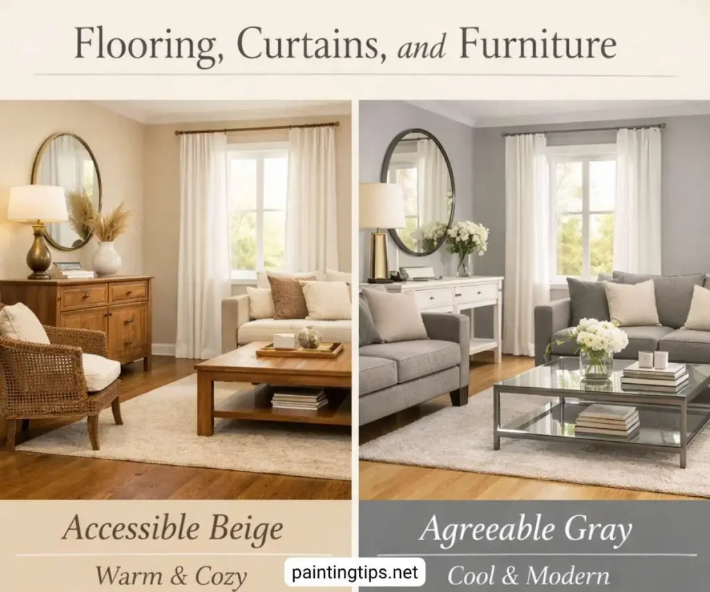
Agreeable Gray is more forgiving. Warm wood furniture still works here, but cool-toned pieces — painted furniture, metal accents, glass surfaces — are equally at home. Curtains can go either direction: crisp white linen for a clean, modern feel or soft gray and taupe tones for a more layered look. Chrome, brushed nickel, and mixed metals all coordinate without issue. If you’re still deciding on flooring or furniture for a gray-walled room, our guides on carpet for gray walls and what color of furniture goes with gray walls cover both in detail.
Trim Color Pairings
For Accessible Beige, SW Pure White (SW 7005) is the most reliable trim pairing. It’s bright enough to create clean contrast without going so stark that it makes the wall color look dingy. SW Alabaster (SW 7008) is a softer option for rooms where you want a more tonal, less contrasty look. Avoid cool-white trims like SW High Reflective White — the contrast with Accessible Beige’s warm base will look jarring rather than crisp.
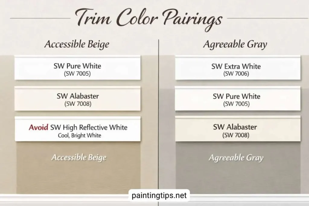
Agreeable Gray gives you more trim flexibility. SW Extra White (SW 7006) works well for a sharp, modern contrast. Pure White is again a solid middle-ground choice. For a warmer, more traditional pairing, Alabaster softens the overall look without making the trim disappear into the wall. “For a more detailed look at your options, we break down the best trim color for Agreeable Gray in a dedicated guide.”
Accent Color Pairings
Accessible Beige pairs naturally with deep navy, forest green, terracotta, and warm burgundy for accent walls or soft furnishings. These colors lean into its earthy warmth and create contrast without fighting the wall. For a more restrained look, dusty sage or muted olive work beautifully as secondary tones.
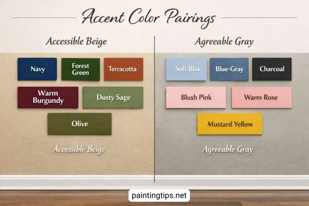
Agreeable Gray opens up to a wider accent palette. Soft blues and blue-grays complement its cooler undertones. Deep charcoal makes a strong statement without clashing. Blush and warm rose add a softer contrast. Even muted yellows and warm mustard can work here — something that would look unsteady against Accessible Beige.
Natural Light: North, South, East, West
North-facing rooms get indirect, cooler light all day — the hardest condition for both colors. Accessible Beige holds up reasonably well here because its warm base pushes back against the cool light; it may shift toward taupe but rarely looks wrong. Agreeable Gray can drift toward a cooler, slightly greenish read without direct sun to activate its warmth. Between the two, Accessible Beige is the more forgiving choice in north-facing rooms. “If your home has several north-facing rooms, it’s worth reading our full breakdown of paint colors for north facing rooms before you commit to either color.”
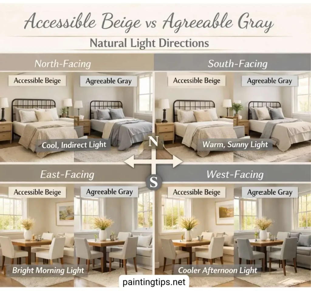
South-facing rooms are where both colors perform at their best. Consistent warm light keeps Accessible Beige rich and settled. Agreeable Gray stays bright and balanced, showing its best version. Your decision in a south-facing room comes down entirely to finishes and personal preference — the light will do right by either color.
East-facing rooms get warm morning light and cooler afternoons. Accessible Beige feels warm and inviting early in the day, then settles into a softer taupe as the light shifts — a pleasant transition for bedrooms and breakfast nooks. Agreeable Gray follows a similar pattern but stays more neutral throughout the day with less dramatic movement.
West-facing rooms have the reverse: cooler mornings, then warm golden afternoon light. Both colors look their best here in the late afternoon. Accessible Beige takes on a particularly rich, classic beige quality in that evening light. Agreeable Gray warms up more than people expect and can read almost caramel-toned in late afternoon, which works well for living and dining rooms where evening ambiance carries weight.
Accessible Beige vs Agreeable Gray Living Room
The living room is where the character difference between these two colors becomes most apparent. Accessible Beige creates a room that feels anchored and warm — it deepens the richness of wood furniture, complements leather upholstery, and gives layered rugs in amber, rust, and warm brown tones a cohesive backdrop. It works best in enclosed, defined living rooms where the light is consistent throughout the day. In open floor plans that transition through a kitchen or dining area, it can read differently from one zone to the next — warmer in one spot, more taupe in another — which breaks the visual flow.
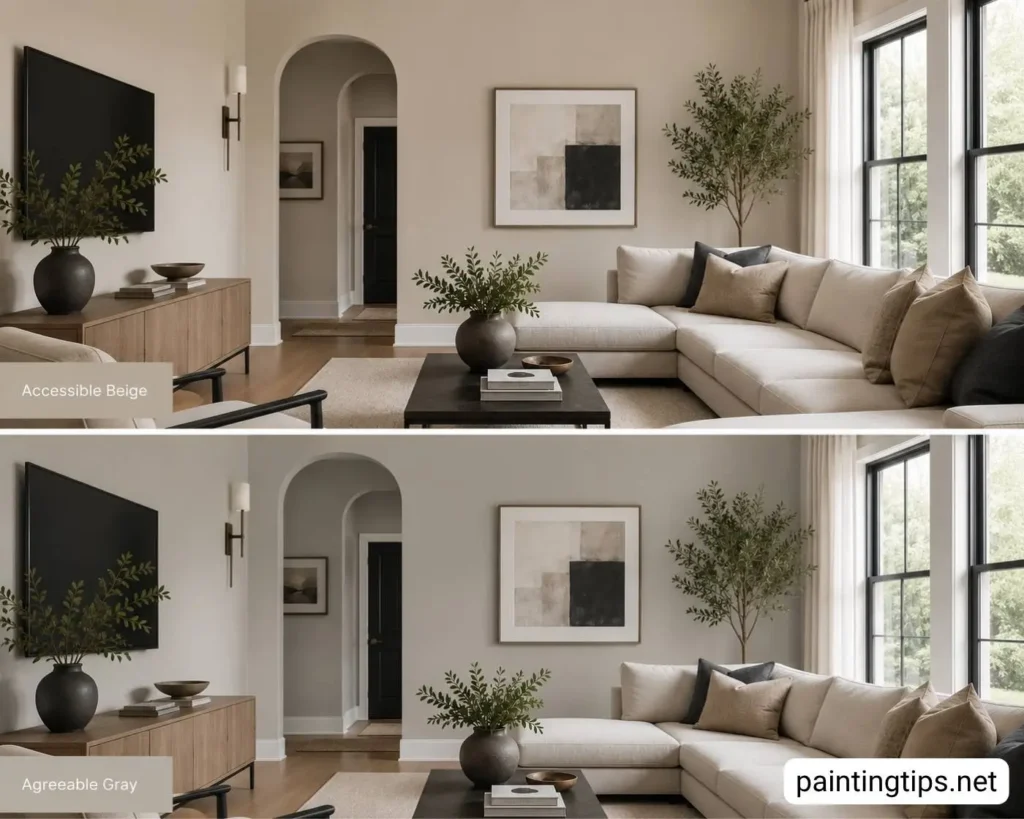
Agreeable Gray handles open-concept layouts far more gracefully. Its balanced character stays consistent across multiple light zones, making it the smarter choice when your living room doesn’t have clear walls separating it from adjacent spaces. It also manages mixed warm-and-cool finishes better than Accessible Beige — if your living room has warm wood floors alongside a cool gray sectional or modern metal light fixture, Agreeable Gray keeps everything looking intentional rather than conflicted.
Accessible Beige vs Agreeable Gray Bedroom
Accessible Beige has earned its strongest following in bedrooms, and it’s not hard to see why. Its earthy warmth creates a wrapped, cocooning quality that cooler colors simply can’t replicate. Pair it with warm white or cream bedding, soft linen drapes, and a wood bed frame with natural grain detail, and the room comes together without effort. It’s particularly well suited to bedrooms with warm wood furniture — honey oak nightstands, a walnut dresser, cherry hardwood floors — where it reinforces the palette rather than competing with it.
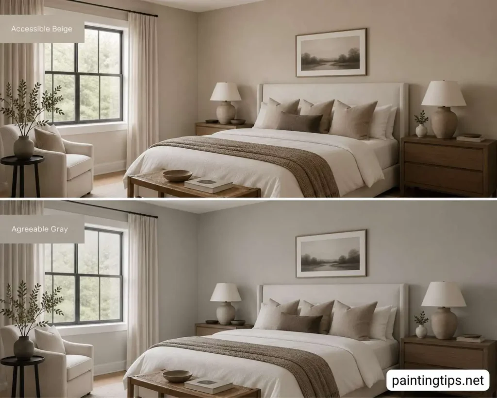
Agreeable Gray bedrooms have a cleaner, more airy quality. It works with virtually any bedding color, from crisp white to deep navy, and makes artwork on the walls stand out more clearly. Cool-toned furniture and hardware — painted pieces, chrome or brushed nickel fixtures — feel natural alongside it in a way they wouldn’t against Accessible Beige. For bedrooms with a streamlined, modern aesthetic, rooms that face north and need every point of their LRV, or spaces where the furniture mixes warm and cool finishes, Agreeable Gray is the stronger choice.
Accessible Beige vs Agreeable Gray Bathroom
Bathrooms put undertones under a microscope. Artificial lighting, cool tile surfaces, white grout, and chrome fixtures create an environment where any yellow or green lurking in a paint color will make itself known — and neither of these colors is entirely free of that risk.
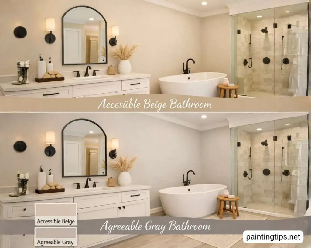
Agreeable Gray performs more reliably in most bathrooms. Its gray-forward base doesn’t compete with cool tile and chrome hardware; it settles into the neutral palette of the space and keeps everything cohesive. In small bathrooms where the wall color is right in your face at all times, that compatibility matters more than it does in a large room where you have visual breathing room.
Accessible Beige works well in bathrooms, but only when the surrounding finishes give it something warm to work with. Travertine tile, cream ceramic, a wood vanity, and matte black or oil-rubbed bronze hardware — in that context, it’s genuinely excellent. Strip those warm elements out and replace them with cool gray tile and chrome fixtures, and the same color can turn muddy fast. For small bathrooms with limited natural light, Agreeable Gray is the safer call. For larger bathrooms built around warm materials and good window light, Accessible Beige can be the more characterful option of the two.
Which Is Better for Resale Value?
If you’re painting before listing your home, Agreeable Gray is the stronger choice. It reads as current, neutral, and broadly appealing to buyers across different style preferences. Its gray-forward quality photographs well — important in an era where most buyers first encounter a home through listing photos online. Accessible Beige can feel slightly more traditional to buyers who prefer a contemporary look, though it still performs well in markets where warm, classic interiors are the norm. Agreeable Gray is the safer bet if you don’t know your buyer.