Choosing the right neutral paint color can be challenging, especially when you want something warm but not overly beige or yellow. Sherwin Williams Natural Linen has become a popular choice because of its soft, balanced warmth and timeless appeal. This natural linen sherwin williams paint color works beautifully in living rooms, bedrooms, kitchens, bathrooms, entryways, and cabinets. Known as SW 9109, it creates a comfortable and versatile foundation for many interior styles. In this guide, you’ll see how it looks in real homes, along with photos showing how it behaves in different lighting and spaces.
Sherwin Williams Natural Linen SW 9109 Overview
Developed by Sherwin-Williams, Natural Linen is a popular Sherwin Williams paint color (SW 9109) known for its balanced blend of beige and greige. It doesn’t feel overly creamy, but it also avoids the coldness of gray. This balance is exactly why natural linen sherwin williams paint is among the most searched and admired neutral paint colors in the United States. It is frequently featured in expert recommendations of popular beige wall paint colors for its versatility.
One of the biggest reasons homeowners choose sherwin williams natural linen paint is its ability to work with a wide range of materials and finishes. It looks especially beautiful with wood furniture, whether light oak, medium walnut, or darker espresso tones. It also pairs naturally with white trim, linen curtains, and both light and dark flooring. The color creates a soft contrast without making the space feel busy. Because the undertones are so balanced, Natural Linen SW feels calm, warm, and timeless rather than trendy or temporary.
Another advantage is how well it adapts to lighting. In bright natural light, it appears lighter and softer. In rooms with less light, it deepens slightly and creates a cozy atmosphere. This flexibility makes it a reliable whole-home paint color. It is also often compared to Accessible Beige SW 7036, which has a slightly deeper and more traditional beige appearance.
Is Sherwin Williams Natural Linen Warm or Cool?
Natural Linen falls on the warm side, but it doesn’t feel heavy or overly beige. Instead, it has a soft, balanced warmth that makes a room feel more inviting while still looking clean and neutral. For comparison, many homeowners also consider Agreeable Gray, which has a slightly cooler greige balance.
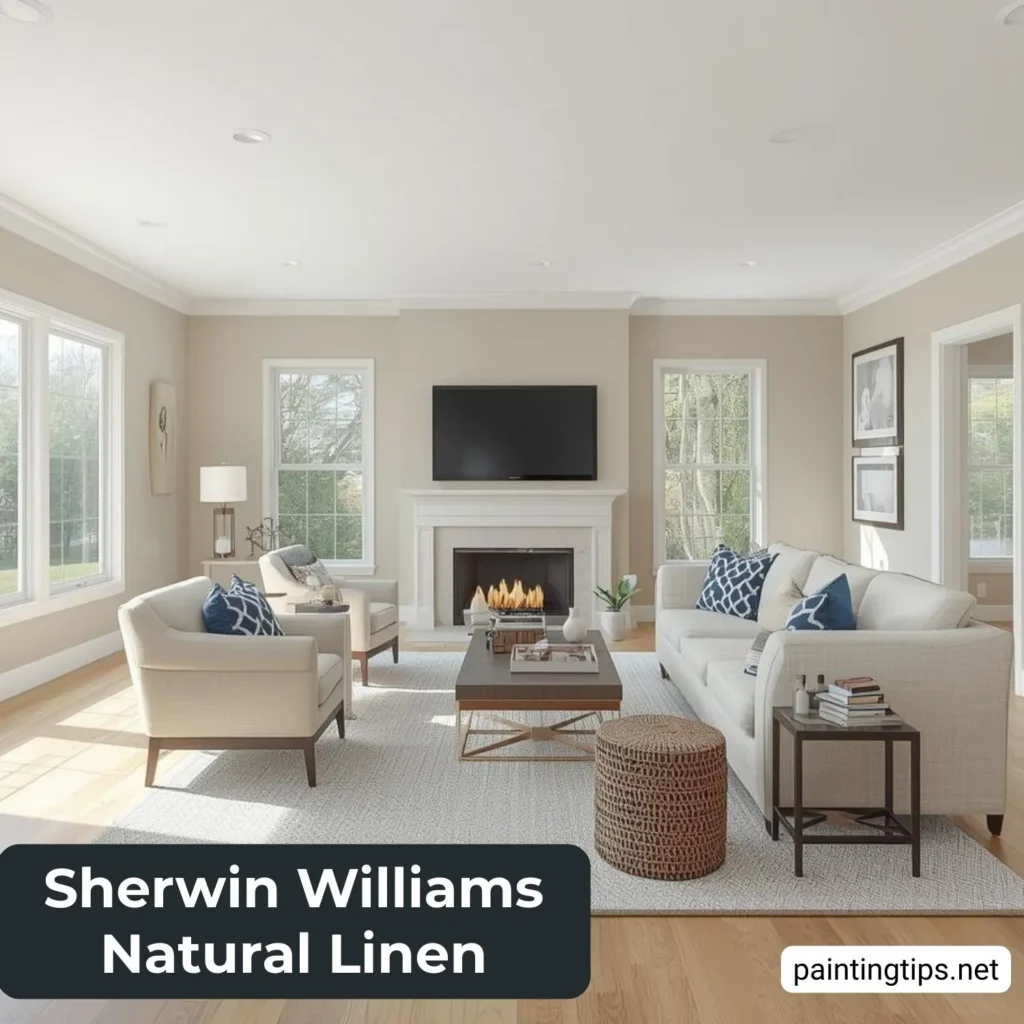
Sherwin Williams Natural Linen Living Room
In living rooms, Sherwin Williams Natural Linen paint color creates a welcoming and comfortable foundation. It has enough warmth to make the space feel inviting, but it still looks clean and modern. This is especially important in living rooms where you spend a lot of time relaxing or entertaining guests.
Natural Linen works beautifully behind both light and dark furniture. Light sofas stand out softly against it, creating a clean and airy feel, while darker furniture adds depth and a more grounded, cozy atmosphere. Wood tones, especially oak, walnut, and espresso, appear warmer and more refined against this color. This versatility is one of the key reasons Sherwin Williams Natural Linen is such a popular choice for modern and transitional living rooms—it creates a space that feels calm, elegant, and effortlessly inviting.
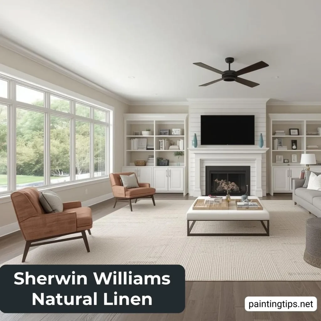
Another reason this color works so well in living rooms is its softness. It reflects light in a gentle way, avoiding the harsh brightness that pure white walls sometimes create. This is one reason it is often chosen instead of cooler neutrals like Agreeable Gray. The result is a room that feels balanced, warm, and visually comfortable throughout the day.
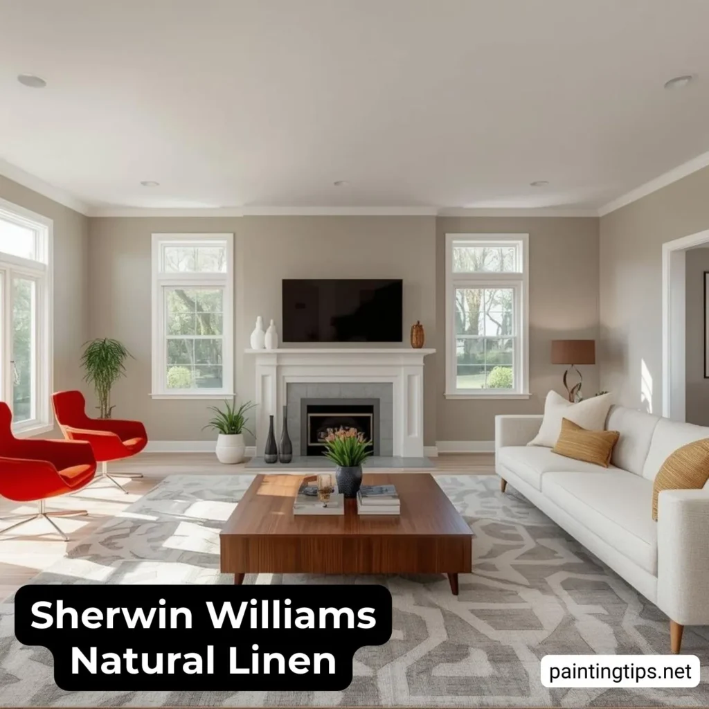
Interior Room With Sherwin Williams Natural Linen Paint Color
One of the strengths of natural linen sherwin williams paint is its versatility across different interior rooms. It works equally well in dining rooms, hallways, and home offices because it provides warmth without dominating the space.
In dining rooms, it creates a refined and welcoming environment. It allows furniture, lighting, and décor to stand out while still giving the room character. In home offices, it feels calm and neutral, which helps create a comfortable environment for focus and productivity.
Because sherwin williams natural linen is neither too light nor too dark, it also helps walls appear smoother and more finished. This makes the entire home feel more cohesive when the color is used throughout multiple rooms.
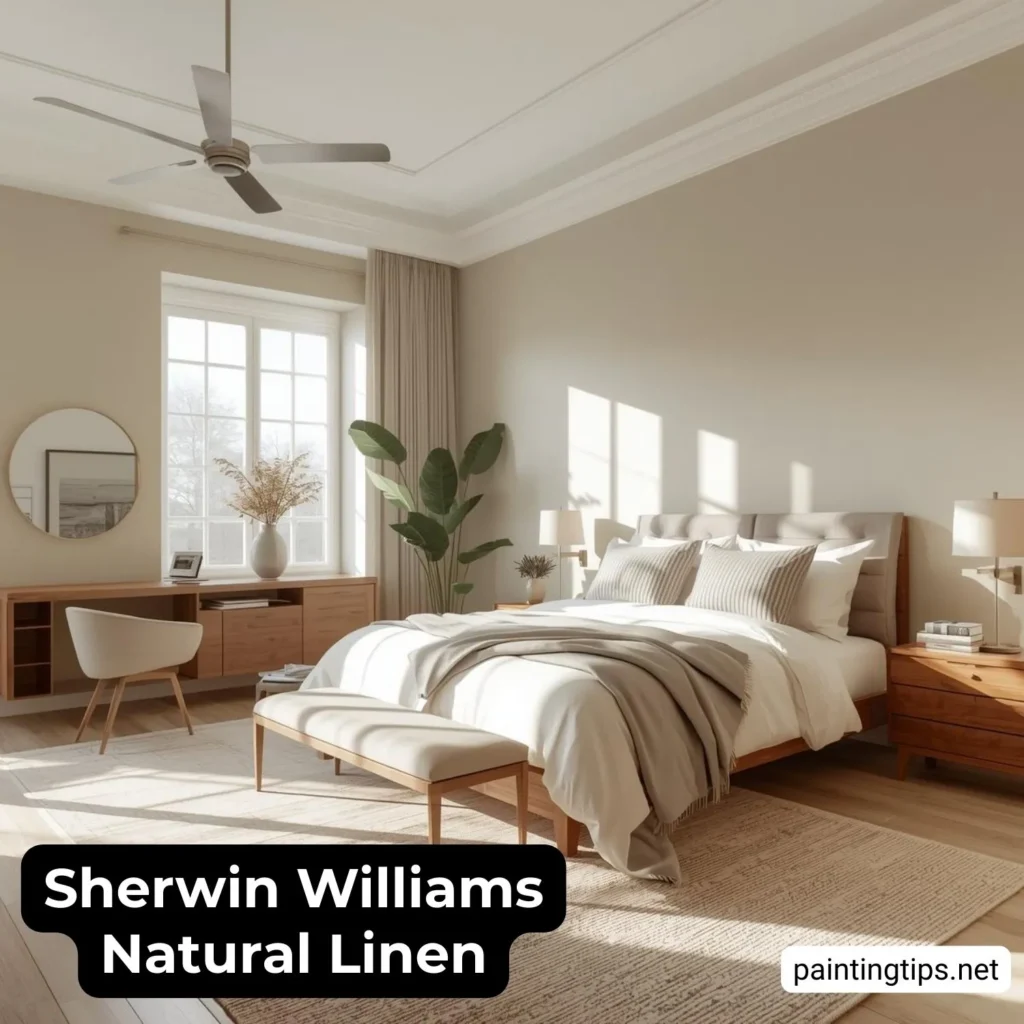
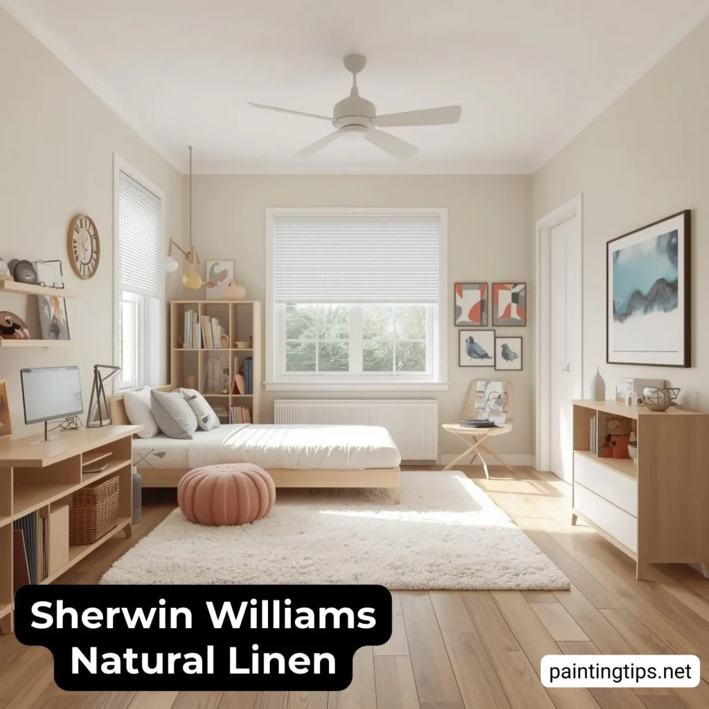
Sherwin Williams Natural Linen Bedroom
Sherwin Williams Natural Linen bedroom walls create a peaceful and relaxing environment that feels warm without being heavy. This color is especially effective in bedrooms because it promotes a sense of comfort and rest.
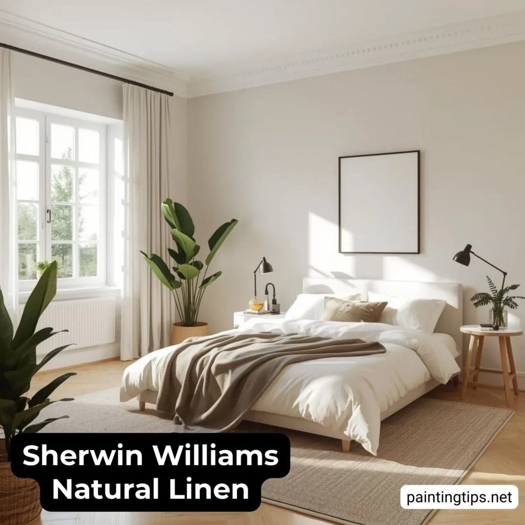
Natural Linen works beautifully with white bedding, soft beige fabrics, and natural wood furniture. The color adds just enough depth to prevent the room from feeling plain, while still maintaining a clean and airy appearance. In rooms with natural sunlight, the color feels soft and calming. In lower light, it becomes slightly richer and more intimate, which is ideal for a bedroom setting.
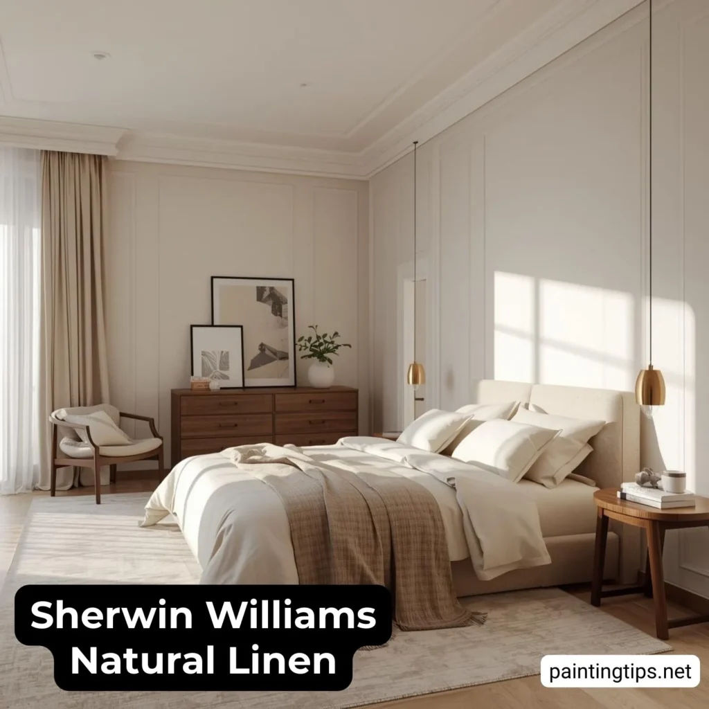
This is one of the reasons why natural linen paint sherwin williams is often chosen for master bedrooms—it feels timeless and comfortable rather than trendy.
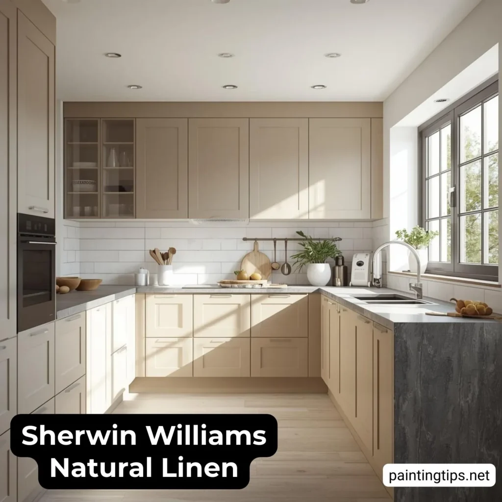
Sherwin Williams Natural Linen Kitchen
Sherwin Williams Natural Linen is a popular choice for kitchen walls Because it works especially well with white cabinets, wood cabinets, and stone countertops.
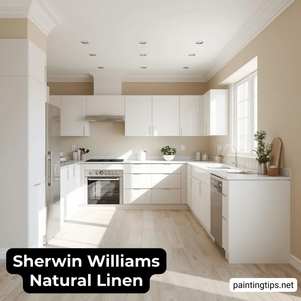
The warmth of the color balances the harder surfaces commonly found in kitchens, such as tile, quartz, and metal. This makes the space feel more comfortable and less sterile. It also allows both modern and traditional kitchen designs to feel cohesive.
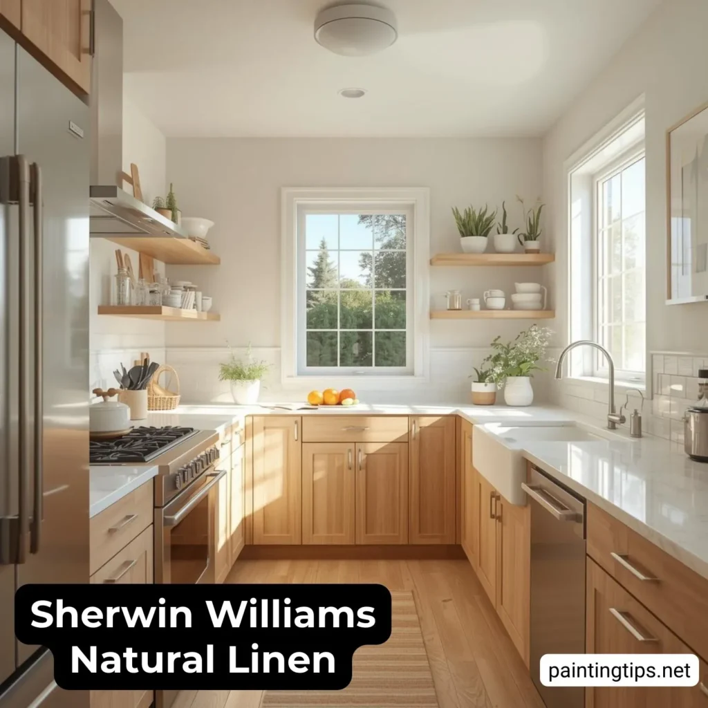
Because kitchens often have a mix of natural and artificial light, natural linen sw 9109 performs well by maintaining its balanced appearance throughout the day.
Sherwin Williams Natural Linen Kids Room
In children’s rooms, Natural Linen provides a neutral background that can easily adapt as the child grows. Instead of committing to bold colors that may feel outdated later, this neutral allows flexibility with décor, bedding, and wall art. It keeps the room feeling calm while still allowing personality to come through in other design elements.
Sherwin Williams Natural Linen Bathroom
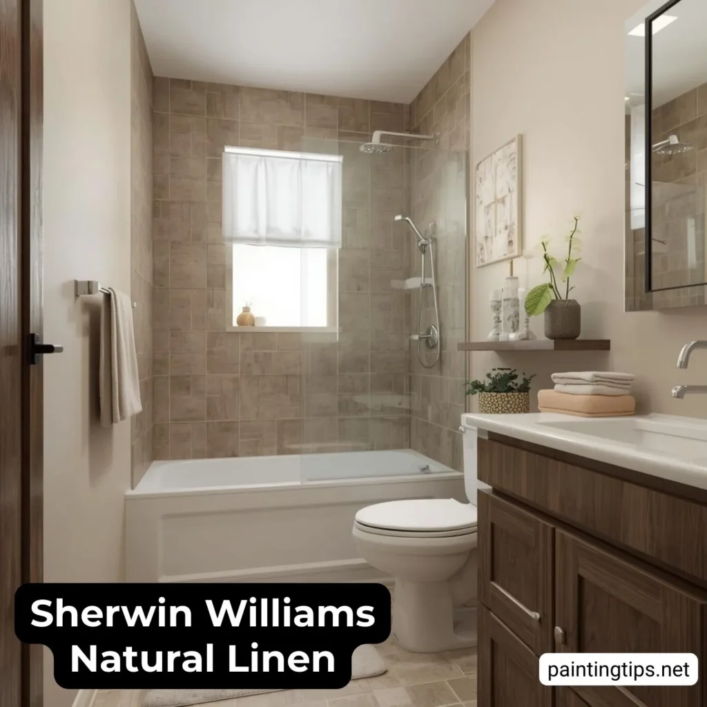
Bathrooms painted in Sherwin Williams Natural Linen feel warm, clean, and relaxing. The color works especially well with white tile, marble, and warm metal finishes. It creates a spa-like feeling without looking cold or clinical. This makes it a popular choice for both small and large bathrooms.
Sherwin Williams Natural Linen Entryway
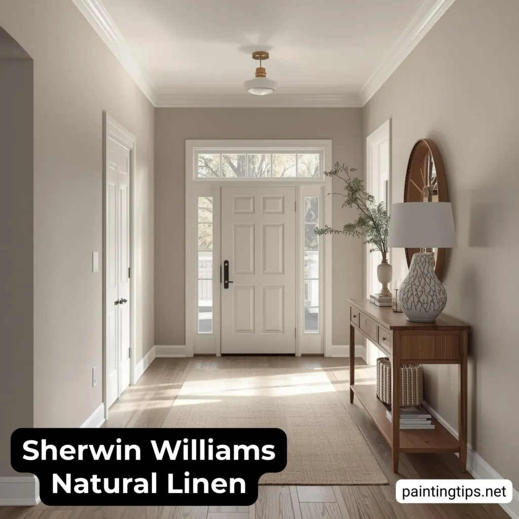
Entryways painted in Natural Linen feel welcoming from the moment you enter the home. Because it sits between beige and greige, it connects easily with other colors used throughout the house. It also looks elegant under both natural and artificial lighting, making the home feel more cohesive overall.
Sherwin Williams Natural Linen Undertones
The Natural Linen Sherwin Williams undertones are warm and balanced, with subtle beige and taupe influences. It contains beige and taupe influences, along with a very subtle muted warmth that keeps it from feeling gray or cold. It does not typically show strong pink or green undertones, which makes it easier to use throughout the home. Natural Linen Sherwin Williams undertones may appear slightly warmer in artificial lighting and softer in natural daylight.
Sherwin Williams Natural Linen LRV
Natural Linen has an LRV (Light Reflectance Value) of 66, which means it reflects a moderate amount of light. This places it in the light-to-medium range, making it bright enough to keep rooms feeling open while still providing warmth and depth. It doesn’t feel stark like white, but it also doesn’t make a room feel dark.
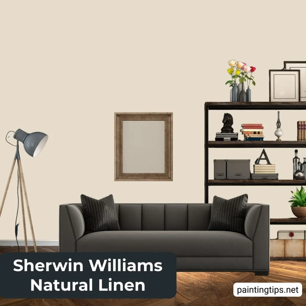
Sherwin Williams Natural Linen Coordinating Colors
Sherwin Williams Natural Linen coordinating colors include warm whites, greiges, and deeper accent tones. It works especially well with popular trim colors and darker accent walls because it provides enough contrast without clashing. This flexibility makes it ideal for whole-home use. It also pairs beautifully with off-white paint colors commonly used for trim, ceilings, and interior doors.
Sherwin Williams Natural Linen Complementary Colors
Complementary colors help add depth and contrast to Natural Linen interiors. Darker shades such as charcoal, navy, or bronze create a sophisticated look, while softer neutrals maintain a calm and cohesive palette. These combinations help bring out the richness of Natural Linen without overpowering it.
Sherwin Williams Natural Linen Cabinets
Sherwin Williams Natural Linen cabinets offer a warm and timeless alternative to white. They keep the kitchen or bathroom feeling bright while adding more warmth and character. This color works especially well in homes where the goal is to create a warm, custom, and timeless look rather than a stark modern contrast.
Frequently Asked Questions
What Colors Coordinate With Natural Linen?
Natural Linen coordinates best with warm whites, soft greige tones, and deeper accent colors. It works especially well with popular trim colors like Alabaster or Pure White, as well as darker shades used for contrast. Natural wood finishes also pair beautifully with this color.
Is Natural Linen Grey?
No, Natural Linen is not a true gray. It is a warm neutral that blends beige and greige characteristics. While it has a slightly muted softness similar to greige, it reads primarily as a warm neutral rather than a cool gray.
Is Natural Linen Cool Or Warm?
Natural Linen is a warm paint color. Its beige and taupe undertones give it a cozy, inviting feel that makes rooms feel more comfortable and welcoming rather than crisp or cool.
Does Natural Linen Pull Pink?
Natural Linen typically does not pull pink. In most lighting conditions, it appears as a balanced warm neutral. Only in rare situations, such as certain artificial lighting, might it show a very subtle rosy softness, but this is not a dominant characteristic.
Does Natural Linen Paint Look Yellow?
Natural Linen can appear slightly creamy in warm lighting, but it does not look strongly yellow. Compared to traditional beige paints, it feels more modern and balanced, without the heavy yellow cast that some warm neutrals have.