Benjamin Moore Van Deusen Coordinating Colors, Blue Bedroom and Accent Wall
A single blue can change how an entire house feels, and Benjamin Moore Van Deusen Blue is one of the shades we return to again and again when a client wants depth without gloom. Below, we break down its undertones and where it works best, the coordinating colors that pair with it most naturally, how it performs in a bedroom, why it has become a favorite for cabinets, and how to use it as an accent wall without overwhelming a room.
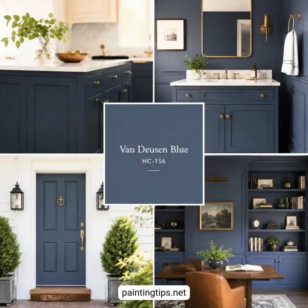
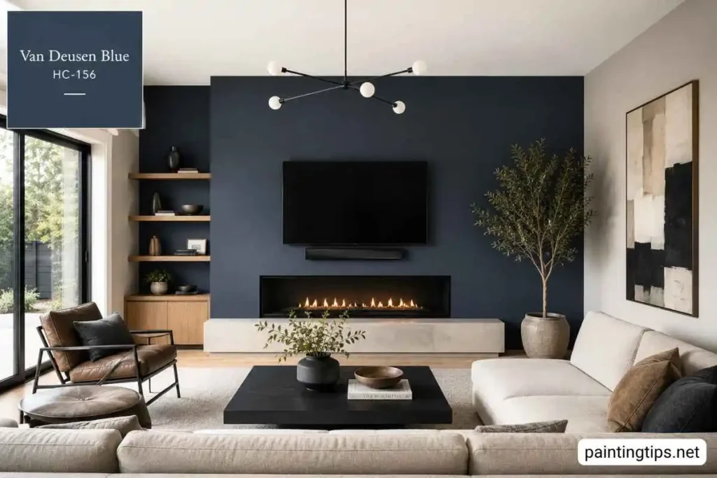
Benjamin Moore Van Deusen Blue HC-156
Van Deusen Blue HC-156 belongs to Benjamin Moore’s Historical Collection, and it carries that pedigree well. In our projects, we see it used most often on kitchen islands, bathroom vanities, front doors, and accent walls, though it also holds up beautifully on full rooms like studies, powder rooms, and primary bedrooms. Homeowners tend to reach for it when they want a navy that feels architectural rather than heavy, something closer to a tailored slate-blue than a flat, dark shadow on the wall.
Part of what makes this color so popular is its light reflectance value of roughly 12, which places it firmly in the deep end of the blue family without tipping into near-black territory the way Hale Navy does. That lower LRV means it absorbs light rather than bouncing it back, so it reads as cozy and grounding in a den or bedroom, yet it never feels claustrophobic the way some true navies can in a small space.
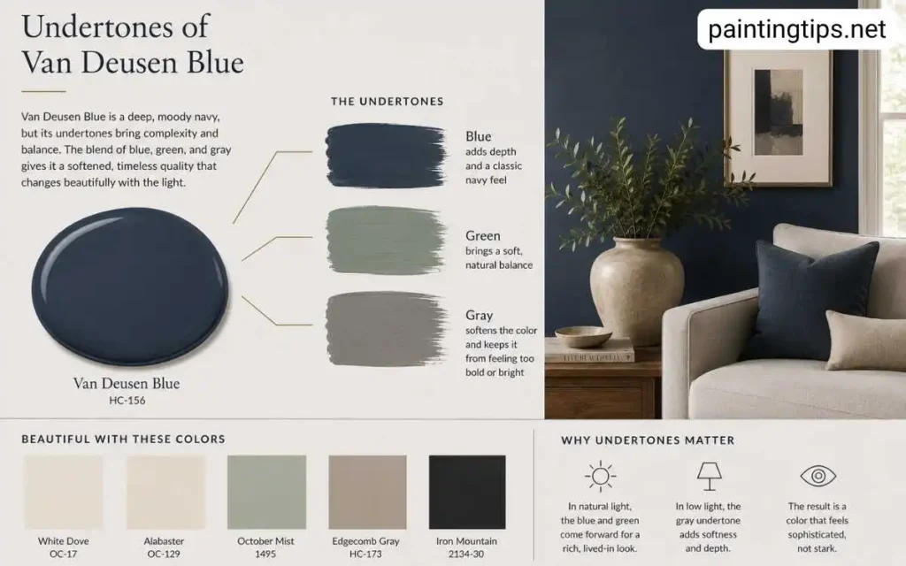
The undertones are where Van Deusen Blue really earns its reputation. It leans on a soft gray base with a faint whisper of green running underneath, and that combination is what keeps it from sliding into purple or looking overly cool under warm lighting. We have watched this color shift subtly throughout the day, reading almost charcoal in low evening light and settling into a rich, confident blue-gray once the sun hits it directly.
That flexibility is a big reason designers keep it on their shortlist year after year: it works with both traditional millwork and clean modern lines without fighting either style.
One detail we rarely see mentioned elsewhere: because Van Deusen Blue is such a deep, saturated color, it typically needs a gray-tinted primer rather than a standard white one, or you end up fighting flashing and uneven coverage through two or three extra coats. We also steer clients away from testing this color with a small paint chip taped to the wall.
A deep blue like this reads completely differently in a two-inch swatch than it does across a full wall, so we always recommend painting a large sample board, at least two feet square, and moving it around the room at different times of day before committing.
Benjamin Moore Van Deusen Blue Coordinating Colors
Benjamin Moore’s own pairing guide points to a handful of colors that were built to sit alongside Van Deusen Blue, including Castleton Mist, Alpine White, Thunder, and Cotton Balls. We like this official grouping because it keeps the palette calm and lets the blue do the heavy lifting rather than competing for attention.
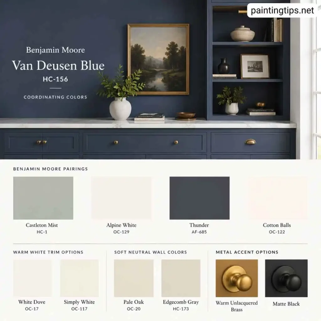
Beyond the manufacturer’s picks, we have had strong results layering in warmer whites and soft neutrals. White Dove and Simply White both make excellent trim partners, since their slight warmth keeps the crispness of the blue from feeling cold. For walls near a Van Deusen Blue accent, Pale Oak and Edgecomb Gray add a quiet, sandy neutral that lets the blue stay the focal point. If a client wants more contrast, we sometimes bring in a warm, unlacquered brass or a matte black fixture finish, since both metals read beautifully against this particular shade of blue.
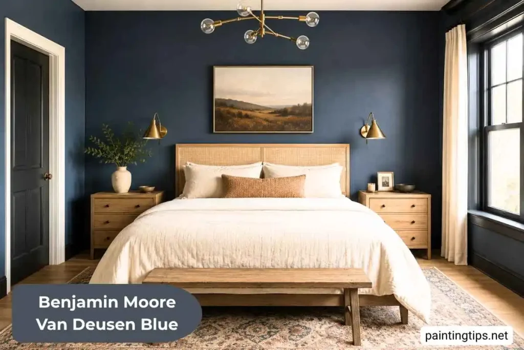
Benjamin Moore Van Deusen Blue Bedroom
A bedroom is one of the settings where Van Deusen Blue truly shines. Because the color absorbs light rather than reflecting it, it naturally calms a room down in the evening, which is exactly what most people want from a space built for winding down, and it lines up closely with what we recommend in our guide to calming paint colors for a bedroom. We typically recommend it on all four walls only when the room gets decent natural light during the day, since a north-facing bedroom with limited sun can start to feel a bit cave-like if the color is applied everywhere.
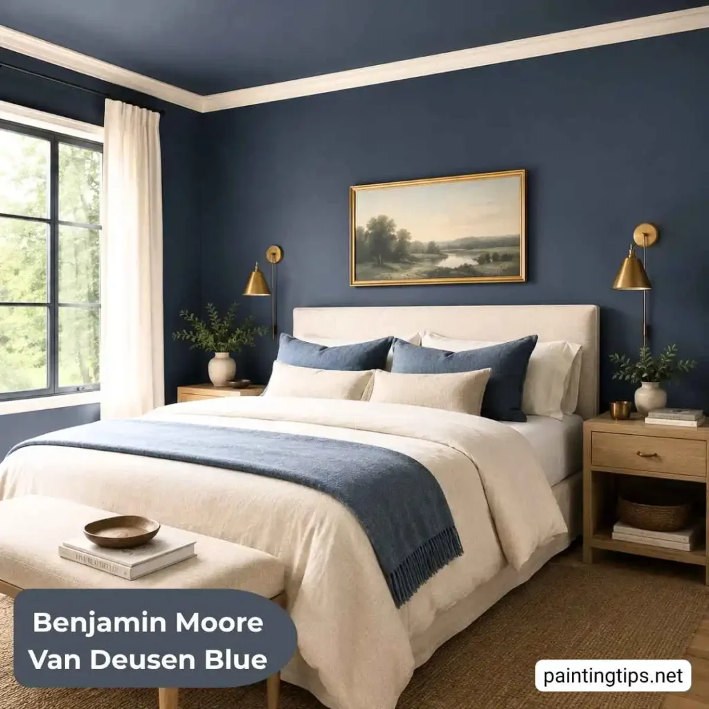
For bedrooms with less natural light, we often suggest keeping Van Deusen Blue to a headboard wall or ceiling and pairing it with a soft white or warm greige on the remaining walls. This approach still delivers that enveloping, hotel-suite feeling without sacrificing brightness. Using it strictly as an accent behind the bed is one of our favorite low-commitment ways to bring in this color, and it pairs especially well with white, off-white, or a pale, muted blue on the remaining three walls, since the lighter surrounding tones keep the accent wall from overwhelming the room. Layering in linen bedding, brushed brass sconces, and a light wood nightstand tends to balance the depth of the paint and keep the room from feeling too formal, and choosing the right sheen matters just as much as the color itself, which is something we cover in more detail in our breakdown of the best type of paint for bedroom walls.
Benjamin Moore Van Deusen Blue Cabinets
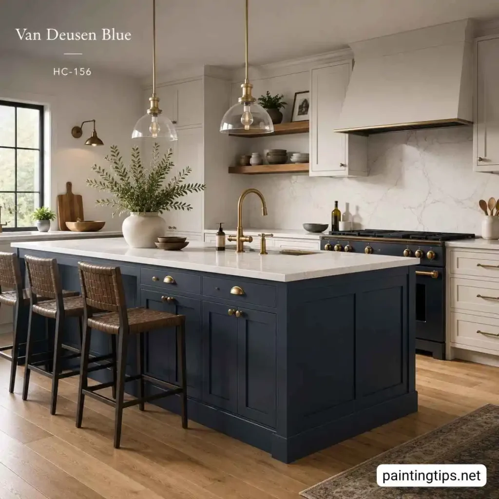
Cabinetry is arguably where Benjamin Moore Van Deusen Blue has built its biggest following, particularly on kitchen islands and bathroom vanities. The color reads as a deep, sophisticated navy on cabinet doors, and because of its gray-green undertone, it never looks flat or plastic once it is on.
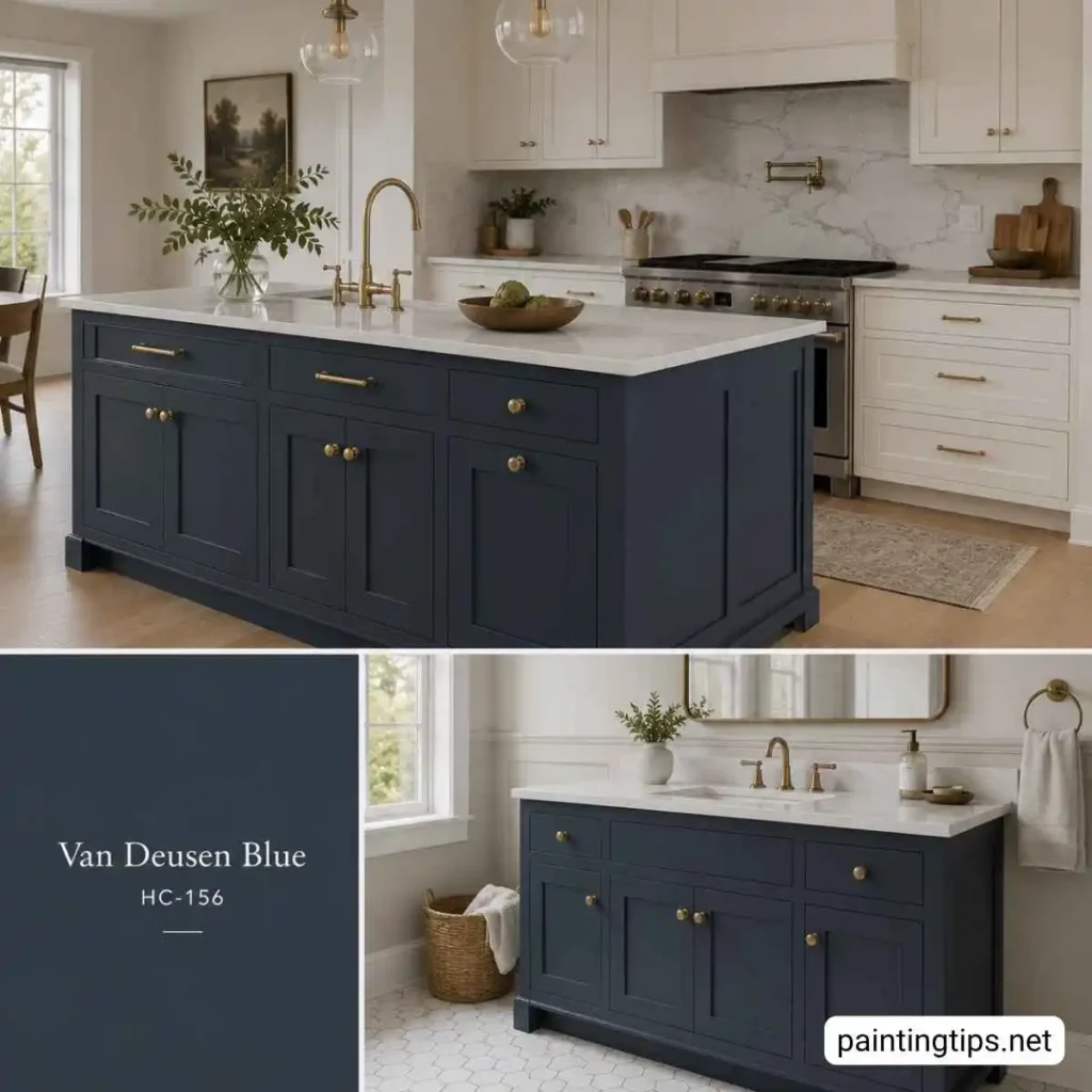
We typically recommend a satin or semi-gloss finish on cabinets, since it holds up to daily wiping and gives the color just enough sheen to catch the light without looking glossy. We have painted more than a few kitchen islands in this shade while leaving the perimeter cabinets in a warm white, and the contrast almost always becomes the room’s focal point. Van Deusen Blue is not limited to cabinetry, either. We have used it just as effectively on kitchen walls, particularly in kitchens with white or light wood cabinetry, where it works as a rich backdrop rather than the doorfront color, so it is worth considering both applications before deciding where the color should live in the room.
On bathroom vanities, the same principle applies on a smaller scale. Van Deusen Blue against a white quartz or marble countertop creates a classic, timeless look that photographs well and tends to age gracefully, unlike some trendier paint colors that feel dated within a few years. Brass or matte black hardware are our two go-to choices for finishing the look, since both metals pick up on the color’s cooler gray undertones without clashing.
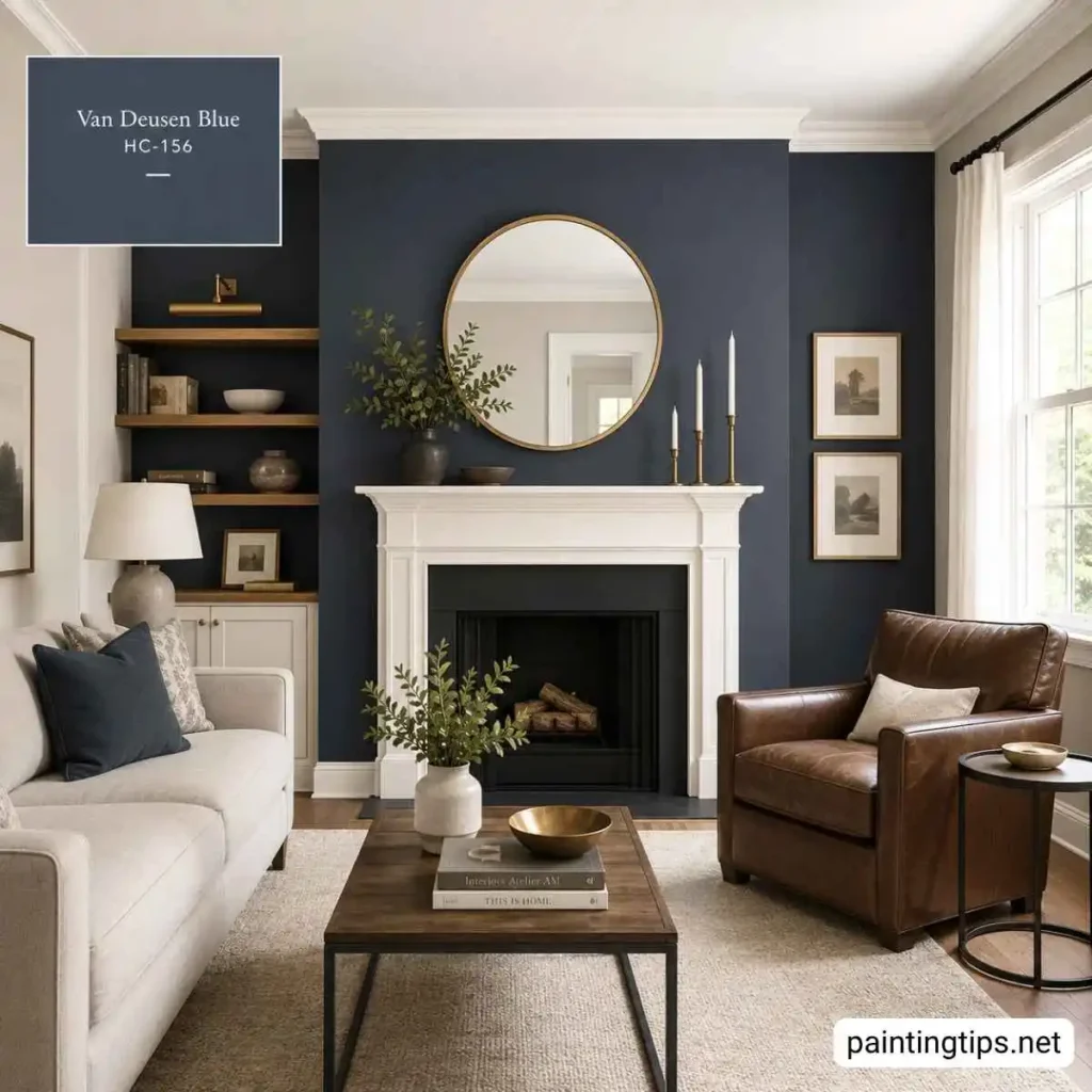
Van Deusen Blue Accent Wall
An accent wall is often the easiest way to test Van Deusen Blue before committing to a full room, and it remains one of the most requested applications we see. A fireplace wall or the headboard wall in a bedroom are both strong candidates, since the color naturally draws the eye and adds architectural weight to a feature that might otherwise blend into the background. If the room itself is tight on square footage, the approach shifts slightly, and we walk through those adjustments in our guide to a small bedroom accent wall.
Behind a television is another spot where this color performs particularly well, since the dark background helps the screen blend into the wall rather than sit on top of it like a bright rectangle, an approach we cover in more depth in our guide to the best color for wall behind tv. For the walls surrounding a TV accent wall, we like sticking with soft neutrals, light grays, or warm whites, so the dark wall keeps its visual weight instead of competing with equally bold colors nearby.
For a more traditional or Victorian-style home, we like combining a Van Deusen Blue accent wall with crisp white trim and a round brass or gilt mirror, which sharpens the trim details and gives the whole wall a finished, intentional look.
In more modern or industrial spaces, a paneled or geometric accent wall in this blue pairs well with black leather furniture and warm wood accents, though we always recommend keeping the surrounding walls lighter so the room does not start to feel closed in. Either direction you choose, Van Deusen Blue rewards a little restraint elsewhere in the room, letting the wall itself carry the character.
Benjamin Moore Van Deusen Blue works because it never asks a room to choose between formal and comfortable. It holds its own on a full accent wall, settles quietly into a set of cabinets, and still reads as calm and grounded in a bedroom meant for rest. Whether you are testing it on a single wall first or committing to it on cabinetry, pairing it with one of its coordinating whites or neutrals is the simplest way to make sure it looks as good in your home as it does in the photos.