If you’ve been scrolling through paint samples trying to find that perfect understated gray — the kind that doesn’t scream for attention but quietly transforms a room — Valspar Filtered Shade deserves a serious look. In this review, we cover everything from the paint card and undertones to coordinating colors, and walk you through how it looks in real spaces like living rooms, kitchens, bedrooms, and entryways. Plenty of photos throughout, so you can see exactly what you’re getting before you commit to a gallon.
What Color Is Filtered Shade Valspar?
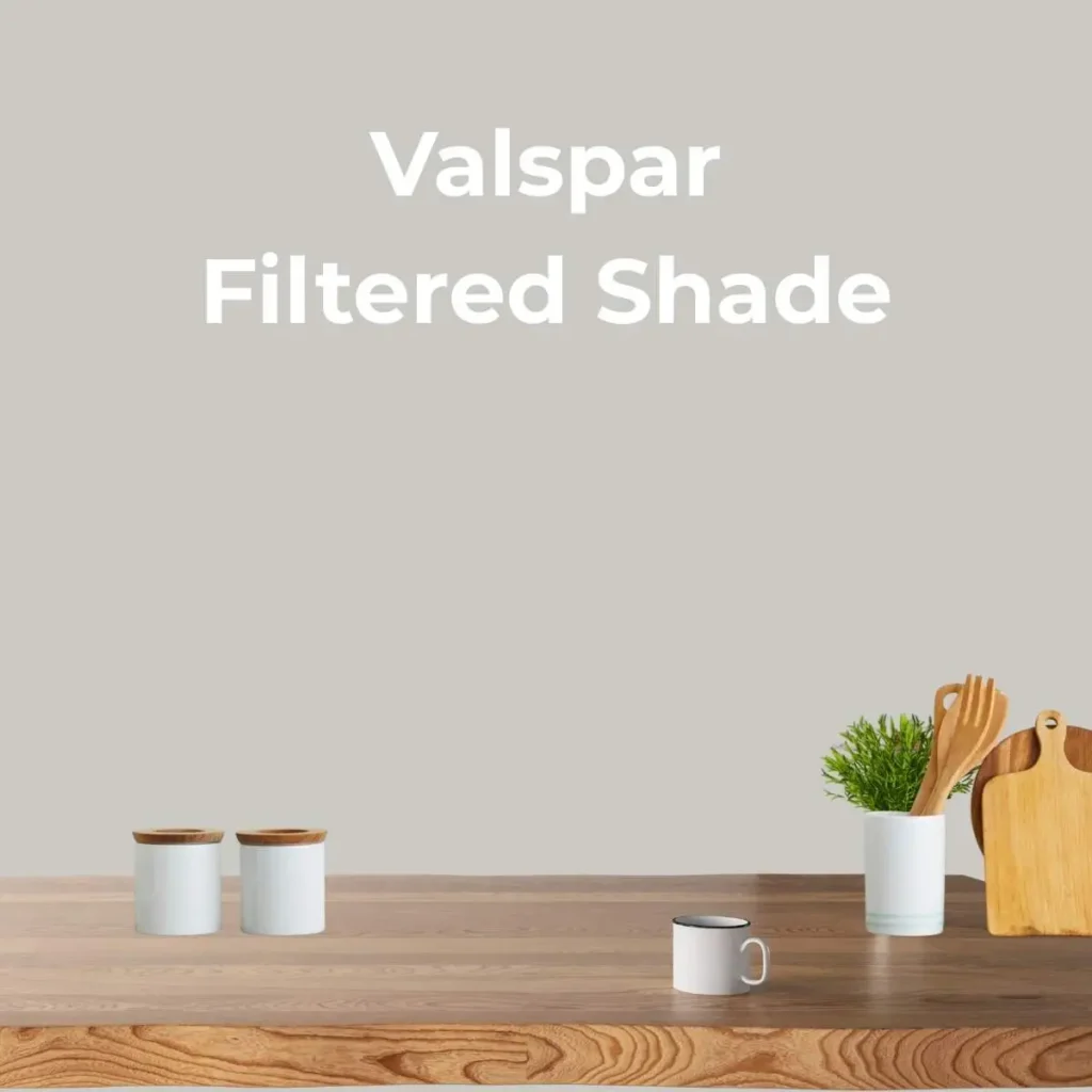
Valspar Filtered Shade is a medium-toned gray that lands comfortably in the middle of the gray spectrum. It’s not pale enough to read as off-white, and it’s not deep enough to feel heavy. What makes it genuinely useful is how it shifts throughout the day — cooler and crisper in morning light, warmer and earthier as afternoon sun fills a room, and downright cozy under incandescent bulbs in the evening.
With an LRV of around 47, it sits right in the middle range. Bright enough to keep rooms from feeling closed in, but substantial enough to read as a real color on the walls — not just a tinted primer.
Valspar Filtered Shade Paint Card
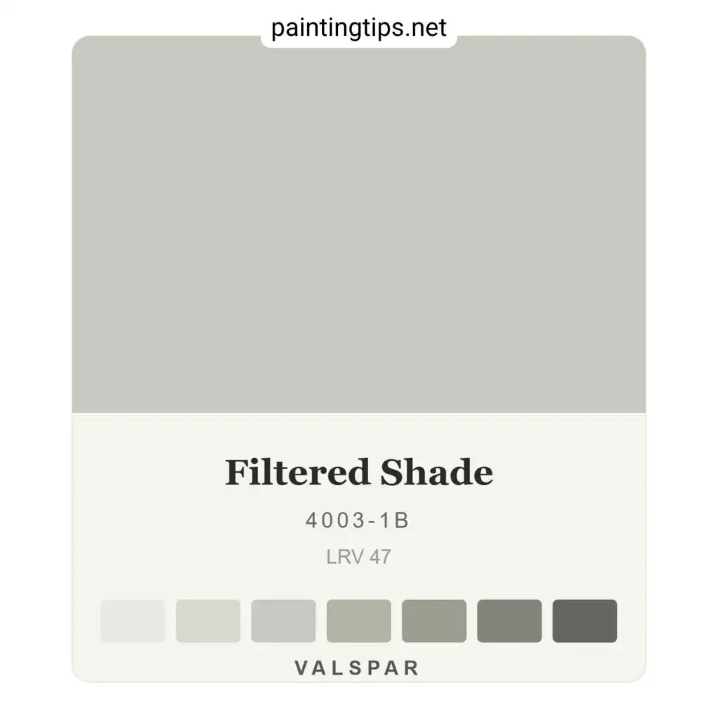
The paint card for filtered shade 4003 1b shows a balanced gray that doesn’t lean dramatically in any direction at first glance. Hold it against a true white, though, and the warmth becomes obvious. The coordinating chips on the card run from softer, lighter versions of the same gray family through deeper anchor shades — a built-in palette for tonal layering.
One practical tip: don’t evaluate the card under store lighting. Fluorescent overheads flatten every gray and push them cooler than they actually are. Bring it home, tape it to the wall, and live with it for 24 hours before deciding.
Filtered Shade Valspar Undertones
This is where filtered shade valspar gets interesting. It carries a subtle green-gray undertone — not sage, not olive, just a quiet earthiness beneath the surface. It becomes most visible when you place it next to warm beiges or tans. In south- or west-facing rooms flooded with warm light, the green pulls back and the color reads as a clean gray. In north-facing rooms, it comes forward and adds a bit more complexity.
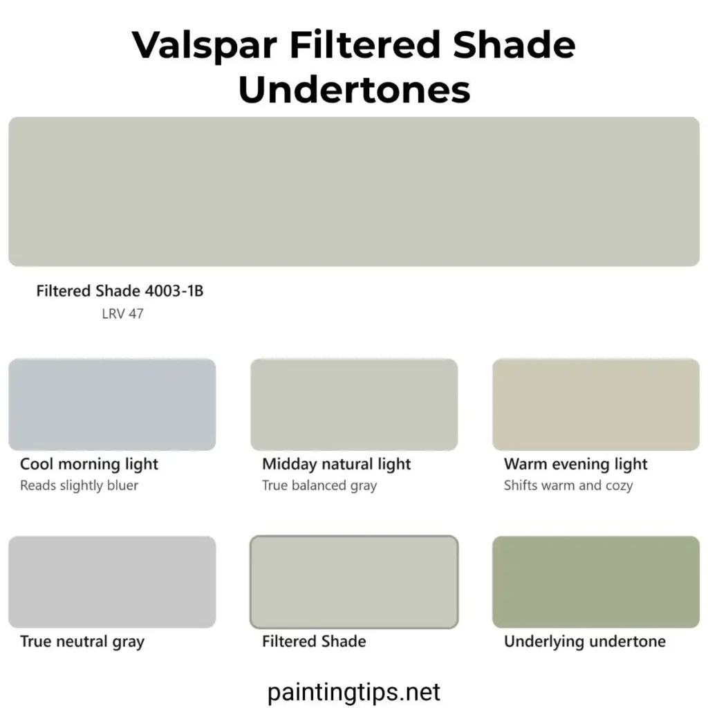
That undertone is actually an asset. It gives the color an organic, natural quality that pure blue-gray or purple-gray neutrals don’t have. It works beautifully with wood tones, stone surfaces, linen, jute, and leather.
One thing to avoid: pairing it with anything carrying a strong pink or orange undertone — honey oak floors or salmon-adjacent accents will fight with the green and neither will look right.
If you’re trying to decide between a medium tone like this one and something airier, it’s worth comparing it against some of the most popular light gray wall colors before making a final call.
Valspar Filtered Shade Coordinating Colors
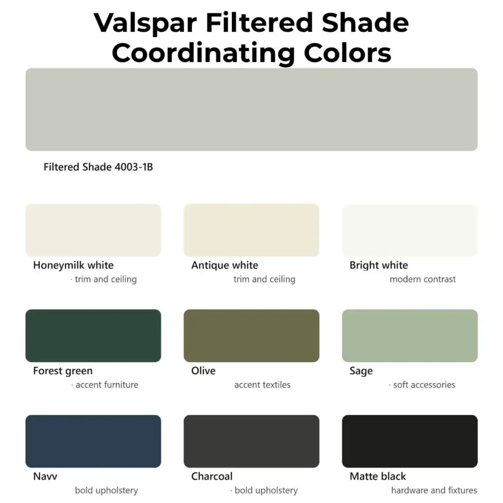
Getting the palette right takes this color from good to genuinely beautiful.
For trim, a warm off-white beats a stark bright white. Something like Valspar Honeymilk or any warm white with a slight cream cast honors the undertone rather than clashing with it. Bright cool-white trim can make the walls look slightly greenish by contrast.
On the accent side, Filtered Shade’s green undertone makes it a natural match for deep forest greens, muted olives, and sage. Warm woods — walnut, oak, cherry — sit comfortably against it. For something bolder, navy blue or charcoal upholstery creates a strong, clean contrast without darkening the room.
Keep warmer accents like blush or terracotta muted and dusty. Bright or saturated warm tones will compete rather than complement. If you want to take the gray theme further into your accessories and decor, we’ve put together a guide on some of our favorite gray accent colors that pair effortlessly with walls like this one.
Valspar Filtered Shade Living Room
In a living room, valspar filtered shade paint works as a backdrop that makes everything else look more intentional. It doesn’t compete — it supports. Furniture, art, and textiles all read more clearly against it.
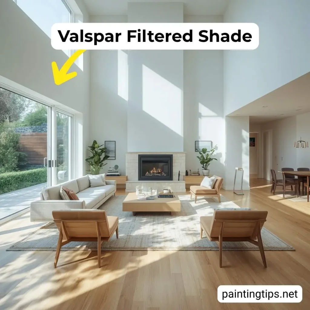
Pair it with warm wood floors, a cream or ivory area rug, and textured upholstery in bouclé or linen. For lighting, go warm — 2700K bulbs in layered sources will bring out the color’s coziest side. Not sure what to put in the room itself? Our guide on what color furniture goes with gray walls breaks down the best options by style and budget. Trim in a warm white keeps the look clean without feeling sterile. If you’re working with carpet instead of hardwood, we’ve covered what color carpet goes with gray walls in detail to help you avoid a flat, washed-out look.
Valspar Filtered Shade Kitchen
Filtered shade 4003 1b handles kitchens well, but if you’re still weighing your options, it’s worth browsing some of the great colors for kitchen walls that tend to perform best with cabinetry and lighting in mind. It holds up against the visual noise of appliances and cabinetry, and it bridges the gap between white cabinets and natural wood or stone elements better than most grays.
With white Shaker cabinets, it creates a timeless combination — clean and fresh without being cold. With darker cabinets in navy or forest green, it serves as the lighter balancing element. Countertops in white quartz or warm beige quartzite, backsplash tile in white subway or sage handmade tile — all of it coordinates naturally.
Valspar Filtered Shade Bedroom
Few colors suit a bedroom as well as this one, but if you’re comparing it against other options, we’ve rounded up some of the best colors for bedroom walls to help you weigh the alternatives. The muted, earthy quality is naturally calming, and without harsh cool or blue undertones, it doesn’t produce that restless, clinical feeling some grays bring to sleeping spaces.
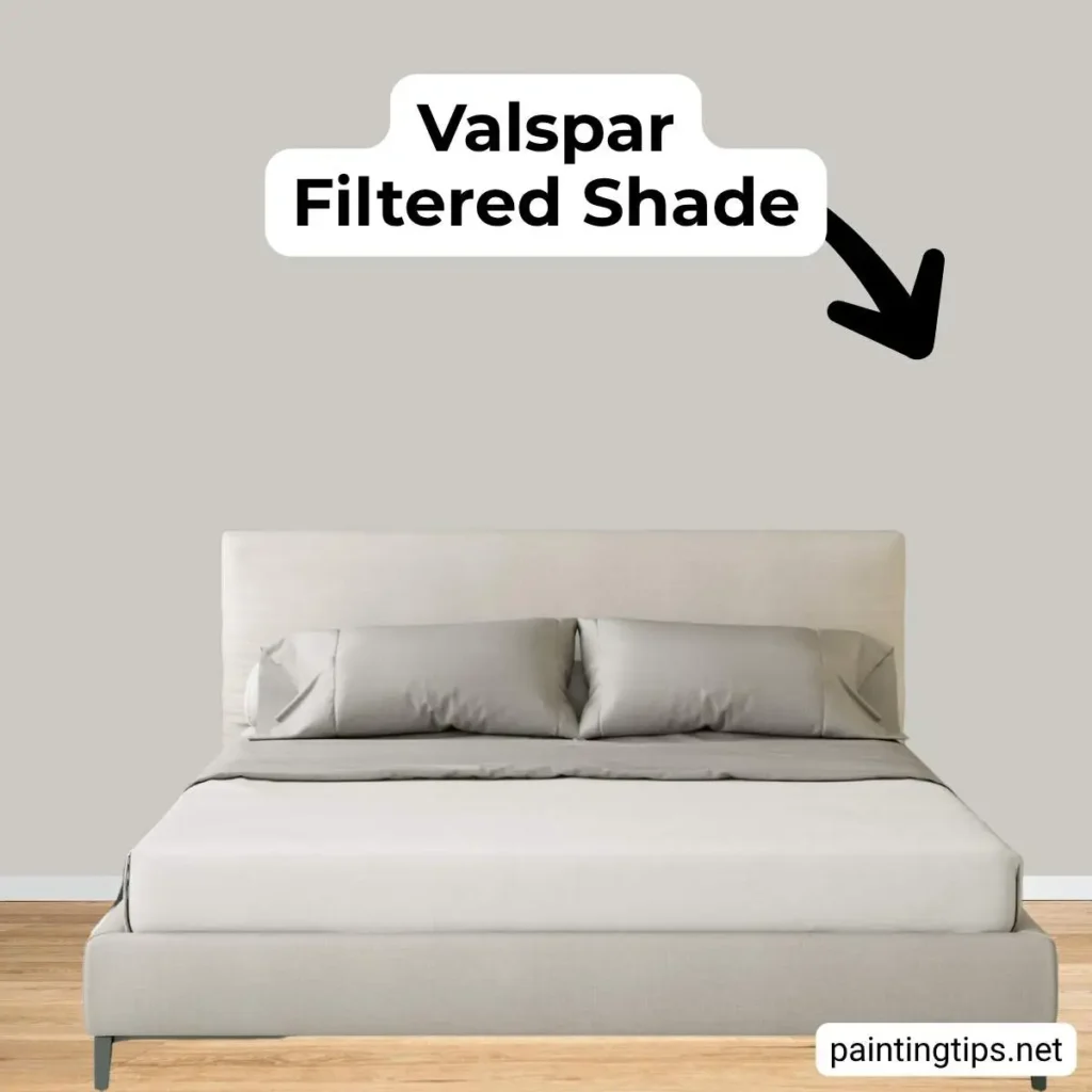
Layer bedding in warm white or ivory, add throws in dusty blush or sage, and lean into natural materials — linen, jute, wood. A warm white trim (think Swiss Coffee, not bright white) ties it all together without jarring contrast.
Valspar Filtered Shade Entryway
In an entryway, this color reads as welcoming without trying too hard. It’s sophisticated but not intimidating — which is exactly what you want when guests walk through the door.
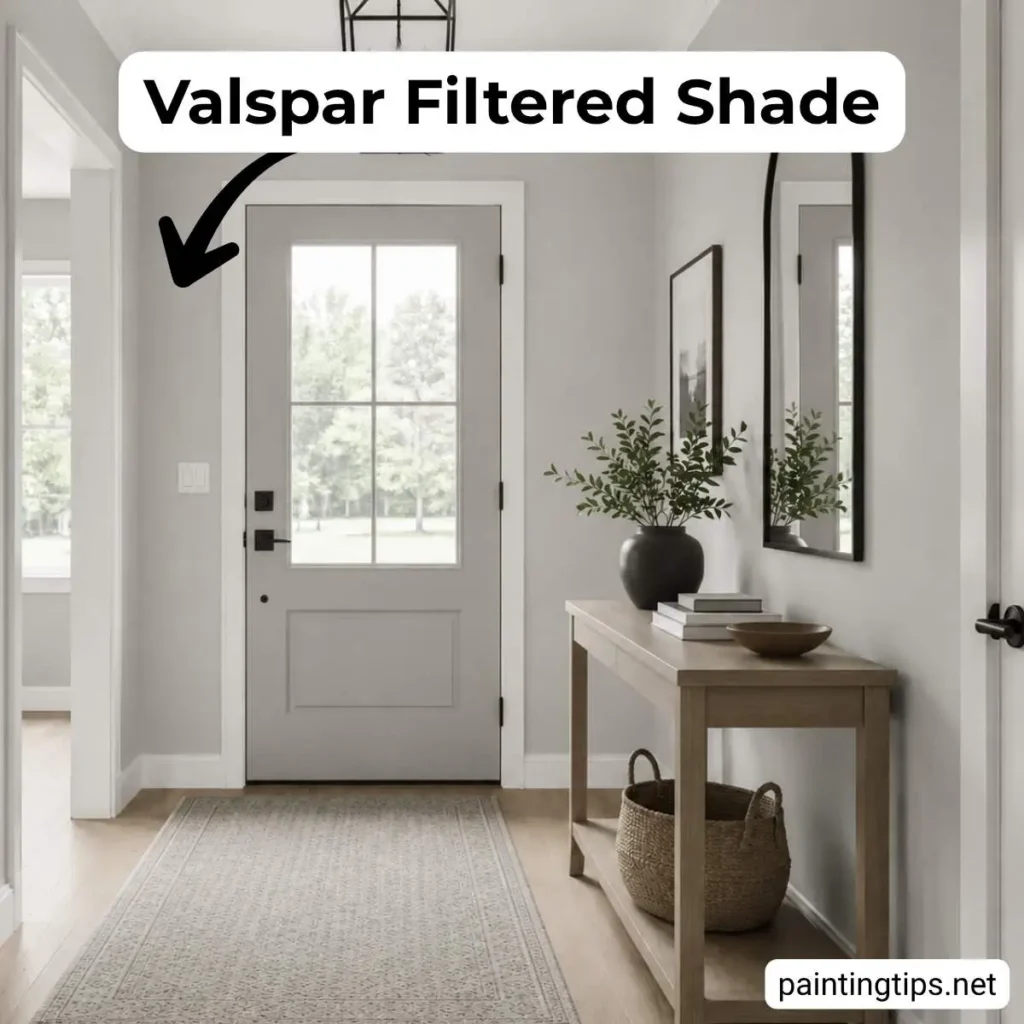
Bright white trim on doors and casings gives it a crisp, finished look. Since entryways often have limited natural light, use a warm-toned bulb (2700K) and a fixture with a diffuser. A brass or bronze mirror frame will add warmth and bounce light around the space. This color pairs especially well with classic flooring — white marble, checkerboard tile, or warm wood plank.