Sea Salt from Sherwin Williams is one of those colors that shows up in almost every coastal or farmhouse mood board we come across, and for good reason. Below, we walk through what this shade actually looks like in different light, which colors pair with it, and how it performs in specific rooms of the house, from bathrooms to bedrooms to living spaces.
Sea Salt Paint Sherwin Williams

Sea Salt (SW 6204) is a soft, muted blend of green, gray, and a whisper of blue, which is exactly why decorators call it a “chameleon” color. It carries an LRV (Light Reflectance Value) of 63.2, putting it firmly in the light category.
That LRV matters in practice: a color this light will bounce a good amount of daylight around a room without ever feeling stark or clinical the way a true white can. This is also one of the reasons sea salt paint from Sherwin Williams draws so much attention from homeowners planning a repaint.
It reads differently depending on the room it’s in, which sounds like it could be a downside, but most people who’ve lived with it consider it the whole appeal. In a north-facing room with cooler daylight, sea salt sherwin leans noticeably blue-green.
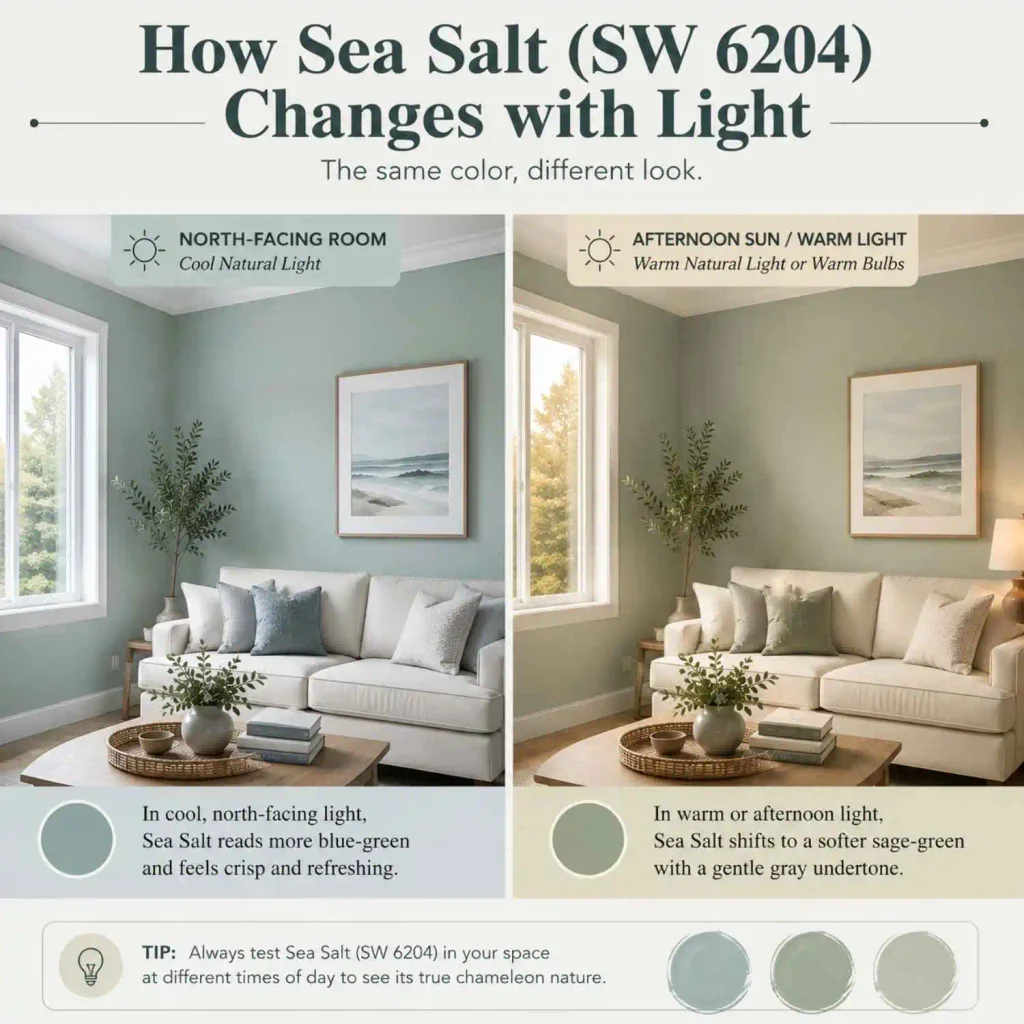
Under warm bulbs or in a room that gets afternoon sun, the same wall can look more sage-green with a soft gray cast. We’ve seen it described as everything from a beach-glass blue to a quiet sage, and both descriptions are fair depending on the light hitting it.
If you’re comparing this shade to other paint lines, the closest sibling within Sherwin Williams’s own lineup is SW Rainwashed, which sits a touch greener and slightly deeper in tone. We’d recommend reading our full breakdown of that color if you want something a shade richer than Sea Salt for a bathroom or bedroom.
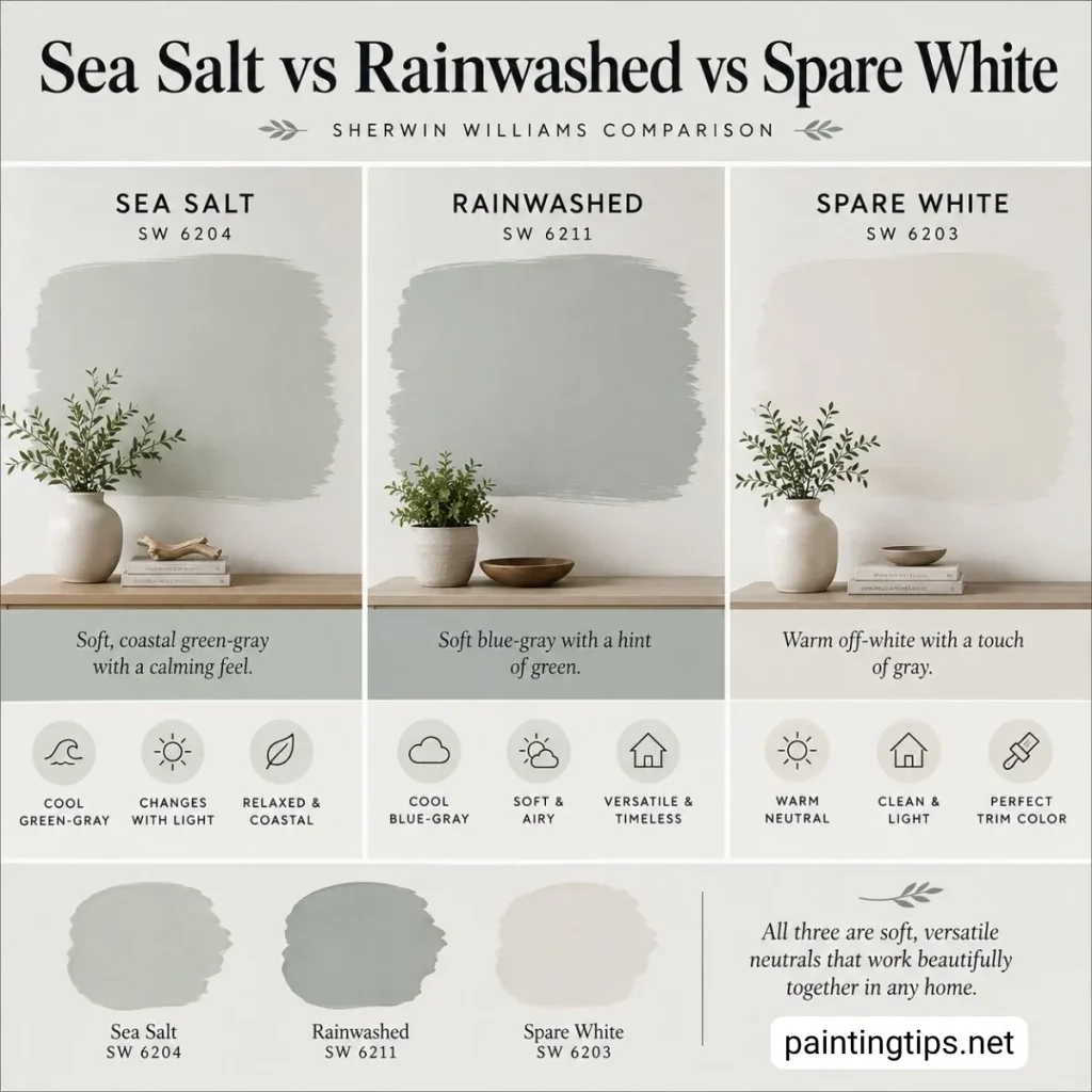
On the lighter end of the same color strip, Spare White (SW 6203) is essentially a paler, quieter version of Sea Salt, useful if a full wall of SW 6204 feels like too much color for a smaller room. So there really is a light-to-dark family here rather than a single fixed shade, worth sampling more than one card if the first one doesn’t feel quite right on your wall.
Is Sherwin Williams Sea Salt Blue or Green?
Technically, sea salt sherwin williams is classified as a green by the brand’s own color family system, but in practice it rarely reads as a pure green on the wall. Most people looking at it describe blue, green, and gray all showing up at different times of day, and that’s not really a contradiction.
The color has such low saturation that whatever light hits it, along with whatever’s nearby, tends to nudge the eye toward one undertone or the other. If you need a short answer for planning purposes, it’s safest to think of it as a green-gray with a cool undertone that can flash blue.
Sherwin Williams Sea Salt Color Palette
Because Sea Salt sits right at the boundary between a neutral and an actual color, it works as the backbone of several different palettes rather than locking you into one style. For a coastal or beach-house feel, it pairs naturally with warm whites, driftwood tones, and touches of navy for contrast.
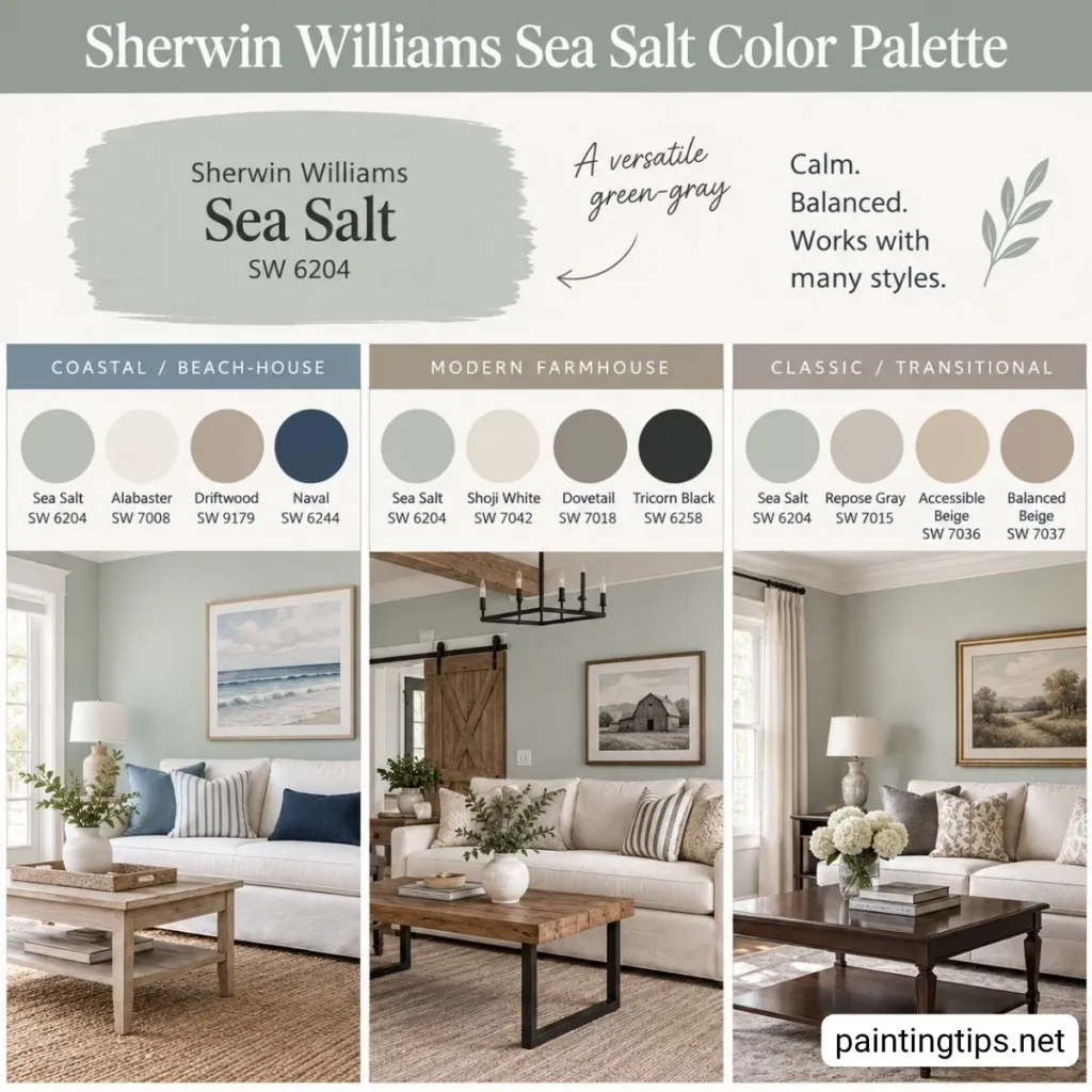
In a modern farmhouse palette, it tends to show up alongside warm woods, black hardware, and creamy off-whites. It also holds its own in a more classic, transitional home when it’s paired with soft grays and warm beiges rather than anything too saturated. The common thread across all of these directions is that Sea Salt never fights for attention, it sits quietly in the background and lets furniture, art, and wood tones do the talking.
Sherwin Williams Sea Salt Coordinating Colors
Sherwin-Williams Sea Salt (SW 6204) works beautifully with soft whites, muted grays, and other calm blue-green shades. For an easy, balanced palette, Spare White (SW 6203), Fleur de Sel (SW 7666), and Summit Gray (SW 7669) are the official coordinating colors for Sea Salt. These shades can be used on trim, ceilings, doors, or nearby walls without taking away from Sea Salt’s soft character.
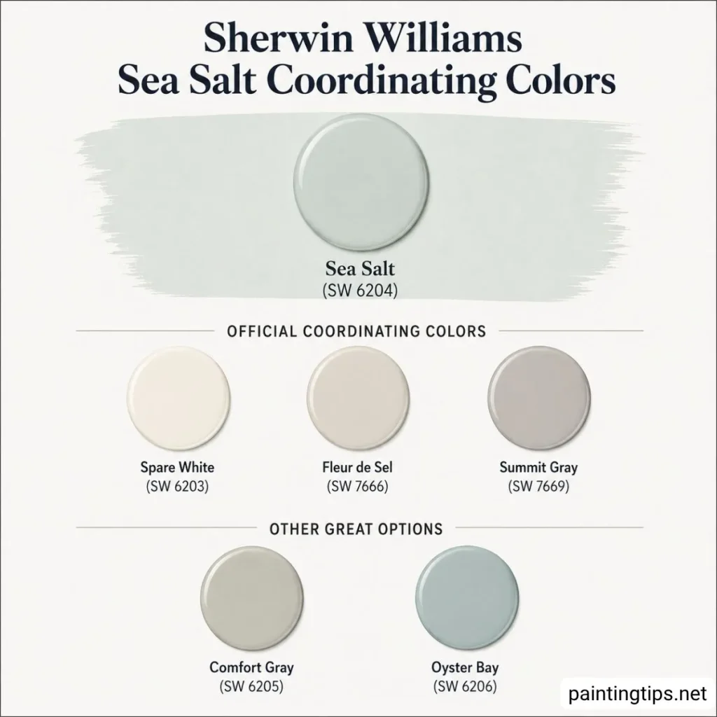
If you want a slightly deeper look, Comfort Gray (SW 6205) and Oyster Bay (SW 6206) are also worth considering. Because Sea Salt has noticeable blue-green undertones, muted and understated colors tend to complement it better than strong, warm shades.
If you’re planning a whole-house scheme rather than a single room, we’d point you toward Behr Sculptor Clay and Sherwin Williams Alabaster, both of which work well as connecting neutrals that flow from room to room without competing with Sea Salt in the spaces where it’s used as the main color.
What Colors Look Good With Sherwin Williams Sea Salt?
White trim is the easiest and most reliable pairing, whether that’s a bright white like Extra White or a creamier option like Alabaster, both of which let Sea Salt’s color come through clearly. For accent colors, navy and black work surprisingly well since Sea Salt’s muted, grayed-down base can handle bold contrast without feeling busy.
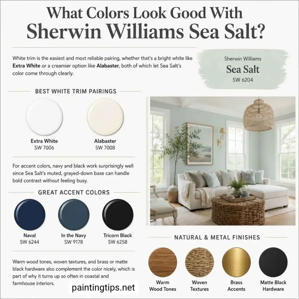
Warm wood tones, woven textures, and brass or matte black hardware also complement the color nicely, which is part of why it turns up so often in coastal and farmhouse interiors.
Sherwin Williams Sea Salt vs Benjamin Moore Sea Salt
One thing worth clearing up, since it trips people up in searches all the time: Benjamin Moore also sells a color literally named Sea Salt (CSP-95), and it is not the same color as Sherwin Williams’s version. Benjamin Moore’s Sea Salt is a warm, beige-greige with a slightly reddish undertone, while sea salt paint sherwin williams is a cooler green-gray with blue undertones.
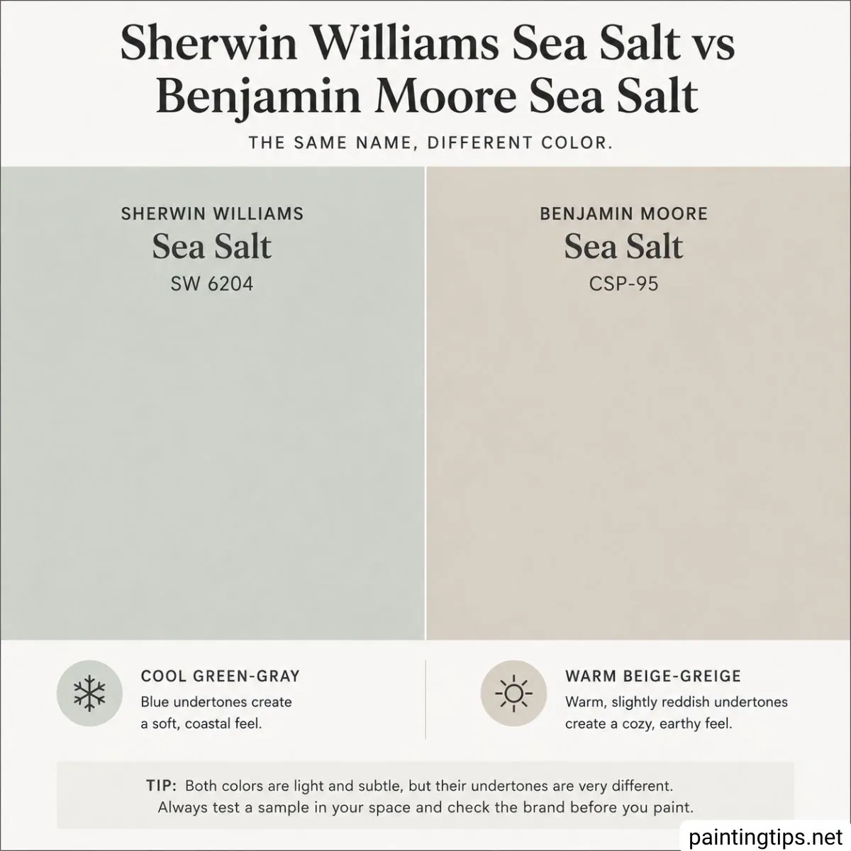
They land in a similar lightness range, but side by side, the difference in undertone is easy to see, especially against white trim or in daylight. If you picked up a sample expecting the cool, coastal look associated with the Sherwin Williams version, double check the brand on the can before you paint a whole room.
Is Sherwin Williams Sea Salt Still Popular?
Yes, and it’s not close to fading. Sea Salt has held a spot on Sherwin Williams’s list of best-selling colors for years now, and it’s still one of the most searched paint colors among people planning a repaint, which tells us actual demand hasn’t slowed down.
Part of the staying power comes from how flexible it is. Trends in bold, saturated colors come and go, but a soft, easy-to-live-with color like this one doesn’t really go out of style the way a trendier shade might.
Is Sea Salt a Good Color for the Bathroom?
This is genuinely where Sea Salt shines the most. Bathrooms tend to have a lot of white already, from the tile to the vanity to the fixtures, and Sea Salt’s soft color reads more vividly against that backdrop than it does on a large open wall.
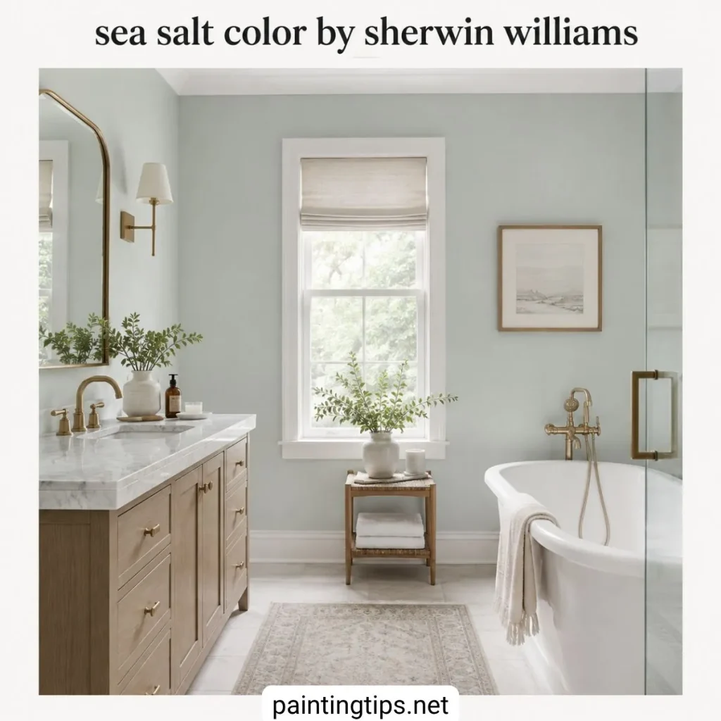
It gives a spa-like, calming feel without turning the room dark, and because the LRV is high, it still keeps a smaller bathroom feeling open rather than boxed in.
Sherwin Williams Sea Salt Living Room
Sea Salt can absolutely work in a living room, though it takes a little more thought than a bathroom does. Because it’s such a light, airy color, it tends to do best in living rooms that already get a good amount of natural light, since a room that stays dim most of the day can make the color look flat or muddy rather than fresh.

That said, it’s worth being honest that this color gets used in bathrooms far more often than living rooms, mostly because open living spaces show off its color-shifting nature in a way that can feel inconsistent from one wall to the next. If your living room doesn’t get much light, we’d suggest sampling Behr White Moderne or Valspar Filtered Shade instead, both of which hold up a little better in dimmer spaces.
If you love Sea Salt and your living room gets decent light, it’s still a solid choice, just sample it on more than one wall before committing to the whole room. For more options beyond these, our roundup of most popular wall colors is a good next stop.
Sherwin Williams Sea Salt Bedroom
The bedroom is where this color feels almost tailor-made. Used on all four walls, it creates a calm, enclosed feel that suits a space meant for winding down, and the softness of the color keeps it from feeling cold even at that scale.

It also works well as a single accent wall behind the headboard, paired with a slightly deeper, related tone to add some depth without breaking from the same color family. We’d recommend Benjamin Moore Van Deusen Blue for that headboard wall specifically, with Sea Salt carried across the remaining three walls for balance.
If you’d rather keep the whole room in the same family, For more direction on this room specifically, see our guide to the best wall colours for bedroom spaces.
Sea Salt has earned its popularity honestly. It’s rare for a paint color to work in a steamy bathroom, a sunlit bedroom, and a coastal-themed living room all at once, but this one manages it by staying quiet enough to adapt to whatever room it’s put in. A large sample on at least two walls, viewed at different times of day, is still the best way to see which version of Sea Salt you’ll end up living with.
