In this complete review of Sherwin-Williams Alabaster, we’ll break down everything you need to know: we’ll look at its technical details (like its undertones), see how it performs room-by-room, compare it to other famous whites, and answer all your most frequently asked questions.
Sherwin Williams Alabaster SW 7008

If you’ve ever tried to choose a white paint, you know the struggle. You search for something clean and bright, but what you often get is either cold and sterile or surprisingly yellow. Finding that perfect, Goldilocks-style “just right” white can feel impossible. That is, until you meet Alabaster. It has become a legend for a reason.
More than just a popular choice, Alabaster is a problem-solver. It’s the warm, welcoming white that designers and homeowners turn to when they need a color that feels both modern and timeless. It brings light into a space without any of the harshness, creating a backdrop that simply feels like home. Before we explore how it looks in every room, let’s get the technical details out of the way.
Alabaster at a Glance: The Quick Facts
- Undertones: A delicate balance of warm beige with a soft, neutralizing gray.
- LRV (Light Reflectance Value): 82 (Bright, but soft on the eyes)
- Color Family: Warm Off-White
- Hex Code: #EDEAE0
How Alabaster Looks in Your Home (Room by Room)
Theory is one thing, but seeing a color in action is what really matters. Here’s a practical guide to how Alabaster performs throughout the house.
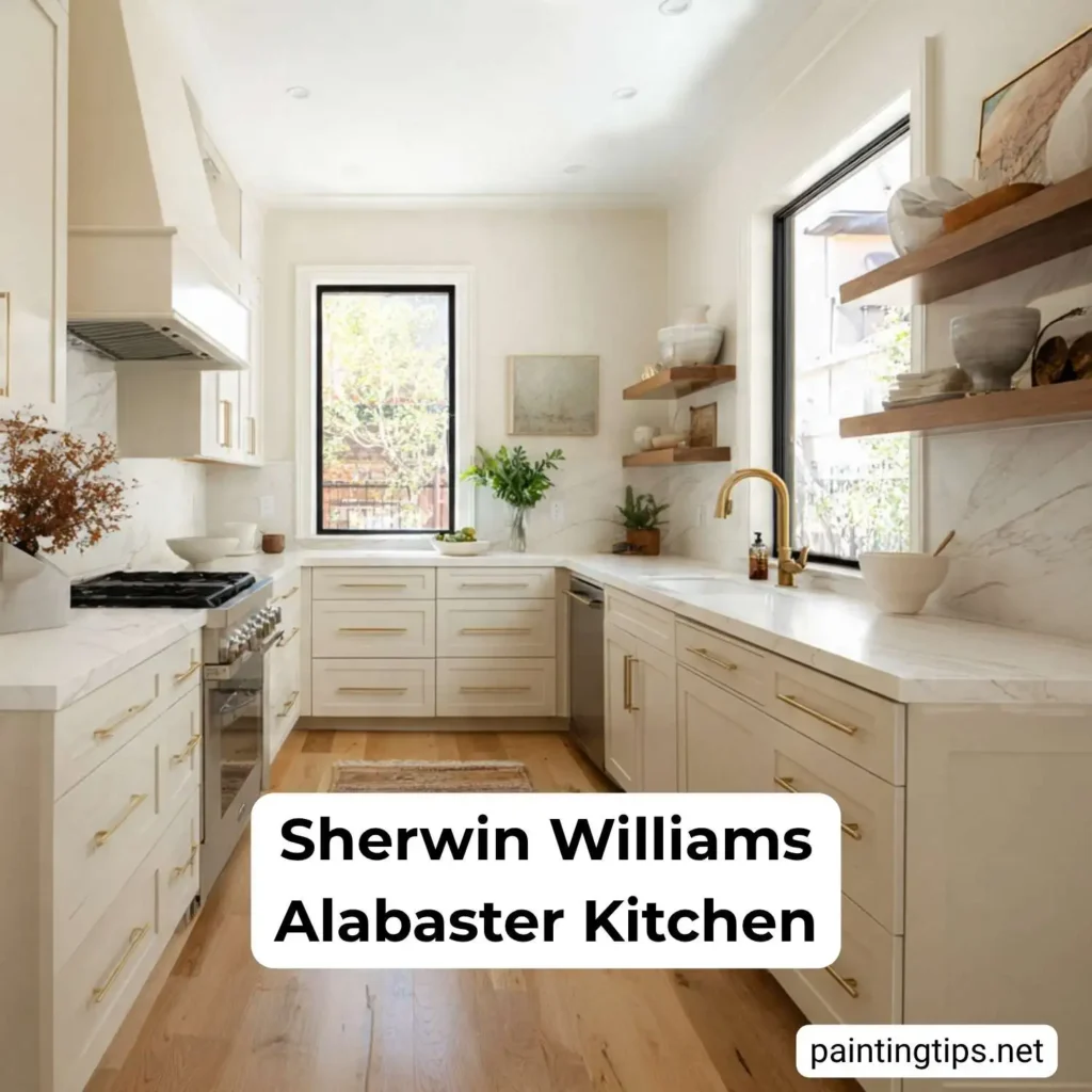
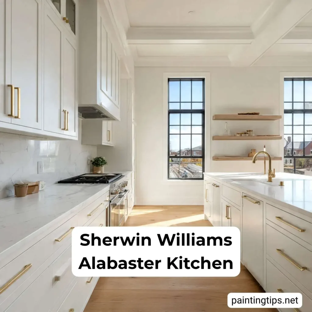
Sherwin Williams Alabaster Kitchen
Using Alabaster in the kitchen is one of its most popular applications, and for good reason. As a cabinet color, it creates a timeless look that feels both clean and incredibly welcoming. A great Alabaster kitchen design offers brightness without any of the cold, clinical feeling, making the heart of your home feel more inviting.
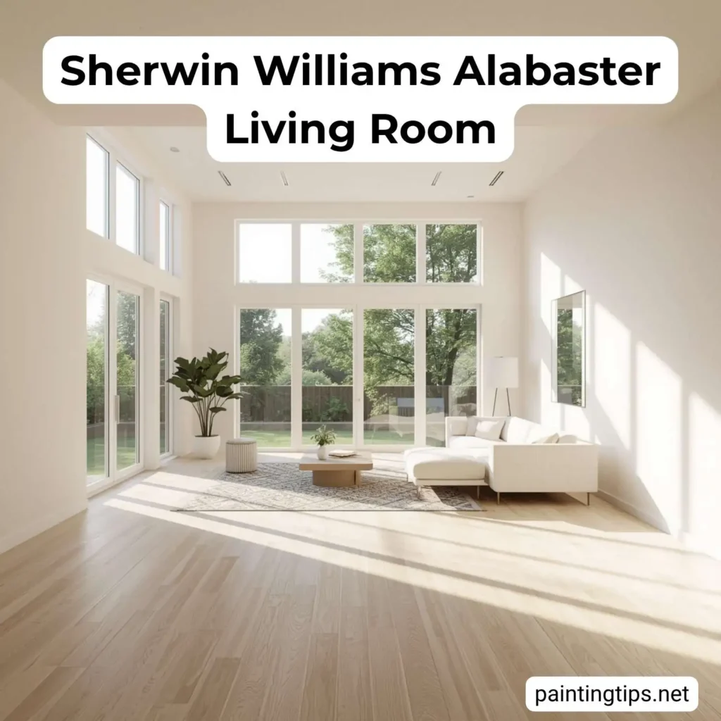
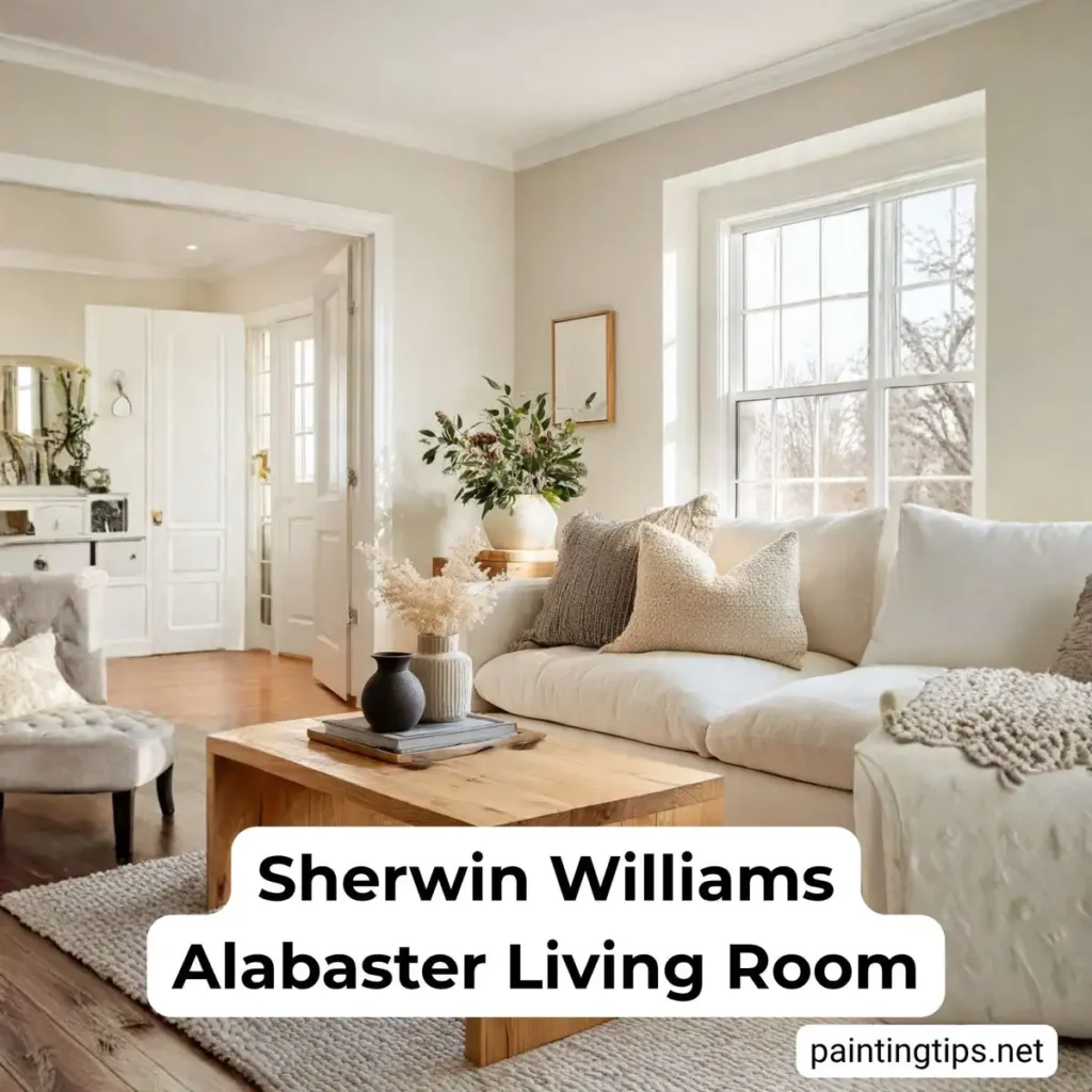
Sherwin Williams Alabaster Living Room
As a primary wall color for a living room, Alabaster creates a calm, sophisticated canvas. In a living room with lots of natural light, it feels bright and airy. In spaces with less light, its inherent warmth will make the room feel cozy and intentional, wrapping you in a soft glow.
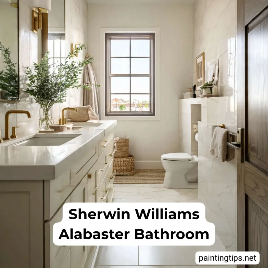
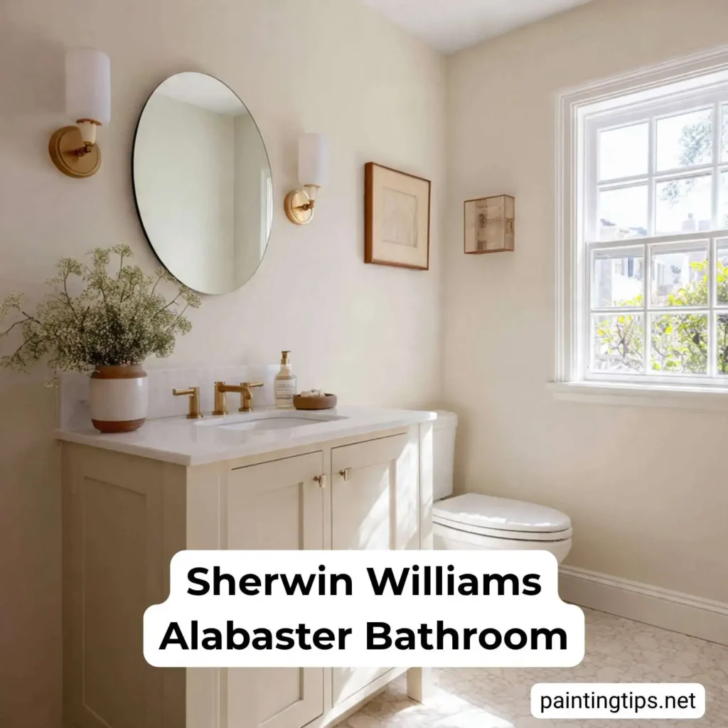
Sherwin Williams Alabaster Bathroom
If you’re worried about a white looking too sterile, using Alabaster in a bathroom is the perfect solution. It delivers a clean, spa-like feel that is also deeply relaxing. An Alabaster bathroom pairs beautifully with classic marble, modern black fixtures, or warm wood vanities.
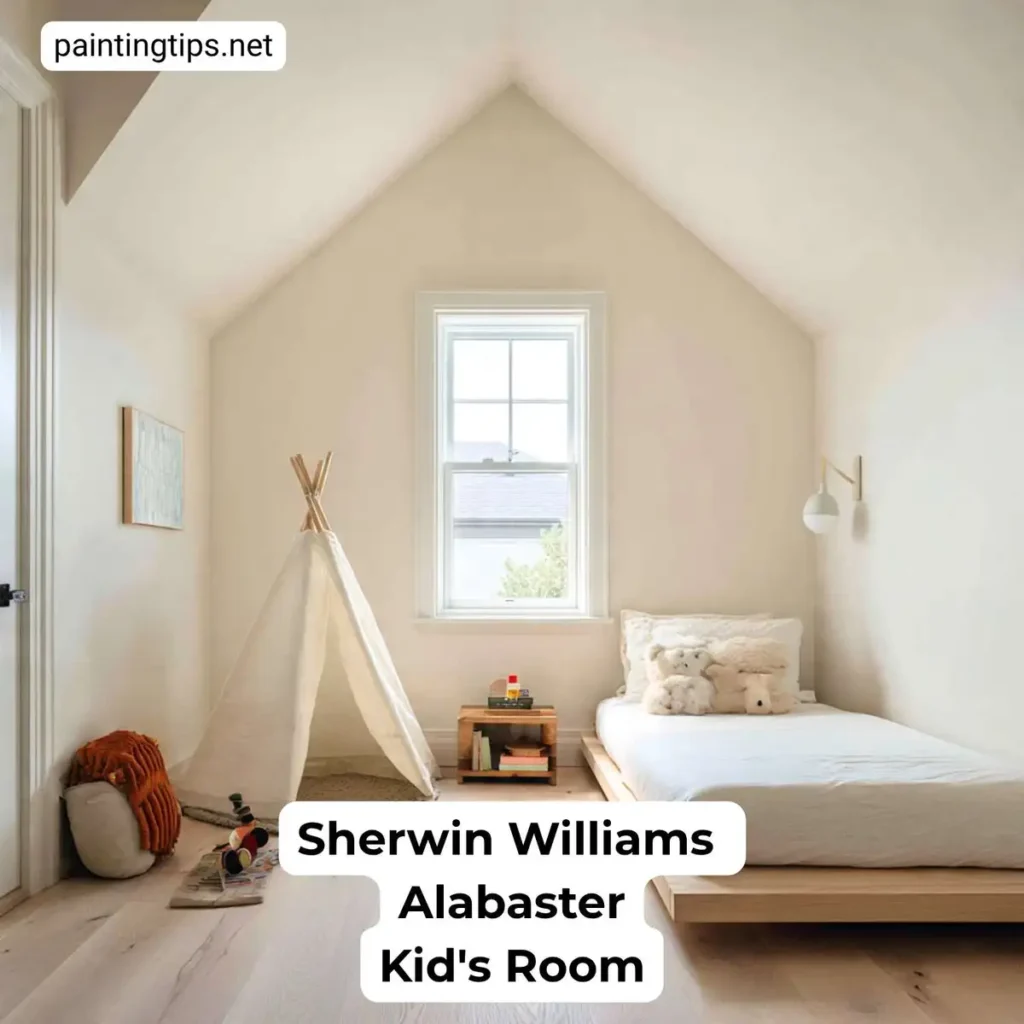
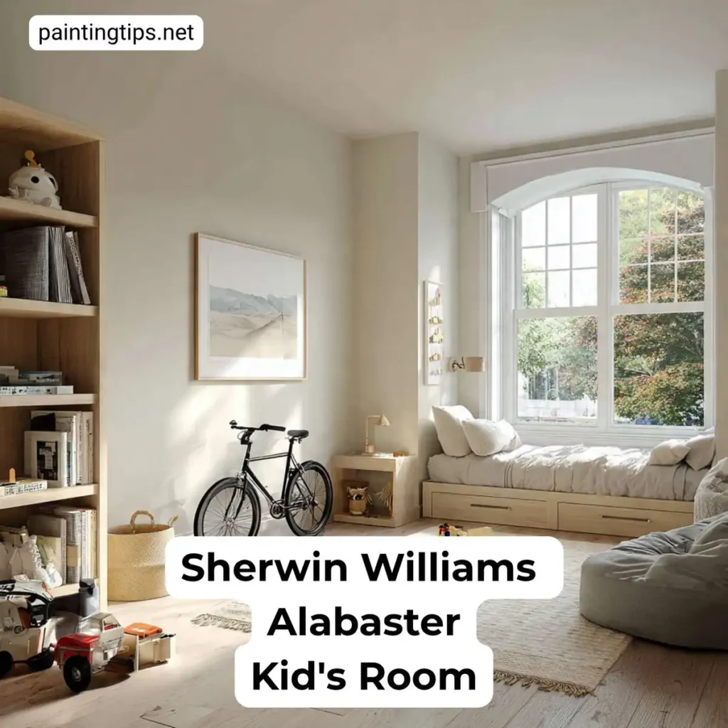
Sherwin Williams Alabaster Kid’s Room
Alabaster is a fantastic choice for a nursery or kid’s room because it provides a soft, calming backdrop that isn’t overstimulating. It’s the perfect neutral canvas that allows colorful toys and artwork to be the star. Best of all, an Alabaster kid’s room is a design that grows with them, easily transitioning from a nursery to a cool teen room.
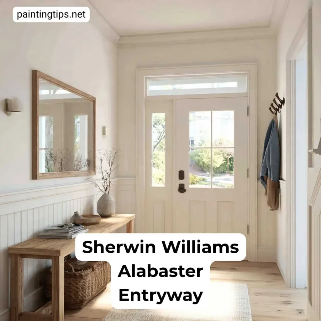
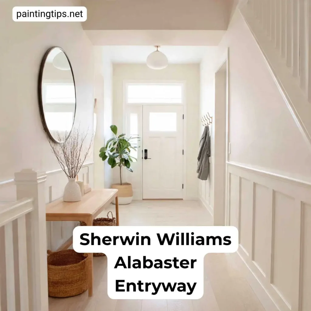
Sherwin Williams Alabaster Entryway
The entryway sets the first impression, and Alabaster makes that impression a warm and welcoming one. In an Alabaster entryway that may lack natural light, its high LRV works hard to make the space feel brighter and more open. It’s like a warm hug for anyone who walks through the door.
Sherwin Williams Alabaster Trim
Using Alabaster for trim and doors is a fantastic choice, especially when your walls are a slightly darker warm neutral. For a modern, seamless look, you can also paint the walls and trim the same Alabaster color—just use different sheens (e.g., eggshell for walls, satin for trim) to create subtle definition.
What Colors Go Well With Alabaster?
Alabaster is a team player. It loves warm greiges and beiges like Accessible Beige (SW 7036) or Agreeable Gray (SW 7029) for a soft, whole-house palette. Learn more about Accessible Beige (SW 7036). Compare with Agreeable Gray (SW 7029).
For contrast, charcoal or soft black trims such as Iron Ore (SW 7069) or Tricorn Black (SW 6258) look crisp against Alabaster walls. Natural wood tones, brushed brass, matte black, and muted blues/greens (think Sea Salt SW 6204 or Rainwashed SW 6211) all sit comfortably next to it. If we want a classic exterior combo, Alabaster siding with a dark front door and warm wood accents is a proven winner.
FAQ
Is Sherwin Williams Alabaster White or Cream?
Sherwin Williams Alabaster is an off-white that leans creamy. On a white paint chip Alabaster SW 7008 looks like a soft white; next to a true bright white (like Pure White), you’ll see the creaminess. Most people describe it as a warm white rather than a cream.
Is Alabaster Too Yellow?
Alabaster SW 7008 has a faint yellow base, but the gray balance keeps it from reading yellow on the wall. In very warm lighting (south-facing sun, warm bulbs) it can look creamier, but it rarely looks “yellow” the way a traditional cream paint does.
Does Alabaster Paint Look Grey?
Sherwin Williams Alabaster can look grey in cool light. In north-facing rooms or under cool LEDs, the gray note comes forward and Alabaster can read as a very soft, warm greige. That flexibility is part of its appeal—not a flaw.
What Is So Special About Alabaster?
The balance of Alabaster SW 7008 is special. It’s bright (LRV 82) but not stark, warm but not yellow, and it stays consistent across different lighting conditions. That makes it a safe whole-house white for walls, trim, cabinets, and exteriors.
Why Does Alabaster Turn Yellow?
Sherwin Williams Alabaster doesn’t “turn” yellow, but it can look more yellow in certain settings: warm, low-Kelvin bulbs, strong southern light, or when it’s placed next to cooler whites and gray materials. If you want to minimize creaminess, use cooler (4000K) lighting and pair Alabaster with neutral or cool-toned accents.
Why is Alabaster White So Popular?

It’s popular because it’s the perfect “in-between” white. It’s warm without being yellow, and bright without being sterile. This incredible balance makes it a versatile, problem-solving color that works in almost any style of home, from modern farmhouse to transitional.
Is Alabaster Paint Cool or Warm?

Alabaster is definitively a warm paint color. Its cozy and inviting feel comes directly from its soft yellow and beige undertones.
Before You Commit
If you’re on the fence, grab a peel-and-stick sample (or a painted swatch board) and test Alabaster in your own light—morning, afternoon, and evening. That’s the easiest way to see how the warm-gray balance behaves in your space.