Picking a paint color that feels calm without turning flat is trickier than it sounds, and that’s exactly the gap Valspar Blue Arrow fills. In this review, we walk through what this shade actually looks like on the wall, how it compares to similar colors from other paint brands, and which rooms bring out its best side.
Valspar Blue Arrow

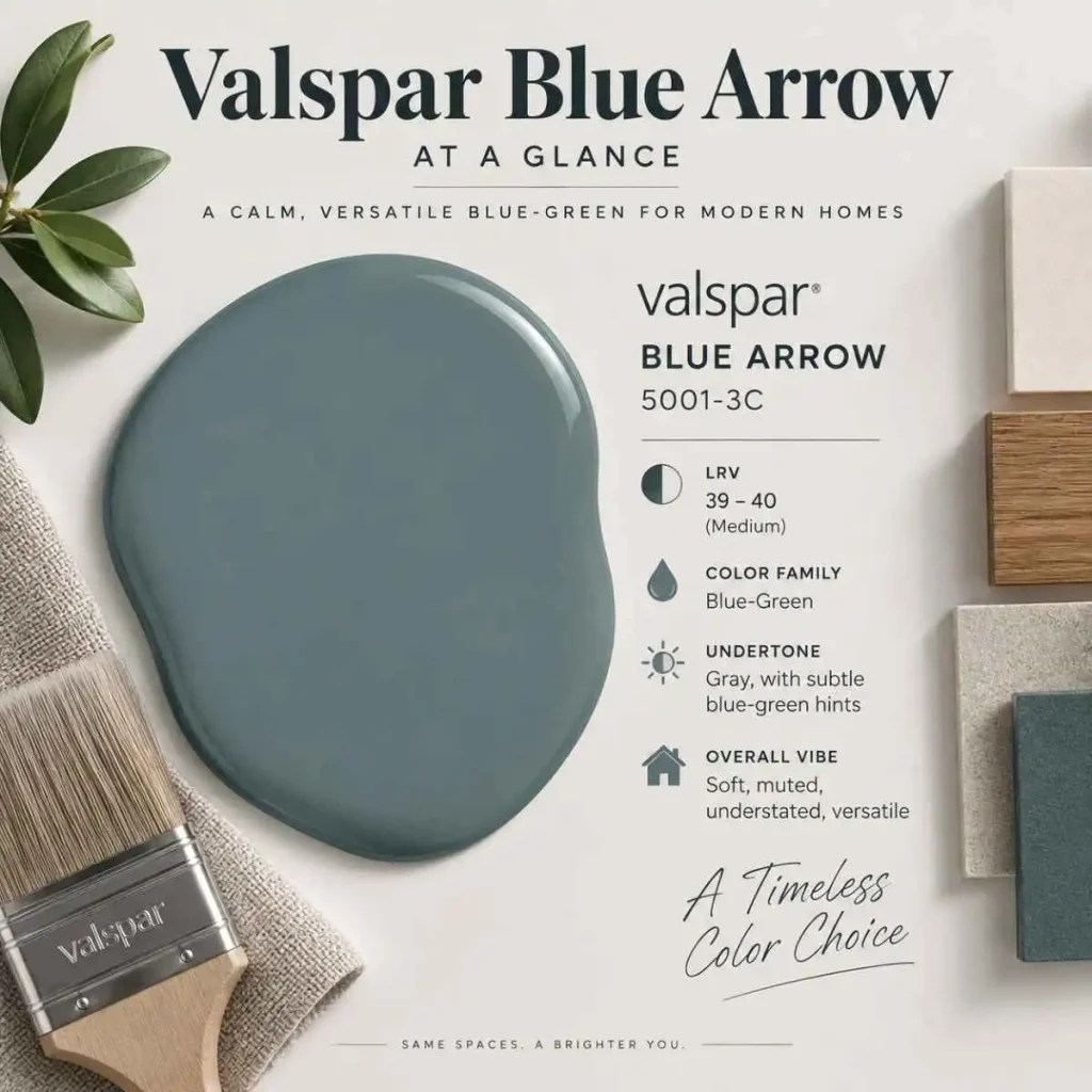
Blue Arrow 5001-3C by Valspar is a soft, muted blue-green with a noticeable gray cast running through it. It sits in Valspar’s teal family, but in person it reads more like a grounded, dusty blue than a true teal — the kind of color that shifts subtly depending on the light hitting it. We’d describe it as understated rather than showy, which is exactly why it works in so many different rooms.
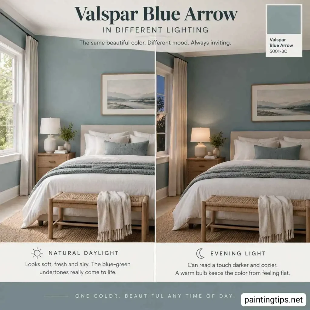
The LRV (Light Reflectance Value) for this blue arrow paint color from Valspar sits around 39 to 40, which puts it in the medium range. That means it reflects a moderate amount of light rather than brightening a room the way a pale color would, but it also won’t swallow light the way a true navy or charcoal might. In rooms with decent natural light, it reads soft and calming. In dimmer rooms, it can lean a bit moodier, which isn’t a bad thing if that’s the mood you’re after.
If you’ve shopped around at Sherwin-Williams, Benjamin Moore, or Behr, you’ve probably run into colors that live in the same family as this valspar blue arrow paint. Sherwin-Williams’ Dutch Tile Blue, Benjamin Moore’s Silken Blue, and Behr’s Veranda Charm all sit close to it on the color wheel, sharing that same grayed-out, coastal-adjacent blue-green quality.
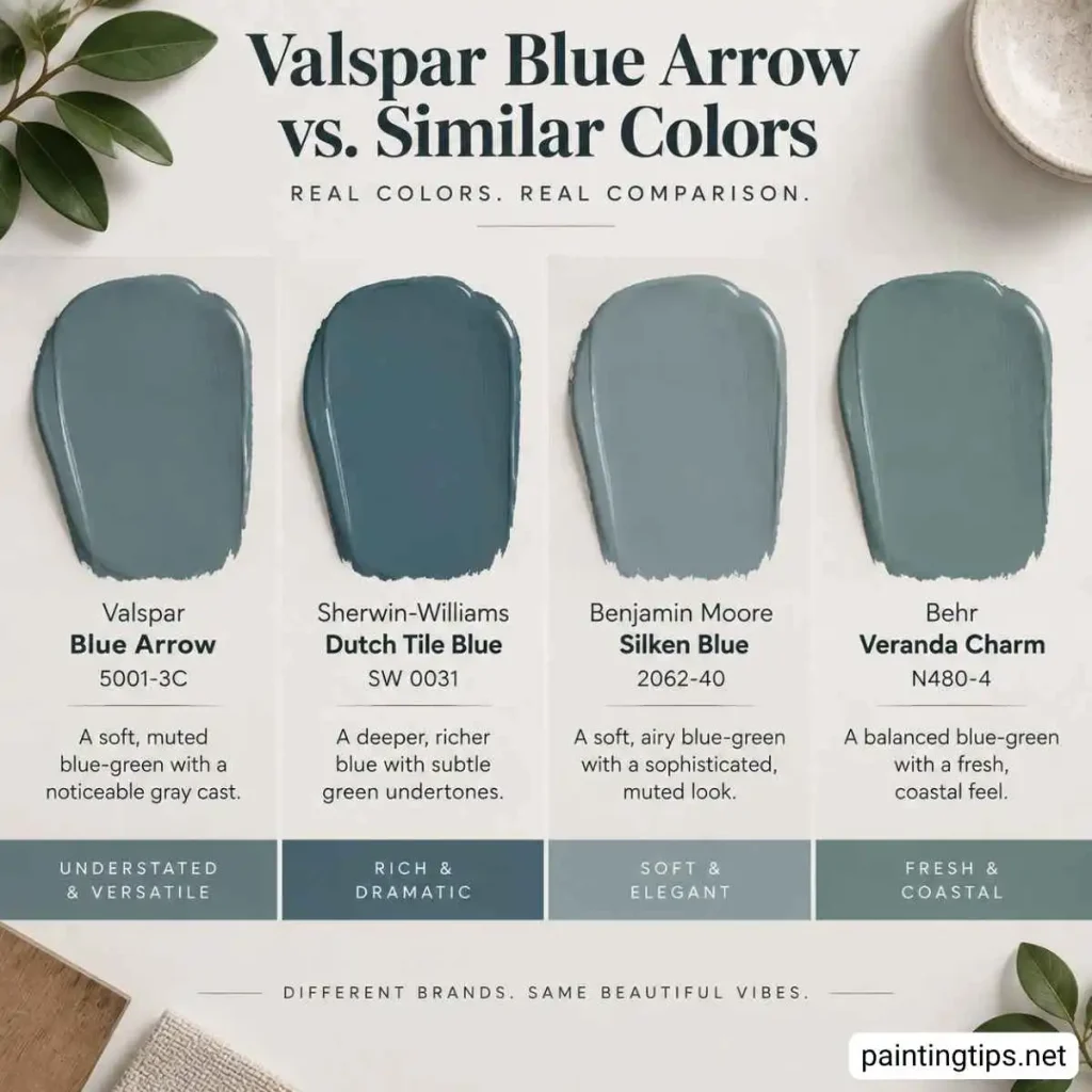
Here’s the thing though — we think Blue Arrow holds its own against all three, and in some lighting, it’s arguably richer and more layered than its more famous cousins. It just doesn’t get the same attention, probably because Valspar doesn’t get the marketing push that Sherwin-Williams and Benjamin Moore do. That’s a shame, because this blue arrow valspar paint deserves more credit than it gets.
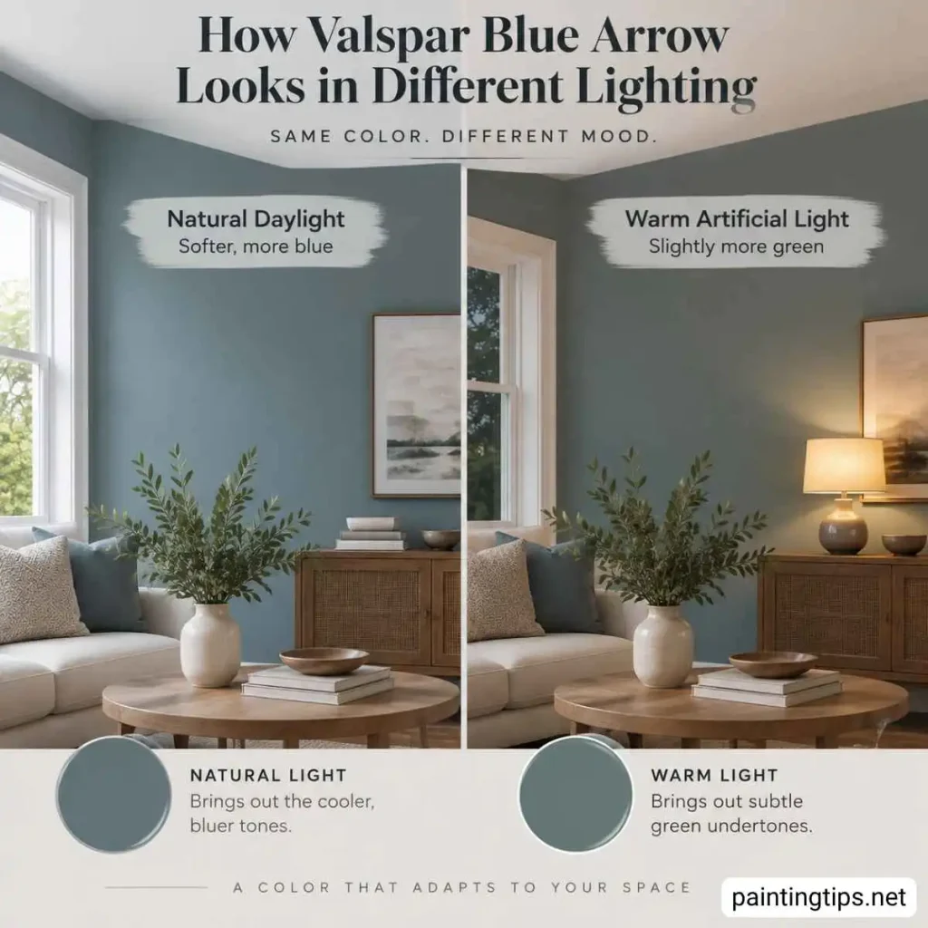
As for where it works best, Blue Arrow tends to shine in bathrooms, kitchens, bedrooms, and living rooms — basically anywhere you want a calm backdrop that still has some personality. It also holds up well as a cabinet color, which we’ll get into further down. Because the undertone leans green in some lights and blue in others, it’s worth testing a sample patch on your actual wall before committing, since lighting temperature, meaning warm bulbs versus daylight LEDs, will nudge it one way or the other.
Valspar Blue Arrow Coordinating Colors
Blue Arrow pairs naturally with warm and cool whites alike, which explains a lot of its staying power as a go-to shade. For trim and ceilings, a soft white with a hint of warmth keeps the room from feeling cold, while a crisp, cooler white sharpens the contrast if you want something more modern. Beyond white, this color sits comfortably next to warm neutrals like greige, sandy beige, and soft taupe, all of which soften the blue-green tone and keep a room feeling grounded rather than cold.
For a bolder pairing, Blue Arrow works surprisingly well with warm wood tones — think honey oak, walnut, or rattan textures — since the warmth in the wood balances out the coolness in the paint. If you’re drawn to a more layered, designer look, pairing it with deeper navy accents or a muted sage green can build out a small palette without anything clashing.
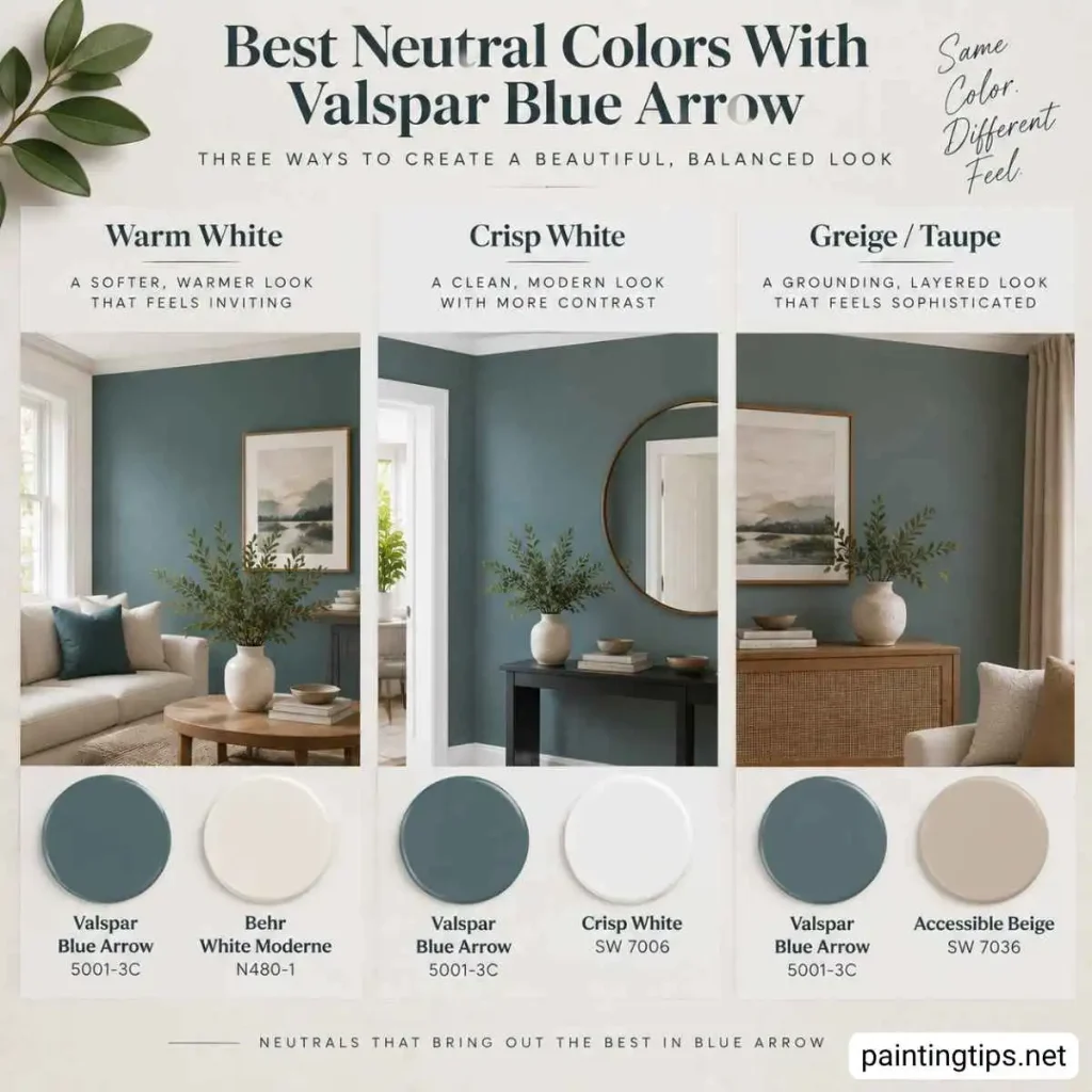
A few specific shades are worth calling out by name if you’re building a full palette around this color, and we’ve covered each in its own post if you want the deeper dive. Benjamin Moore’s Van Deusen Blue makes a strong deep-accent partner if you want a moodier trim or built-in color that still stays in the same blue family. On the lighter end, Behr’s White Moderne is a soft, warm white that keeps trim and ceilings from feeling stark next to Blue Arrow’s cooler tone.
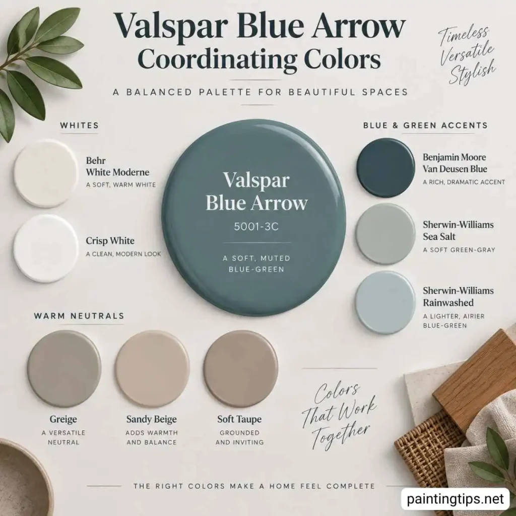
Sherwin-Williams’ Sea Salt is one of the more popular pairings we’ve seen used alongside it, since its green-gray softness echoes Blue Arrow’s undertone without competing with it. And Sherwin-Williams’ Rainwashed rounds things out as a lighter, airier cousin that works well when you want a matching accent a shade or two paler than Blue Arrow itself. This is really the heart of what people mean when they search for valspar blue arrow coordinating colors: it’s less about finding one perfect match and more about knowing which temperature of neutral, or which supporting blue-green, to lean on.
Valspar Blue Arrow Bedroom
Bedrooms are one of the more natural fits for this shade, since the same soft, blue-green undertone that reads as calming in a bathroom does the same job here, just with more room to breathe. Blue Arrow works especially well as a wall color behind the headboard, where it adds depth without making a smaller bedroom feel closed in, and it pairs easily with crisp white or linen-colored bedding for a look that leans restful rather than trendy.
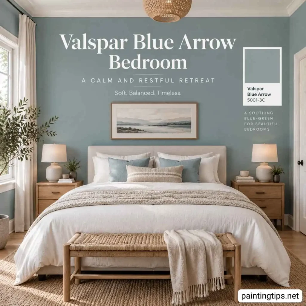
Because the LRV sits in the medium range, it holds up fine in bedrooms with moderate daylight but can read a shade darker in rooms with heavy curtains or limited windows, so a warmer bulb in a bedside lamp helps keep it from feeling flat once the sun goes down. If a bedroom is what you’re planning, it’s worth a look at our guide to the best wall colors for a bedroom before you commit, since Blue Arrow is only one of several muted shades that work well in a space meant for winding down.
Valspar Blue Arrow Kitchen
Kitchens are where this color really gets to show off, especially as a cabinet color. This shade against white countertops, white subway tile, or white upper cabinets creates that classic two-tone kitchen look that’s been popular for a few years now and shows no sign of fading. If you’re weighing Blue Arrow against other cabinet-friendly options, our post on the best wall color for a kitchen with white cabinets is a useful next stop, since much of that same pairing logic applies here.
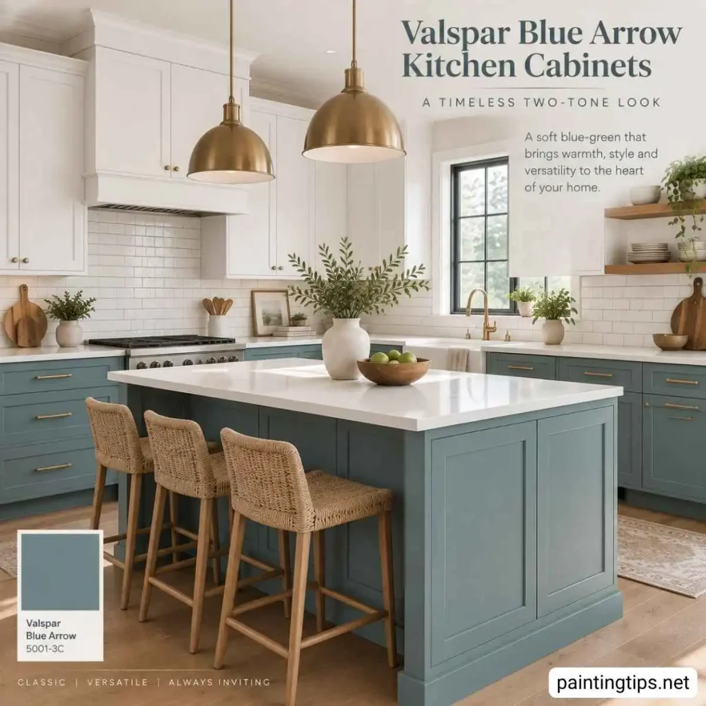
The gray undertone keeps it from feeling too playful or trendy, so it’s the kind of color you can repaint around for years without it ever looking dated. If you’re using it on lower cabinets only, pairing it with white uppers and a warm wood island or open shelving adds contrast without overwhelming the space.
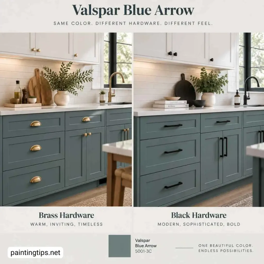
Brass or brushed gold hardware tends to warm the whole look up nicely, while black hardware pushes it in a more modern, moodier direction. On walls rather than cabinets, this color works best in kitchens that already get a good amount of natural light, since it won’t feel heavy the way a darker teal might in a smaller cooking space.
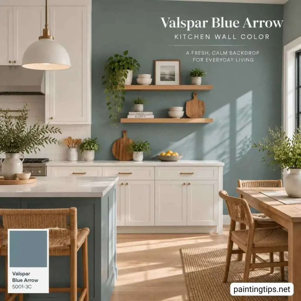
If your kitchen leans darker and you’d rather go a different direction on the walls, our guide to bright colors for kitchen walls rounds up lighter-reflecting shades that solve that specific problem. Otherwise, test Blue Arrow on an accent wall or island first rather than committing to it on every cabinet, since it can pick up more gray in low light than it shows on a sample chip.
Is Valspar Blue Arrow Good for a Living Room?
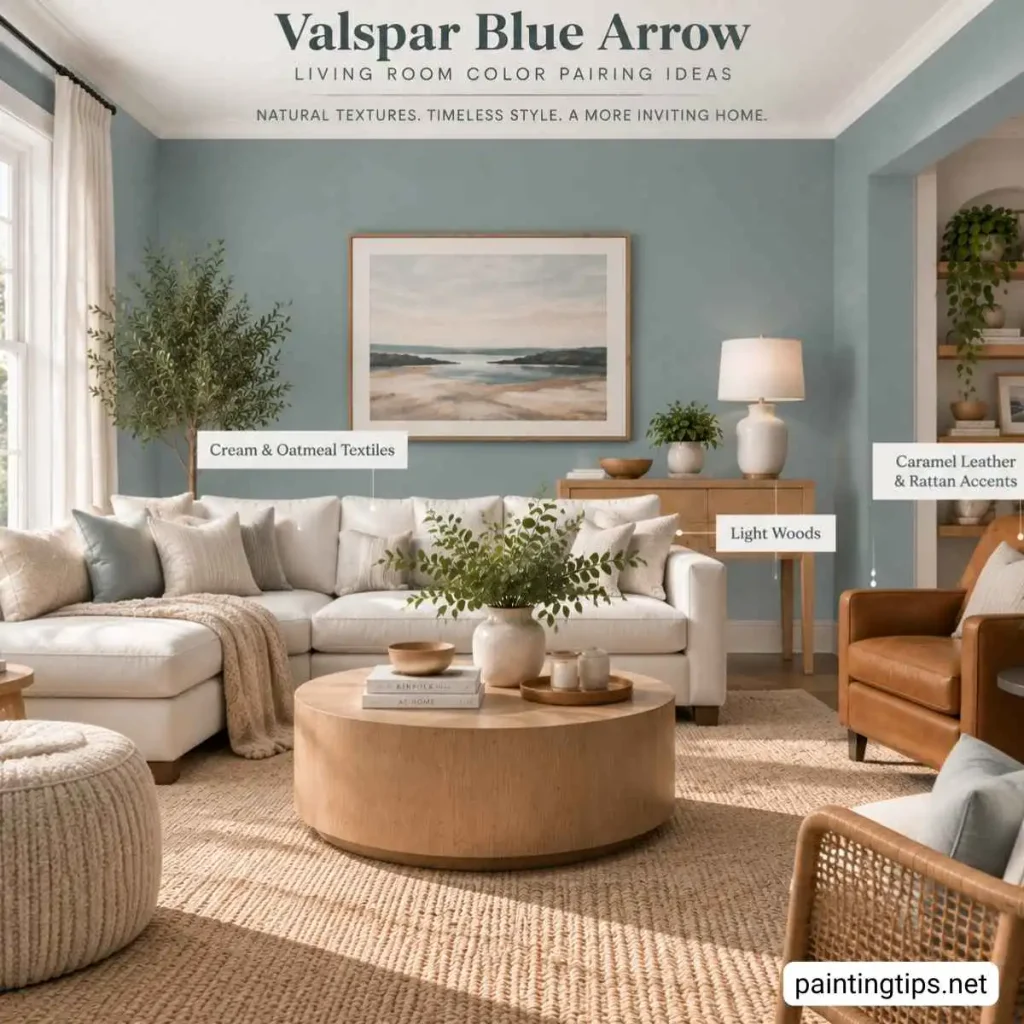
Valspar Blue Arrow can absolutely work in a living room, but the room’s lighting matters more here than in almost any other space in the house. In living rooms that get plenty of natural light throughout the day, this color reads soft, calm, and a little bit coastal — the kind of backdrop that makes a room feel put-together without demanding attention. In rooms with less natural light, especially north-facing rooms or spaces with small windows, it can lean darker and grayer than expected, so we’d lean toward using it on an accent wall rather than all four walls if your living room doesn’t get much sun.
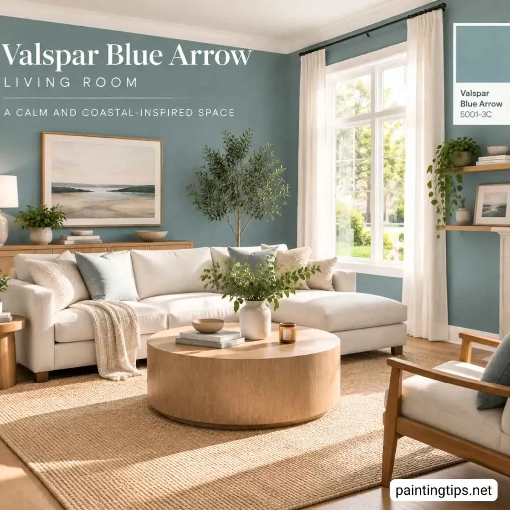
For color pairings, white trim and ceilings keep the room feeling open, while a mix of cream, oatmeal, and soft gray textiles, think a linen sofa or a chunky wool throw, let the wall color stay the star of the show. If you want more contrast, deep navy or charcoal accent pieces, like a pair of accent chairs or a coffee table, add depth without fighting the wall color.
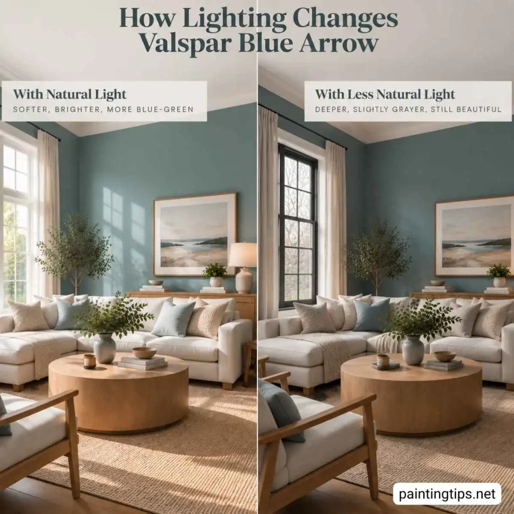
As for furniture, this shade pairs beautifully with light woods like white oak or ash, and it also looks great against a cream or oatmeal-colored sofa, which lets the wall color read as calm rather than cold. If your seating group leans warmer, like a caramel leather sofa or a rattan accent chair, that warmth balances out the cooler undertones in the paint and keeps the whole room feeling inviting rather than sterile.
At the end of the day, Valspar Blue Arrow is proof that the best paint color in the store isn’t always the one everyone’s already heard of.
