North-facing rooms get a different kind of light than the rest of the house, and most paint colors don’t behave the way you’d expect under it. A swatch that looks warm and inviting at the store can turn flat, gray, or even slightly blue once it’s on the wall, because north light stays cool and indirect all day long. Picking a color that actually works in this light comes down to understanding a handful of undertones, finishes, and color codes, not just whatever looks good on a fan deck.

Paint Colors For North Facing Room
For most north-facing rooms, the safest and most reliable choices are colors with warm undertones: soft creams, warm whites, warm grays (often called greige), and muted warm beiges. These tones counteract the cool, blue-gray cast that natural light brings into a room that never gets direct sun, keeping walls from looking washed out or cold. Cool colors aren’t off the table, but they need to be chosen carefully, since a pale blue or green that looks soft and pretty on the chip can read gray and lifeless once it’s rolled onto four walls, especially during the shorter days of winter.
One thing that surprises a lot of homeowners is that bold, saturated colors often work better in north-facing rooms than mid-tone pastels do. Because there’s no direct sunlight to wash out a deep color, shades like navy, charcoal, or forest green hold their richness throughout the day instead of looking patchy or uneven. Meanwhile, a color sitting right in the middle of the value scale, not quite light and not quite dark, is the one most likely to look muddy or indecisive in this kind of light.
When we’re choosing paint for a north-facing room, we also pay close attention to the Light Reflectance Value (LRV) printed on the back of most paint chips. Colors with an LRV above 60 generally stay bright and livable even on overcast days, while anything in the 30s and 40s should be tested on the actual wall, preferably on more than one wall, before committing to a full room.
Best Sherwin-Williams Colors for North-Facing Rooms
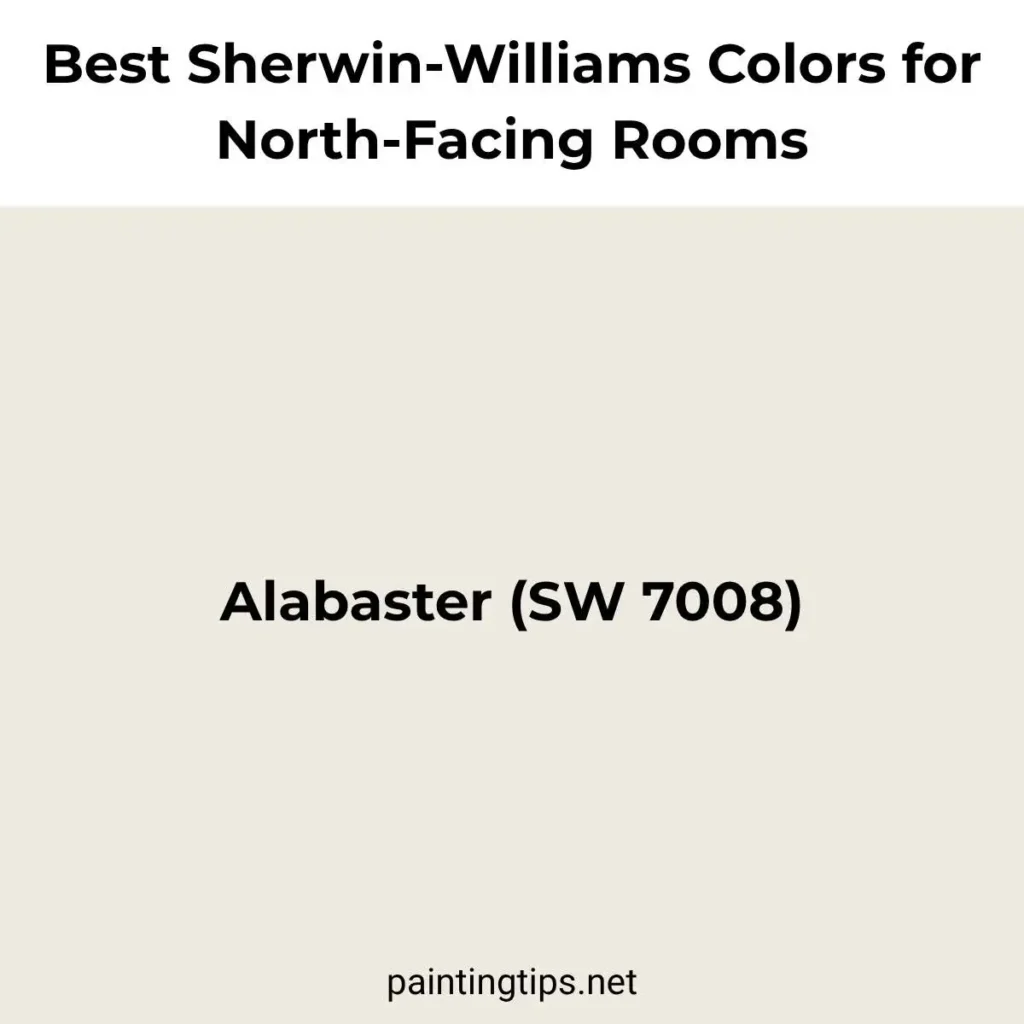
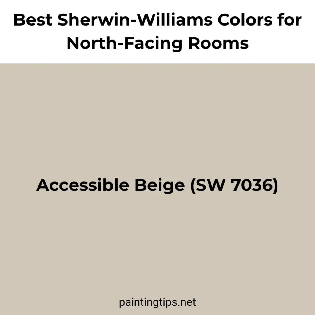
Sherwin-Williams has a deep bench of colors that hold up well in cool, indirect light, and a few of them show up again and again in north-facing rooms we’ve worked on. Alabaster (SW 7008) is probably the most popular warm white in the entire Sherwin-Williams lineup, and for good reason: it has just enough cream in it to stay warm without tipping into yellow, which makes it a safe wall color for almost any north-facing space. Accessible Beige (SW 7036) is another favorite, a soft greige that leans warm enough to keep a room feeling cozy rather than gray, and it’s often the color we reach for specifically because a room faces north and needs that extra bit of warmth.
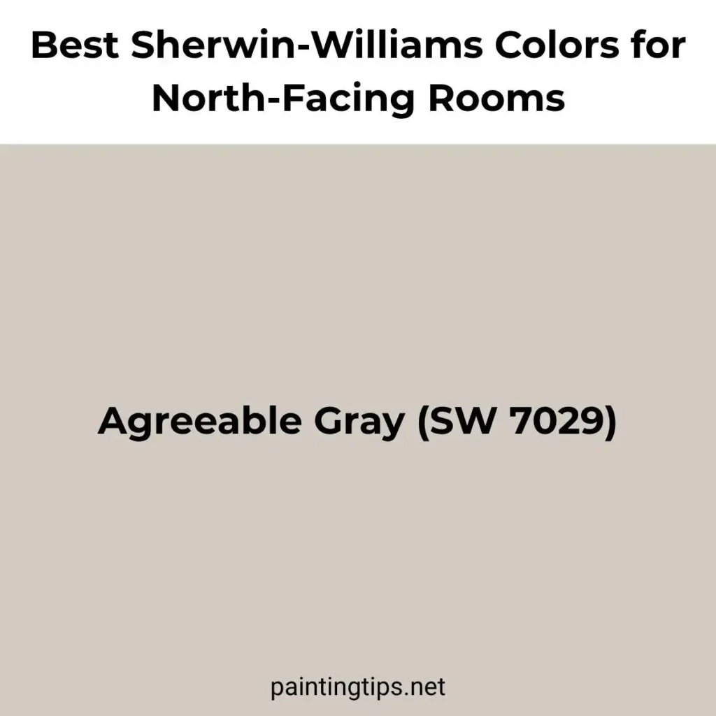
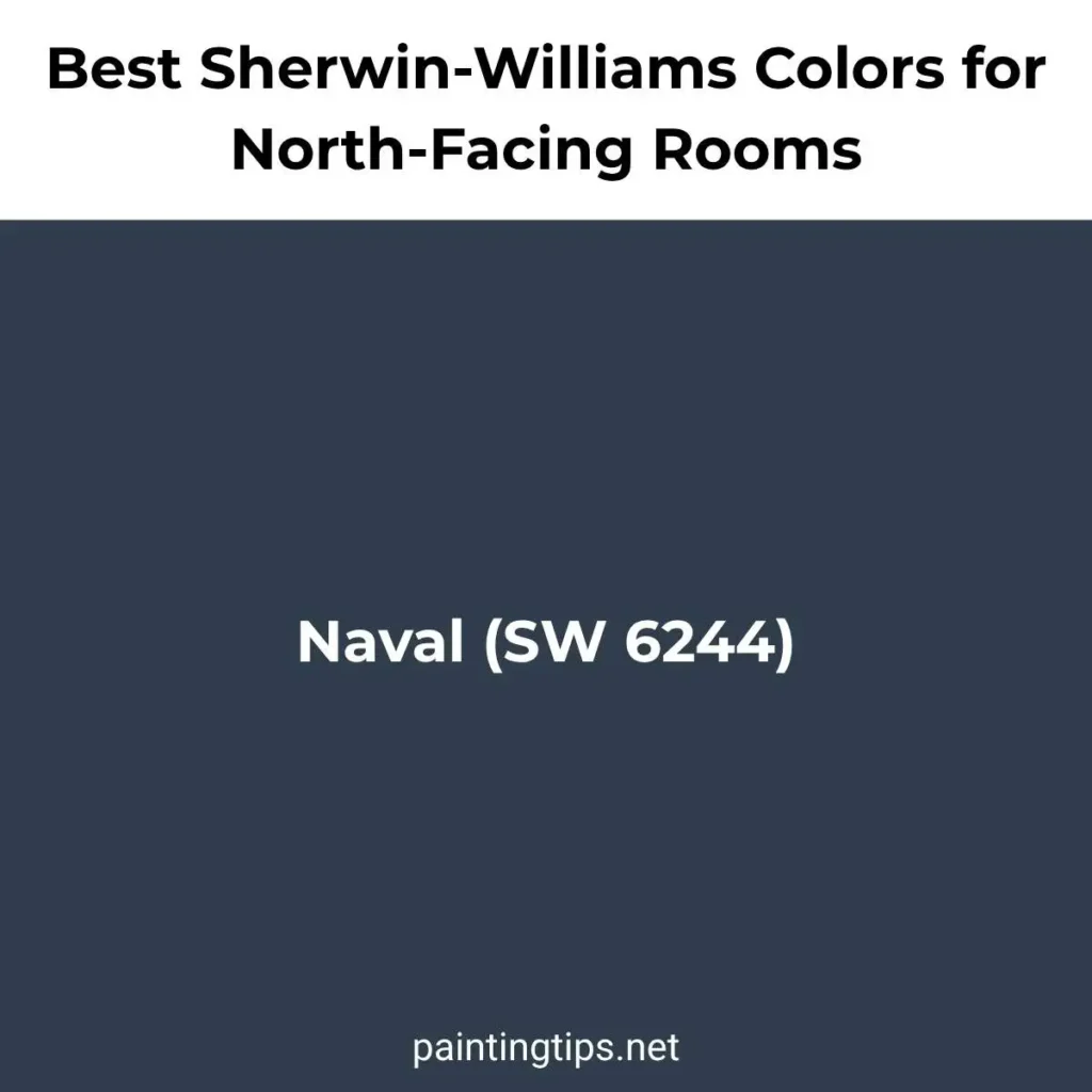
For rooms that need a little more depth, Agreeable Gray (SW 7029) is a warm-leaning gray that’s become something of an industry standard, and it tends to avoid the cold, slightly blue-gray look that pure grays often pick up in north light. And if the room can handle a bolder statement, a home office, a powder room, or an accent wall, Naval (SW 6244) is a deep navy that stays rich and saturated all day instead of looking flat, which is exactly the kind of color that benefits from a room with no harsh direct sun.
Best Benjamin Moore Paint Colors for North-Facing Rooms
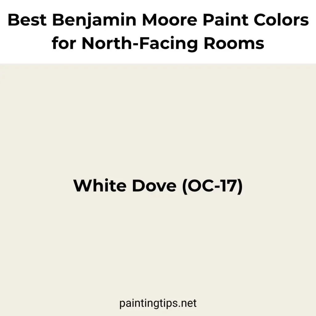
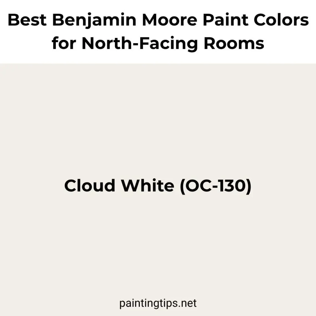
Benjamin Moore’s most reliable colors for north-facing rooms tend to be the ones with a noticeably warm base, since the brand’s whites and grays can otherwise lean cool. White Dove (OC-17) is the one we reach for most often. It’s a soft, warm white that reads almost like a pale cream rather than a stark white, which keeps north-facing walls from feeling sterile. Cloud White (OC-130) is a close cousin with a touch more warmth, and it works well in rooms with white trim where you want everything to blend rather than contrast.
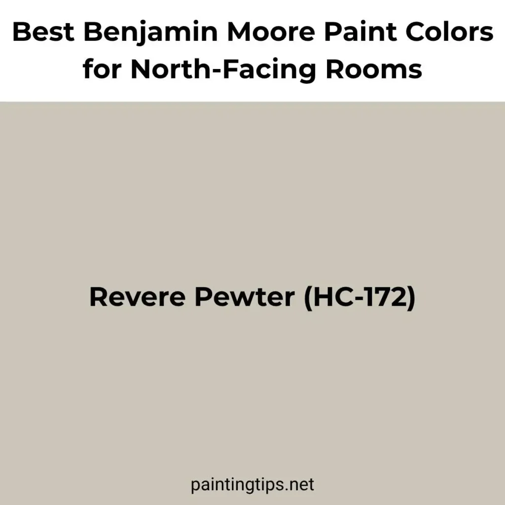
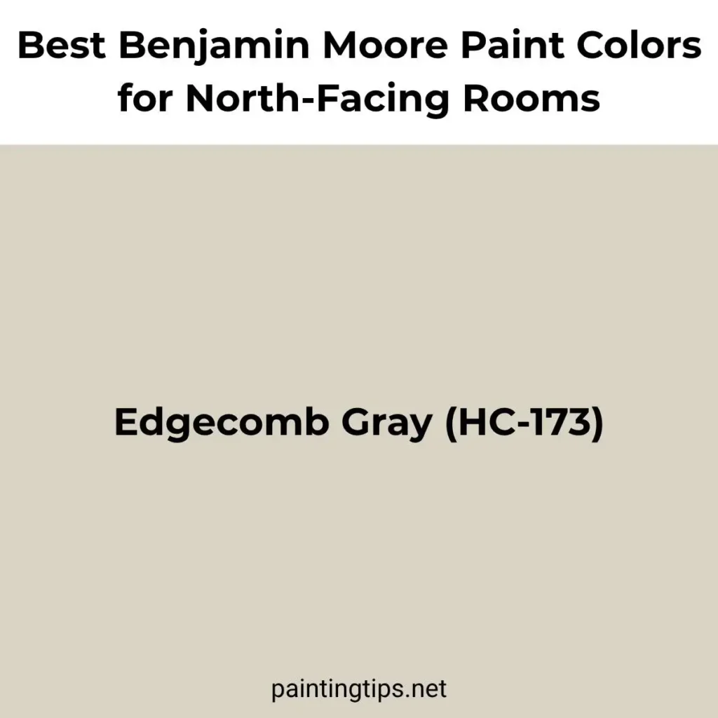
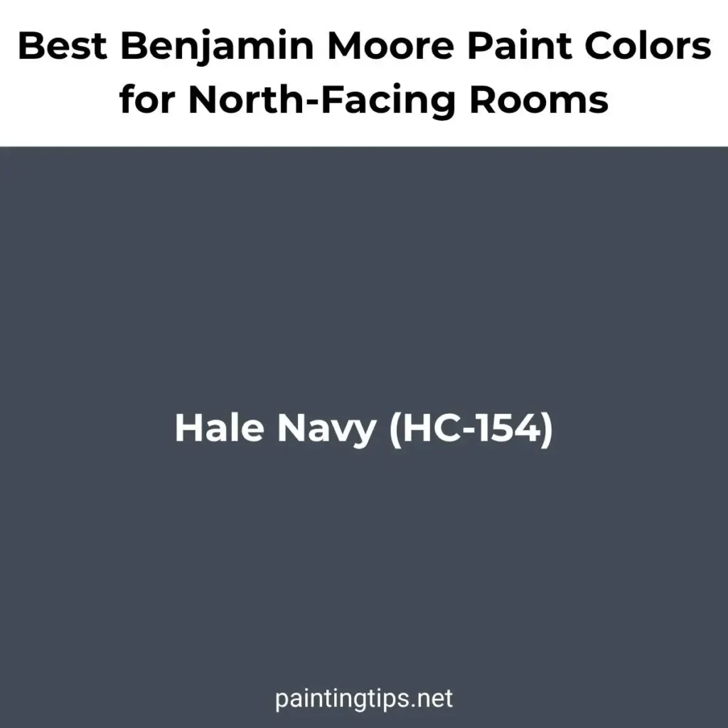
For a warm gray that doesn’t drift toward blue, Revere Pewter (HC-172) remains one of the most dependable greiges on the market, shifting gently between gray, beige, and taupe depending on the light in the room. Edgecomb Gray (HC-173) is a lighter alternative in the same family, often described as a greige that leans more toward beige. And for a north-facing room that can take a strong, saturated color, think a study or a dining room, Hale Navy (HC-154) is a classic deep blue that keeps its richness even on gray days, instead of turning muddy the way a mid-tone blue might.
Best Behr Paint Colors for North-Facing Rooms
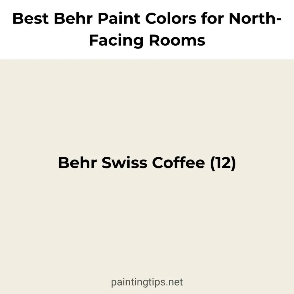
Behr’s color library includes several warm neutrals that translate well to north-facing walls, along with a couple of bolder options for rooms that can handle more saturation. Swiss Coffee is one of Behr’s most popular near-whites, with enough warmth to keep it from looking gray, which makes it a dependable choice for trim, ceilings, or full walls in a room with limited direct light. Silky White (PPU7-12) is another warm off-white worth considering, often used as a slightly cooler companion alongside Swiss Coffee in the same room.
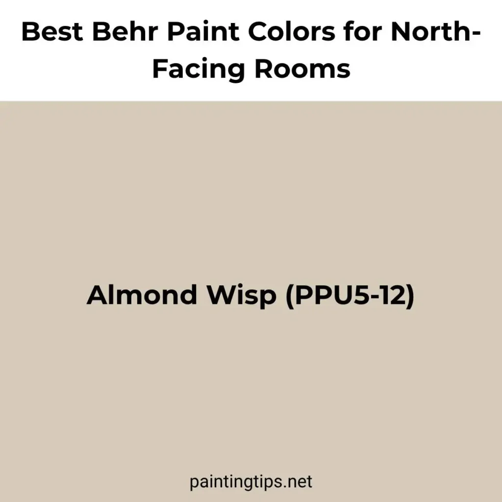
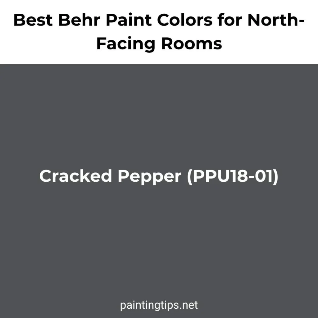
Almond Wisp (PPU5-12) is a soft, warm beige that works well as a deeper alternative when a room needs more coziness than a pure white can provide, particularly in bedrooms and hallways. For a bolder option, Cracked Pepper (PPU18-01) is a deep charcoal with a muted, almost graphite undertone that performs well in north-facing rooms because its depth keeps it from looking gray or washed out, even without direct sunlight hitting the walls. As with any deep color, we’d recommend testing a large sample first, since colors like this can shift noticeably between a small chip and a full wall.
Best Paint Colors for North-Facing Rooms With Low Light
Rooms that face north and also have small windows, deep overhangs, or nearby trees blocking light need an extra layer of consideration, because the available light is both cool and limited. In these spaces, we generally suggest one of two directions, and very little in between. The first is to lean into brightness with a high-LRV warm white or cream, something like Alabaster, White Dove, or Swiss Coffee, applied in an eggshell or satin finish rather than flat, since the slight sheen helps bounce what little light is available back into the room.
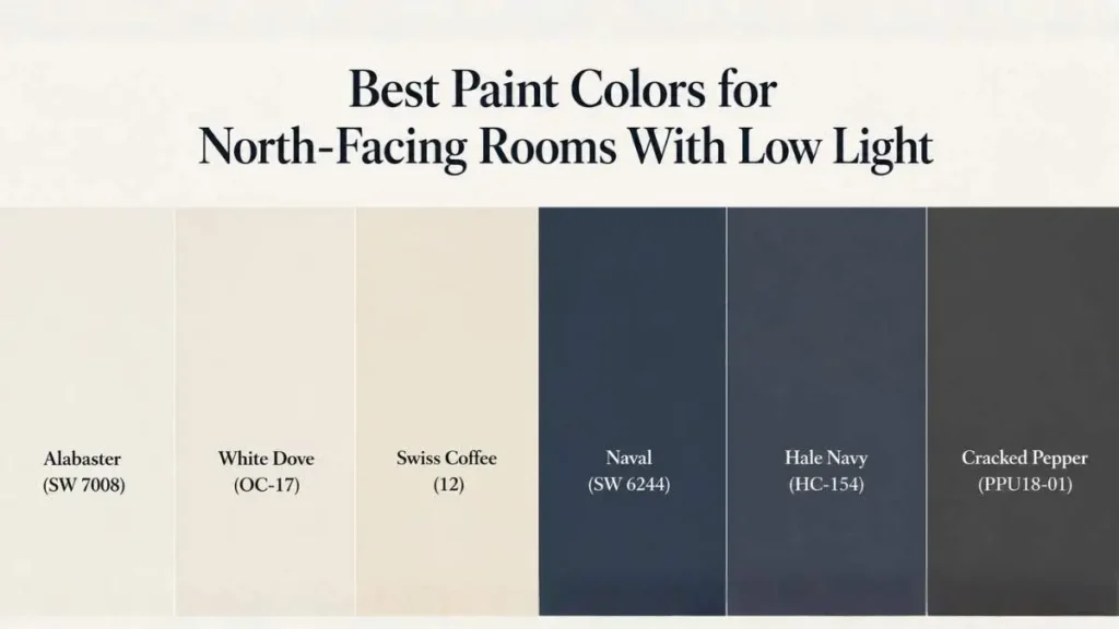
The second approach is to stop fighting the lack of light altogether and choose a deep, saturated color instead. A color like Naval, Hale Navy, or Cracked Pepper won’t look brighter just because it’s lighter in value; a medium-tone color in a dim north-facing room often ends up looking gray and undefined, while a confidently dark wall reads as intentional. We’ve seen this play out often in small home offices and powder rooms: a pale gray-blue looks dull and uninspired, while the same wall painted in a deep navy feels cozy and well-designed, even though less light is bouncing around the room.
Best Blue Paints for North-Facing Room
Blue is one of the trickier colors to get right in a north-facing room, since the cool, indirect light tends to pull blue tones toward gray rather than letting them stay soft and clear. The blues that hold up best are the ones with a warm or green undertone built in, rather than a pure or violet-leaning blue. Sherwin-Williams Rainwashed (SW 6211) is a soft blue-green that keeps a gentle, livable quality in north light rather than turning cold. Benjamin Moore Wedgewood Gray (HC-146) is another good option, a muted blue-gray that reads as calm and collected rather than icy.
For a bolder statement, Benjamin Moore Van Deusen Blue (HC-156) works well as a deep accent color, since its saturation keeps it from looking flat even without direct sun, and the same is true of Hale Navy if a near-black blue feels too dramatic. A bright, clear sky blue, on the other hand, is one of the riskier choices for a true north-facing room. It can look beautiful on the chip and surprisingly dull once it covers four walls.
Best Warm White for North-Facing Room
A genuinely warm white needs to have a visible amount of yellow, cream, or beige mixed into the base, otherwise it will lean gray the moment it’s exposed to cool north light. Sherwin-Williams Creamy (SW 7012) lives up to its name, with a soft butter undertone that keeps walls feeling warm without looking dated. Benjamin Moore White Dove (OC-17) belongs in this category too, since its warmth comes through clearly compared to brighter, cooler whites.
Behr Swiss Coffee rounds out the group nicely, a long-time favorite for exactly this reason: it reads as an off-white with a gentle warmth that holds up in rooms with little to no direct sun. All three of these work especially well when paired with warm wood tones, brass or gold fixtures, and natural fiber textures, which reinforce the warmth the paint color is already providing.
Best Paint Color for North-Facing Living Room
Living rooms tend to get more use throughout the day than any other room in the house, which makes the cool cast of north light especially noticeable, and especially worth planning around. For a warm, welcoming living room, Sherwin-Williams Accessible Beige (SW 7036) is a dependable greige that brings warmth without feeling dated, and it pairs easily with both wood and white trim. Benjamin Moore Revere Pewter (HC-172) is another strong option, especially in homes with a more traditional or transitional style.
For a living room with good-sized windows and a desire for something more dramatic, a deeper color like Sherwin-Williams Cavern Clay (SW 7701) can work surprisingly well, bringing a warm, earthy richness that north light won’t wash out the way it might in a brighter room. As with any north-facing space, we’d recommend sampling these colors on at least two different walls, since the way light moves through a living room over the course of a day can change how a color reads from one wall to the next.
Paint Colors for Northwest-Facing Rooms
Northwest-facing rooms sit in a slightly different category than true north-facing ones, because they pick up some warm, low-angle light in the late afternoon and evening, especially during the summer months. This extra bit of warm light gives northwest rooms a little more flexibility than a true north room would have, particularly with cooler colors. Sherwin-Williams Sea Salt (SW 6204) is a soft green-gray that can look slightly cool earlier in the day and then shift to something warmer and more inviting as afternoon light comes in.
Benjamin Moore Gray Owl (OC-52) is another color that benefits from this shift, staying soft and neutral for most of the day before picking up a gentle warmth in the evening. That said, the warm-undertone colors recommended for true north-facing rooms, like Alabaster, White Dove, or Accessible Beige, will still work well in a northwest room, and tend to be the safer choice if the room doesn’t get much late-day sun due to nearby trees or buildings.
Best White Paint Color for North-Facing Room
If we had to pick just one white for a north-facing room, it would be Sherwin-Williams Alabaster (SW 7008). It strikes a balance that’s hard to find in a true white: warm enough to avoid looking gray or clinical, but neutral enough that it doesn’t read as overtly cream or yellow, even in rooms with little direct light. It works as well in a kitchen or bathroom as it does in a bedroom or living room, which is part of why it’s become such a popular choice across the country.
Benjamin Moore White Dove (OC-17) and Behr Swiss Coffee are both excellent alternatives if Alabaster isn’t available through your preferred retailer, and all three share the same basic quality: a warm undertone that keeps the color from going flat under cool, indirect light. Whichever of these you choose, an eggshell or satin finish will help reflect a bit more light back into the room than a flat finish would.
Best Beige for North-Facing Room
Beige has fallen out of fashion in some circles, but in a north-facing room, a well-chosen beige can do more for the overall warmth of the space than almost any other color category. Benjamin Moore Edgecomb Gray (HC-173) is technically marketed as a greige, but it leans warm enough to function as a beige in most lighting conditions, and it pairs beautifully with both warm and cool-toned furnishings. Sherwin-Williams Accessible Beige (SW 7036) is a slightly deeper option with the same warm, grounding quality.
Behr Almond Wisp (PPU5-12) rounds out the group as a soft, warm beige that works particularly well in bedrooms and hallways. The common thread across all three is a visible amount of warmth in the undertone. None of these colors will surprise you by turning gray or pink once they’re on the wall, which is exactly what you want to avoid in a room that doesn’t get direct sun.
Best Greige for North-Facing Room
Greige, that in-between blend of gray and beige, is one of the most popular color categories for north-facing rooms, but it’s also one where undertones matter the most. Sherwin-Williams Agreeable Gray (SW 7029) is one of the most popular greiges on the market for a reason: it leans warm enough to avoid the cold, almost lavender cast that some gray-based colors pick up in north light. Benjamin Moore Revere Pewter (HC-172) is another long-standing favorite, with a similar warmth that shifts gently between gray and taupe depending on the room.
Sherwin-Williams Repose Gray (SW 7015) is a slightly cooler greige that still works in most north-facing rooms, though it can lean a touch more gray on overcast days compared to Agreeable Gray. If a room is going to get very little natural light overall, we’d generally steer toward the warmer end of the greige spectrum, Agreeable Gray or Revere Pewter, rather than anything closer to true gray.
Best Off-White for North-Facing Room
Off-white sits in the space between a true white and a pale neutral, and it’s one of the most forgiving categories for a north-facing room because it has just enough color in it to avoid looking sterile, without committing to a full beige or cream. Sherwin-Williams Dover White (SW 6385) is a classic example, a soft, warm off-white that’s been a popular trim and wall color for years. Benjamin Moore Linen White (OC-146) offers a similar feel with a slightly more pronounced cream undertone.
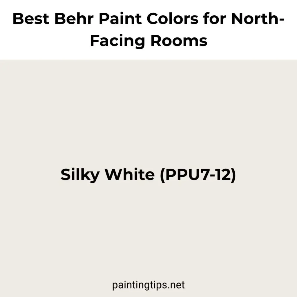
Behr Silky White (PPU7-12) is a good option from that brand’s lineup, with enough warmth to keep it from reading as a plain white. All three of these work especially well in rooms where the walls and trim are painted in closely related tones, since the subtle warmth in each color helps tie everything together without creating obvious contrast.
Best Gray for North-Facing Room
True gray is the color most likely to go wrong in a north-facing room, because cool light tends to pull gray toward blue or purple, especially on overcast days. That said, a warm-leaning gray can still work beautifully. Sherwin-Williams Repose Gray (SW 7015) is one of the most popular grays on the market specifically because it stays on the warm side of the gray spectrum, avoiding the cold, almost lavender look that some grays develop in north light. Benjamin Moore Gray Owl (OC-52) is another dependable option, a soft, light gray with enough warmth to keep it from feeling flat.
For a slightly deeper, more grounded gray, Behr Greyhound (PPU24-21) is a warm-leaning medium gray that holds its tone well without sliding into the cold, bluish territory that catches a lot of homeowners off guard. We’d still recommend testing any of these on the actual wall first, and pairing them with warm-toned furniture, rugs, and lighting to keep the room from feeling cold.
Best Green Paint for North-Facing Room
Green is one of the more forgiving colors for north-facing rooms, as long as it leans toward a muted, earthy tone rather than a bright or true green. Sherwin-Williams Evergreen Fog (SW 9130) has become one of the most popular greens in the country over the past few years, and part of its appeal is exactly this quality: it reads as a soft, grayed-out green that doesn’t shift dramatically under different lighting. Benjamin Moore October Mist (OC-66) is a similarly soft, sage-leaning green that works well in both traditional and modern spaces.
Both of these colors sit in the mid-range on the LRV scale, which means they hold their color without looking either washed out or murky in a room that never gets direct sun. For an accent wall, built-in cabinetry, or a smaller room like a powder room or home office, either of these greens can carry a surprising amount of richness, especially next to a warm white trim like Alabaster or White Dove.
Best Neutral Paint Colors for North-Facing Rooms
If there’s one theme that runs through almost every recommendation in this guide, it’s that warmth is the deciding factor for a north-facing room, and that holds especially true for neutrals. Sherwin-Williams Alabaster (SW 7008) and Benjamin Moore White Dove (OC-17) cover the lighter end of the spectrum, while Benjamin Moore Revere Pewter (HC-172) and Behr Almond Wisp (PPU5-12) handle the deeper end with the same warm undertone.
Used together, say, Alabaster on the walls with Revere Pewter on a fireplace surround, or White Dove paired with Almond Wisp in an open floor plan, these colors create a cohesive, warm neutral palette that responds well to the cool, even light a north-facing room receives throughout the day, no matter the season.
Paint Colors for Dark North-Facing Rooms
A room can face north and still be considerably darker than another north-facing room down the hall, depending on window size, ceiling height, and what’s blocking the view outside. For these especially dark spaces, the usual rules still apply, but with less margin for error. A high-LRV warm white like Alabaster or White Dove, used in an eggshell or satin finish, will do the most to keep the room from feeling gloomy, since these finishes reflect more of the available light than a flat finish would.
Alternatively, a confidently dark color, Sherwin-Williams Naval, Benjamin Moore Hale Navy, or Behr Cracked Pepper, can turn a dim room into one that feels intentionally cozy rather than simply underlit. The one combination we’d steer away from is a mid-tone color with a cool undertone, since that’s the pairing most likely to leave a dark north-facing room looking gray, dull, and a little unfinished, no matter what’s done with lighting or furniture.