Choosing between Benjamin Moore Pale Oak vs Edgecomb Gray feels simple — until you’re holding both chips and realize they look almost identical. On a chip, they’re close. On your walls, they can feel like completely different rooms. This guide breaks down exactly how they differ, room by room and lighting condition by lighting condition, so you can make the right call before you open a single can of paint.
Edgecomb Gray vs Pale Oak
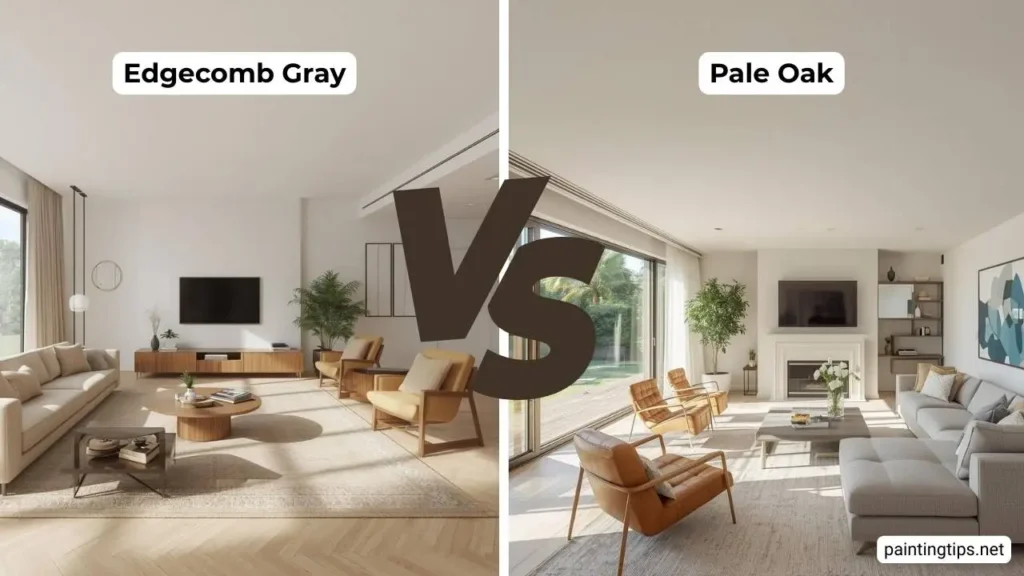
Before you compare them, you need to understand what each color really is. Pale Oak (OC-20) sits in Benjamin Moore’s Off-White collection. It’s a soft, warm greige with an LRV (Light Reflectance Value) of approximately 69, meaning it reflects a generous amount of light and reads fairly bright in most rooms. Its undertones lean toward pink and taupe — which gives it a quiet, creamy warmth that many people describe as feeling almost luminous in the right light. It’s lighter and airier than most true greiges, which is exactly why it became such a go-to for people who want warmth without weight.
Edgecomb Gray (HC-173) comes from Benjamin Moore’s Historical Collection and is a true greige — sitting right at the intersection of gray and beige, with yellow-leaning undertones and an LRV of approximately 63 to 64. That lower LRV gives it more visual depth and dimension than Pale Oak. It reads warmer and earthier in most conditions, and it has a slightly more grounded, designer quality that makes it feel sophisticated without trying too hard. Both are light. Both are neutral. Both are genuinely beautiful. The question is always which one belongs in your specific room.
What Is the Difference Between Pale Oak and Edgecomb Gray?
The core differences come down to undertone, depth, warmth, and how each color behaves when the light changes throughout the day.
Undertone is where people most often get surprised. Pale Oak’s primary undertones are pink and taupe — cooler and slightly more complex than you’d expect from something in the “off-white” family. Edgecomb Gray pulls warm yellow-beige, which puts it firmly in warmer, earthier territory. When you hold large swatches of each next to each other in natural daylight, Edgecomb Gray will look noticeably warmer and more vibrant, while Pale Oak will look lighter and slightly cooler — even though its undertone is technically pink. This surprises a lot of people.
Depth and LRV: With an LRV roughly 6 points lower than Pale Oak, Edgecomb Gray carries more visual weight. In a sun-drenched room, this depth is an asset — it keeps the walls from washing out. In a low-light room, it can trend heavier and more muted than Pale Oak would.
Warmth: Edgecomb Gray is the warmer of the two in most conditions, despite what the name implies. Its yellow base gives it a cozy, enveloping quality. Pale Oak’s warmth is softer and more ethereal — inviting without being heavy.
Lighting behavior: Pale Oak is relatively stable — it stays soft and creamy in most conditions, though it can pull slightly gray or lavender in very cool north-facing light. Edgecomb Gray is more of a chameleon: warm and beige-dominant in afternoon sun, and more taupe-gray in indirect or overcast conditions. Neither is a flaw — but both are things you need to account for before you commit.
Is Pale Oak Warmer Than Edgecomb Gray?
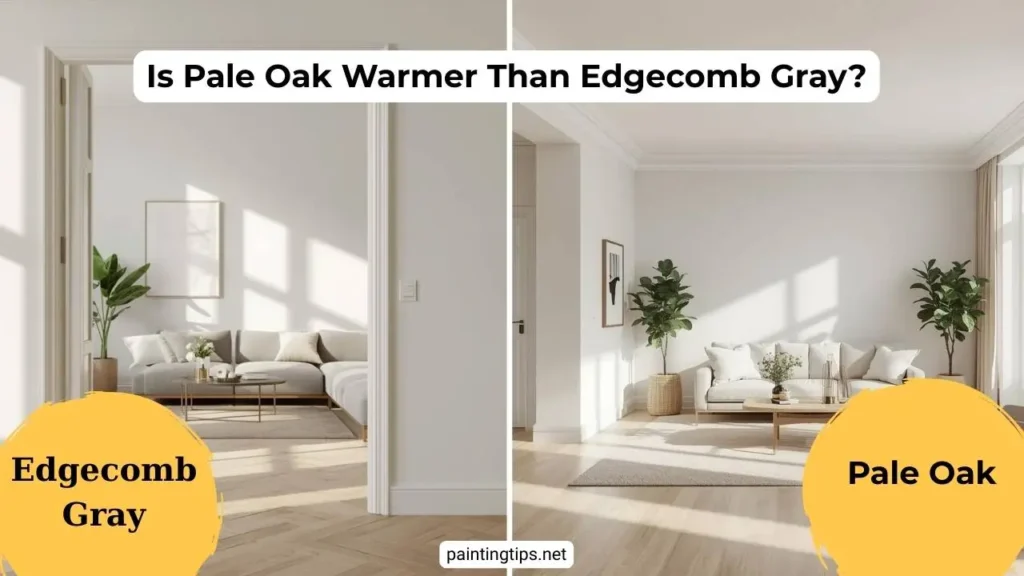
This is one of the most common misconceptions about these two colors, and it’s worth addressing directly. Most people assume Pale Oak is the warmer one — partly because of its pink undertone and partly because the word “oak” implies warmth. But in practice, Edgecomb Gray typically reads warmer on the wall. Its yellow-beige undertone is more assertive and vibrant than Pale Oak’s softer, more muted warmth.
The clearest way to see this: put large swatches of both on the same wall and look at them in late afternoon sunlight. Edgecomb Gray will almost certainly look more golden and alive. Pale Oak will look softer, lighter, and slightly cooler by comparison.
The exception is in rooms with cool artificial lighting or north-facing exposure, where Pale Oak’s pink undertone can actually make it feel warmer than Edgecomb Gray, which may read as more neutral-gray in those conditions.
Does Edgecomb Gray Look Gray or Beige?
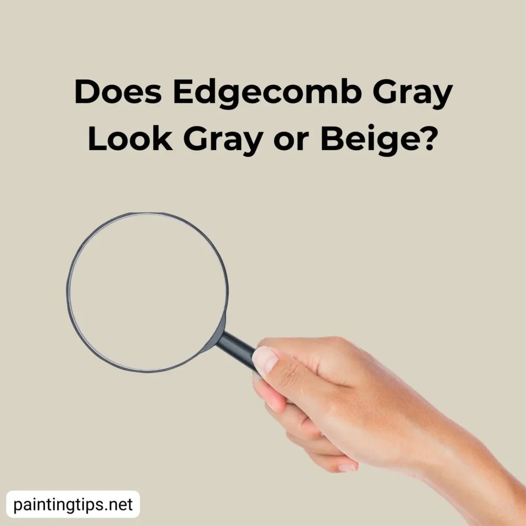
This question gets searched constantly — and the honest answer is that it depends on your room. In warm, sunlit spaces with south or west exposure, Edgecomb Gray reads firmly as a soft, warm beige. It looks grounded and inviting without any hint of cold. In north-facing rooms or spaces with cool artificial lighting, the gray side becomes more prominent, and it can shift toward a muted taupe or even a soft greige that leans slightly purple.
The key thing to understand is that Edgecomb Gray is specifically designed to live between gray and beige — and it genuinely does. The proportions shift based on your light source, your flooring, and the other colors around it. If your space has warm wood tones and cream trim, it will read more beige. If you have cool whites, marble, or chrome finishes, it will pull grayer. This adaptability is exactly what makes it such a popular designer choice. It responds to its environment rather than dominating it.
Does Pale Oak Have Pink Undertones?
Yes — and this is the single most important thing to understand about Pale Oak before you put it on your walls. In certain lighting conditions, particularly in north-facing rooms or under cool LED lighting, Pale Oak can reveal a noticeable pink or faint violet undertone. How much it shows depends heavily on what’s around it. If your flooring, upholstery, or countertops already have warm pink or peachy tones, Pale Oak will amplify that significantly. If your space is full of greens, blues, and cooler neutrals, the pink stays quiet and the color reads more as a clean warm gray.
The pink undertone is not a flaw — it’s actually what gives Pale Oak its softness and depth. But it’s also why some people end up with a result that feels unexpectedly rosy. The fix is always the same: test a large swatch on your actual wall, look at it at different times of day and under your artificial lighting, and pay attention to whether the pink bothers you in the evening when lamps are on. That’s when it tends to come forward the most.
Pale Oak vs Edgecomb Gray: Which Is Better for North-Facing Rooms?
North-facing rooms are the most challenging condition for these two colors, and the choice here is more consequential than it is in a well-lit space.
Pale Oak in a north-facing room can pull noticeably toward lavender or soft gray — especially under cool LED bulbs. It won’t look terrible, but it may not deliver the warm, creamy neutral you were expecting from a chip.
Edgecomb Gray in a north-facing room tends to hold onto more of its warm beige quality, largely because its yellow undertone has more resistance against cool light. It won’t turn gray the way a true cool neutral might, but it will look more muted and less vibrant than it does in good light.
For most north-facing rooms, Pale Oak is actually the safer choice — not because it performs better in cool light, but because its higher LRV keeps the room feeling brighter overall. Brightness matters more than undertone accuracy in low-light spaces. That said, switching your bulbs to warm white LEDs in the 2700K–3000K range will help both colors dramatically, and may be the most important decision you make before even picking a paint color.
Pale Oak vs Edgecomb Gray in the Kitchen
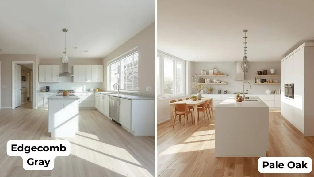
Kitchens are where paint color faces its toughest test, competing with cabinets, countertops, backsplash, and appliances simultaneously. Pale Oak in the kitchen is a natural fit alongside white shaker cabinets and light marble or quartz countertops. It creates a clean, airy look that feels modern without being cold. It’s also an excellent choice for kitchen cabinets themselves — particularly upper cabinets in a two-tone kitchen, where it reads as a soft warm white that’s more interesting than a true white but lighter and fresher than a full greige.
Edgecomb Gray in the kitchen suits more traditional, transitional, and farmhouse-style spaces. Paired with white cabinets and wood floors, it creates a warm, layered look that feels genuinely timeless. It’s particularly effective at visually modernizing orange-toned oak floors and older wood cabinetry — it provides just enough cool contrast to contemporize the space without clashing.
One important note for either color: paint colors on kitchen walls behave differently than they do in living rooms. The reflections from cabinetry, countertops, and tile will all influence how the wall color reads. Always sample directly on the wall in the kitchen itself, not in an adjacent room.
Pale Oak vs Edgecomb Gray in the Bedroom
Bedrooms are where both of these neutrals feel genuinely at home — but they create distinctly different moods. Pale Oak makes bedrooms feel peaceful, airy, and softly romantic. It pairs naturally with light linen bedding, warm wood nightstands, brass hardware, and layered neutral textiles. The subtle pink undertone adds a quiet femininity that works beautifully in a master bedroom without feeling overtly themed. For smaller bedrooms, Pale Oak’s higher LRV also keeps the space from feeling cramped.
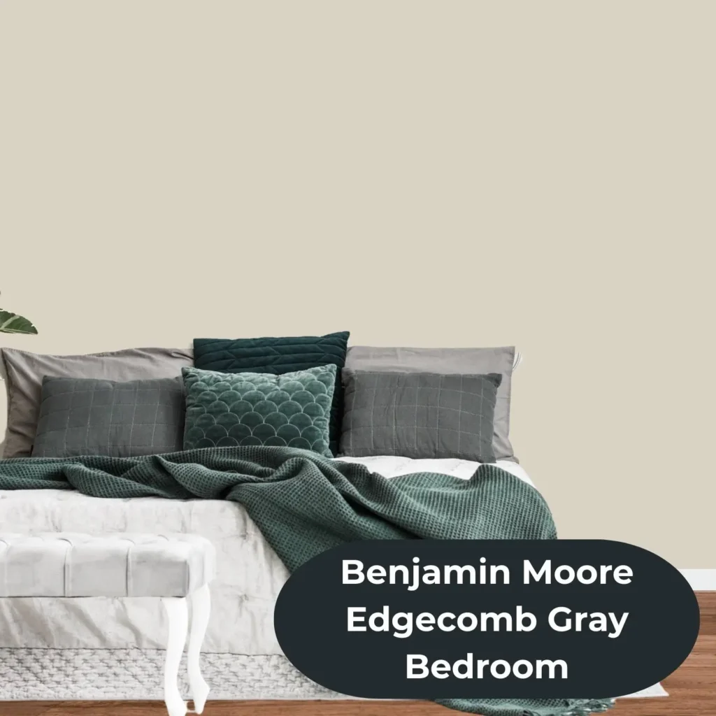
Edgecomb Gray creates a moodier, more grounded bedroom. It feels cozier and more enveloping — the kind of room you sink into rather than float through. It pairs well with heavier textures, darker wood tones, and richer accent colors. If you want a bedroom that reads as a true retreat rather than a light, breezy sanctuary, Edgecomb Gray has the advantage.
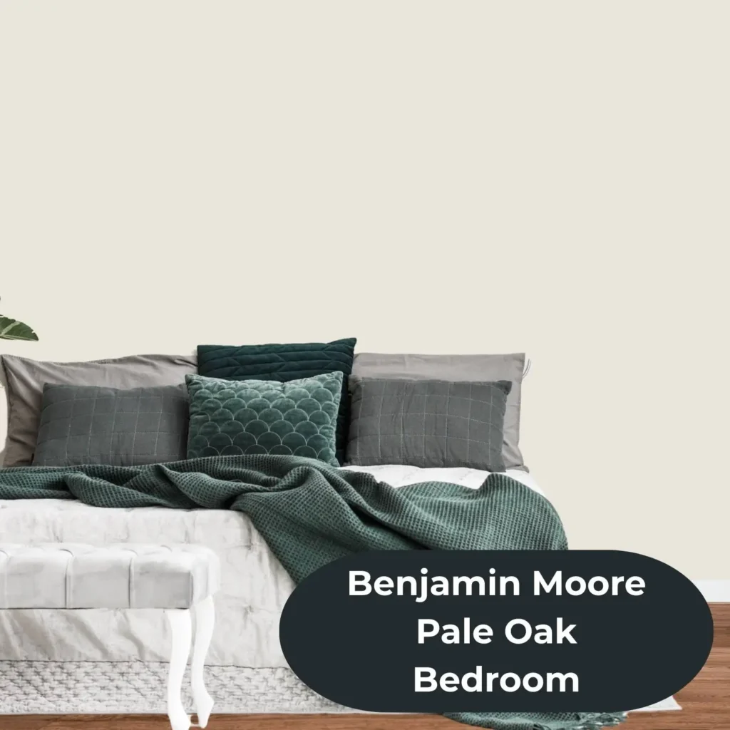
For nurseries and children’s rooms, both are excellent gender-neutral options. Edgecomb Gray in particular has been praised as a nursery color that ages beautifully — it works with virtually any accent palette and doesn’t feel babyish as the child grows.
Pale Oak vs Edgecomb Gray for Cabinets
This is a specific use case that deserves its own attention, because paint on cabinets behaves differently than paint on walls. Pale Oak on cabinets reads as a soft, warm off-white — lighter and cleaner than you might expect from its chip. It’s a beautiful alternative to stark white for people who want warmth without the weight of a full greige. It works especially well on kitchen island cabinets paired with white perimeter cabinets, creating a subtle two-tone effect that feels intentional and fresh.
Edgecomb Gray on cabinets tends to look lighter and warmer than on walls, because the finish on cabinet-grade paint reflects light differently than a flat wall finish. On cabinets, it can read almost like a warm putty or light taupe. It’s a popular choice for bathroom vanities and for kitchen cabinets in spaces where you want something more interesting than white but don’t want to commit to a full color.
In both cases: always sample on an actual cabinet door or drawer front, and look at it under both natural and artificial lighting before committing. The difference between what a color looks like on a chip and what it looks like on a painted cabinet surface can be significant.
What Trim Color Goes Best With Pale Oak and Edgecomb Gray?
Trim color can make or break either of these neutrals — and the right choice is not always obvious. With Pale Oak: Benjamin Moore White Dove (OC-17) is the most harmonious pairing. Its own warm undertones complement Pale Oak’s pink base without creating a jarring contrast. Cloud White is another excellent option for a slightly airier, less creamy look. If you want a crisper, higher-contrast effect, Chantilly Lace (OC-65) works, but it can occasionally amplify Pale Oak’s pink undertone by comparison — so test it in your specific space before committing.
With Edgecomb Gray: White Dove and Simply White (OC-17) are the most popular choices, and for good reason — both have enough warmth to complement Edgecomb Gray’s yellow-beige base without clashing. Avoid very stark, cool whites like Decorator’s White on trim with Edgecomb Gray; the contrast can make the wall color look more gray and flat than it should. Benjamin Moore officially coordinates Edgecomb Gray with White Heron, Dove Wing, and Pashmina for a complete room palette.
The general rule for both colors: warm off-white trim will always be more harmonious than bright, cool white trim. Save Chantilly Lace for wall colors with a cooler base.
Pale Oak vs Edgecomb Gray vs Agreeable Gray: How Do They Compare?
This three-way comparison comes up constantly because Sherwin-Williams Agreeable Gray (SW 7029) is arguably the closest equivalent to Edgecomb Gray in another brand’s lineup.
Agreeable Gray is slightly darker (LRV around 60) and a bit cooler than Edgecomb Gray. Its undertones lean more gray-beige compared to Edgecomb Gray’s warmer, yellower base. In side-by-side testing, Edgecomb Gray almost always reads warmer and more vibrant than Agreeable Gray, which can look more neutral and restrained.
Compared to Pale Oak, Agreeable Gray is darker, cooler, and more definitively gray-leaning. Pale Oak has a softer, more ethereal quality that Agreeable Gray lacks — Agreeable Gray is the more structured and contemporary-feeling of the two.
If you’re working with Sherwin-Williams for budget or availability reasons and want something close to Edgecomb Gray, Accessible Beige (SW 7036) is a warmer, slightly deeper alternative. For something closer to Pale Oak in the SW lineup, Antique White (SW 6119) or Wool Skein (SW 6148) are reasonable starting points, though exact color matches across brands are never guaranteed.
What Colors Coordinate With Pale Oak and Edgecomb Gray?
Both colors are famously easy to work with — but understanding their preferred palettes helps you build a room that feels cohesive rather than accidentally assembled.
Pale Oak coordinates best with: warm whites like White Dove and Cloud White for trim; soft sage and olive greens; muted dusty blues and powder blues; warm metallics like brass, gold, and aged bronze; natural wood tones in honey, walnut, and whitewashed finishes; and deeper navy or charcoal for contrast accents. It does not pair well with cherry or mahogany woods, which clash with its pink undertone.
Edgecomb Gray coordinates best with: White Dove, Dove Wing, and Simply White for trim; earthy tones including terracotta, warm brown, and mushroom; rich navy and denim blues; deep sage and forest greens; charcoal and near-black accents; and warm natural textures like linen, jute, and raw wood. Benjamin Moore’s own recommended palette includes Pashmina (AF-100), Boothbay Gray (HC-165), White Heron (OC-57), and Dove Wing (OC-18). “For more inspiration, browse our guide to the most popular beige wall paint colors.”
How to Choose Between Pale Oak and Edgecomb Gray
There is no universally correct answer here — only the right answer for your specific room, your specific lighting, and your specific taste. But here’s a clear framework for making the decision with confidence.
Choose Pale Oak if your room is on the darker side or faces north and needs maximum brightness; you want the lightest, airiest version of a warm neutral; your style leans soft, romantic, or transitional; your existing finishes include soft whites, light woods, and warm metals; or you’re furnishing a smaller room where the extra LRV points genuinely matter.
Choose Edgecomb Gray if your room gets strong natural light and needs some visual depth to stay grounded; you want a color that feels distinctly designer without being trendy; your finishes include warm oak floors, earthy stone countertops, or traditional millwork; your style leans classic, transitional, or farmhouse; or you want a bedroom or living room that feels cozy and enveloping rather than light and breezy.
For dark rooms and low-light spaces, Pale Oak is the safer bet every time. The extra brightness from its higher LRV makes a more meaningful difference in low-light conditions than the depth advantage Edgecomb Gray offers.
For modern and contemporary spaces, Edgecomb Gray tends to read as more structured and sophisticated. Its deeper, more complex undertones give it a polish that Pale Oak’s softer creaminess doesn’t quite replicate.
For furniture and finishes, pay attention to wood tones. Both colors work beautifully with medium and darker woods. Pale Oak is the better choice alongside cherry, mahogany, or heavily orange-toned wood, where Edgecomb Gray’s warmth can clash. Edgecomb Gray handles heavily painted or lacquered pieces and very light, blonde woods with ease.
For personal taste, trust your gut — but verify it with a real swatch. Order peel-and-stick samples of both, put them on your actual wall, and look at them at 8am, noon, 3pm, and 9pm under your artificial lights. What you see on a chip in a store is almost never what you’ll see on 200 square feet of your actual room.