Repose Gray is one of those paint colors that shows up more often than any other in American homes — and once you see it on the wall, it’s easy to understand why. This review covers what Repose Gray looks like in different rooms and lighting conditions, what to pair it with, and whether it still holds up as a choice today. We’ve included photos of Repose Gray in living rooms, kitchens, bathrooms, bedrooms, and entryways so you can see exactly how it performs before you commit.
Repose Gray by Sherwin Williams

Repose Gray (SW 7015) is not a straightforward gray. It sits in the greige category — somewhere between gray and beige — with warm undertones that keep it from reading as cold or sterile. In strong natural light, Repose Gray reads as a soft, warm gray. In cooler or lower light, it can pull slightly purple or mauve, which catches some people off guard when they see it on their walls for the first time.
The Repose Gray LRV is 58, which places it in the medium-light range — light enough to keep a room feeling open without washing out. This is one of the reasons it works across so many different spaces and lighting conditions. “If you’re weighing other options in the same range, our guide on light gray paint walls compares the most popular shades side by side.”
It pairs most naturally with warm wood flooring in mid-tones — oak, walnut, and honey-toned hardwoods all complement its greige quality. Light blonde wood can feel slightly cold against it depending on the light, and very dark floors can feel heavy unless the rest of the room is kept light. For furniture, white, cream, warm beige, and warm wood tones sit naturally against Repose Gray walls. Navy, charcoal, and deep forest green provide strong contrast. For curtains, warm white or off-white linen is the most consistent choice — for a more deliberate look, navy or sage green work as accent colors without disrupting the palette.
“For a full breakdown of furniture colors that work with gray walls, our dedicated guide covers every combination in detail.”
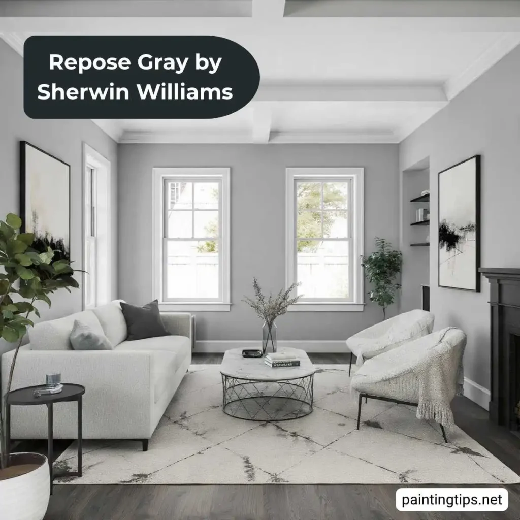
Repose Gray holds up well across an entire home. Its warm neutrality creates a cohesive flow from room to room, which makes it a strong whole-house color — particularly in open-plan spaces. As an accent wall, it’s less impactful than deeper or more saturated colors since its medium value doesn’t create enough contrast to read as a true feature wall in most rooms.
If you’re planning to pair Repose Gray with white trim throughout your home, our guide on gray walls white trim covers which whites work best and what to avoid.
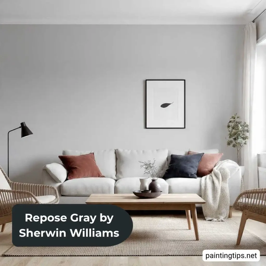
Repose Gray Living Room Ideas
In a living room, Repose Gray reads as a warm, sophisticated gray that recedes as a backdrop and lets the furniture do the work. In south-facing rooms with strong natural light, it stays warm and open. In north-facing or artificially lit rooms, the purple undertones can become more visible — particularly in the evening under warm incandescent lighting.
Warm-toned furniture — cognac leather, camel upholstery, warm wood — counteracts any coolness and keeps the room grounded. A warm white trim like Pure White or Alabaster creates a soft, clean contrast. For rugs, warm terracotta, camel, or a Persian-style rug with warm tones works particularly well against Repose Gray walls.
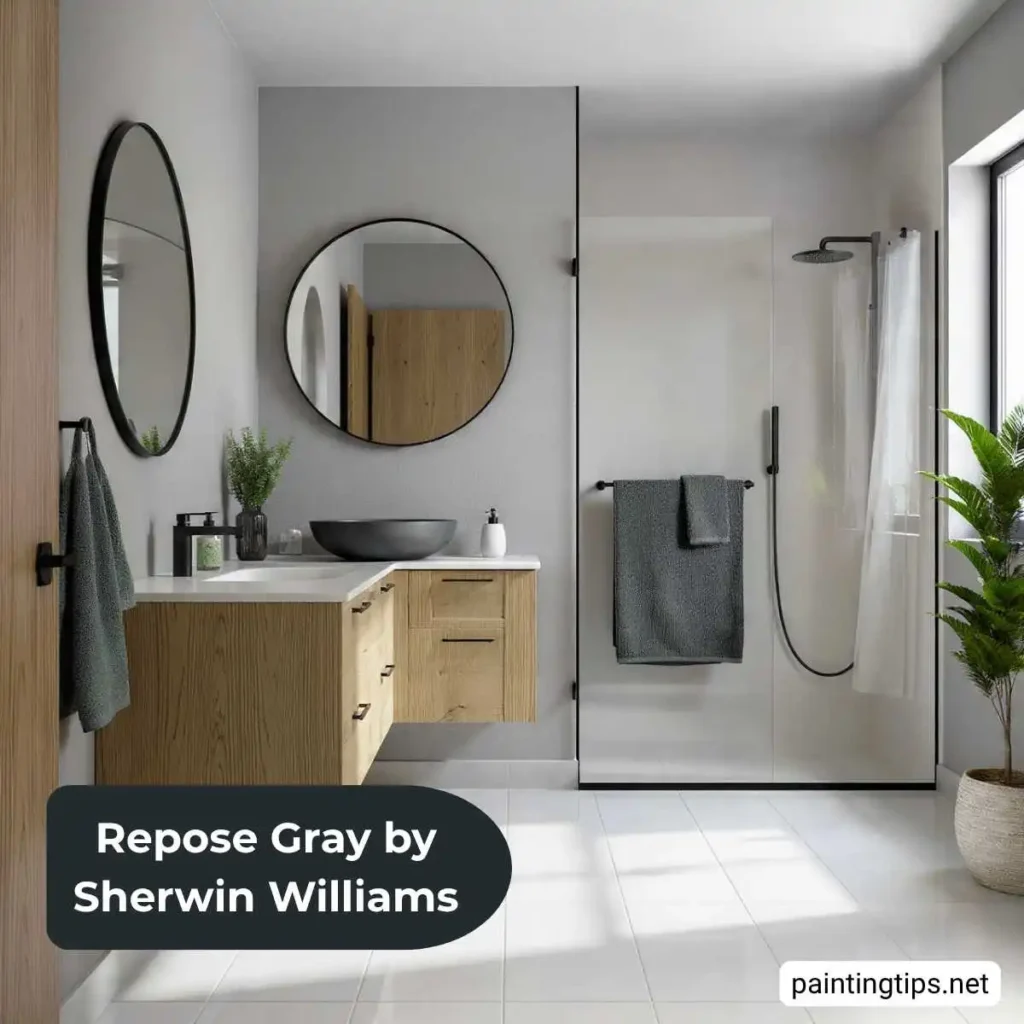
Repose Gray Bathroom
In a bathroom, lighting is the main variable. Cool overhead LEDs can push Repose Gray’s purple undertones forward — switching to warm-toned bulbs (2700K–3000K) usually brings it back to its intended gray-beige quality. White fixtures and warm-toned accessories complement it well. Brushed nickel and matte black hardware read more naturally against its undertone than chrome.
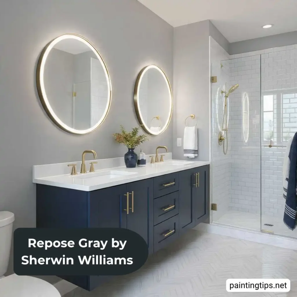
In larger bathrooms, Repose Gray creates a calm, spa-like atmosphere when paired with warm wood vanities and natural stone. Its LRV of 58 is high enough to keep smaller bathrooms feeling open without going too light.
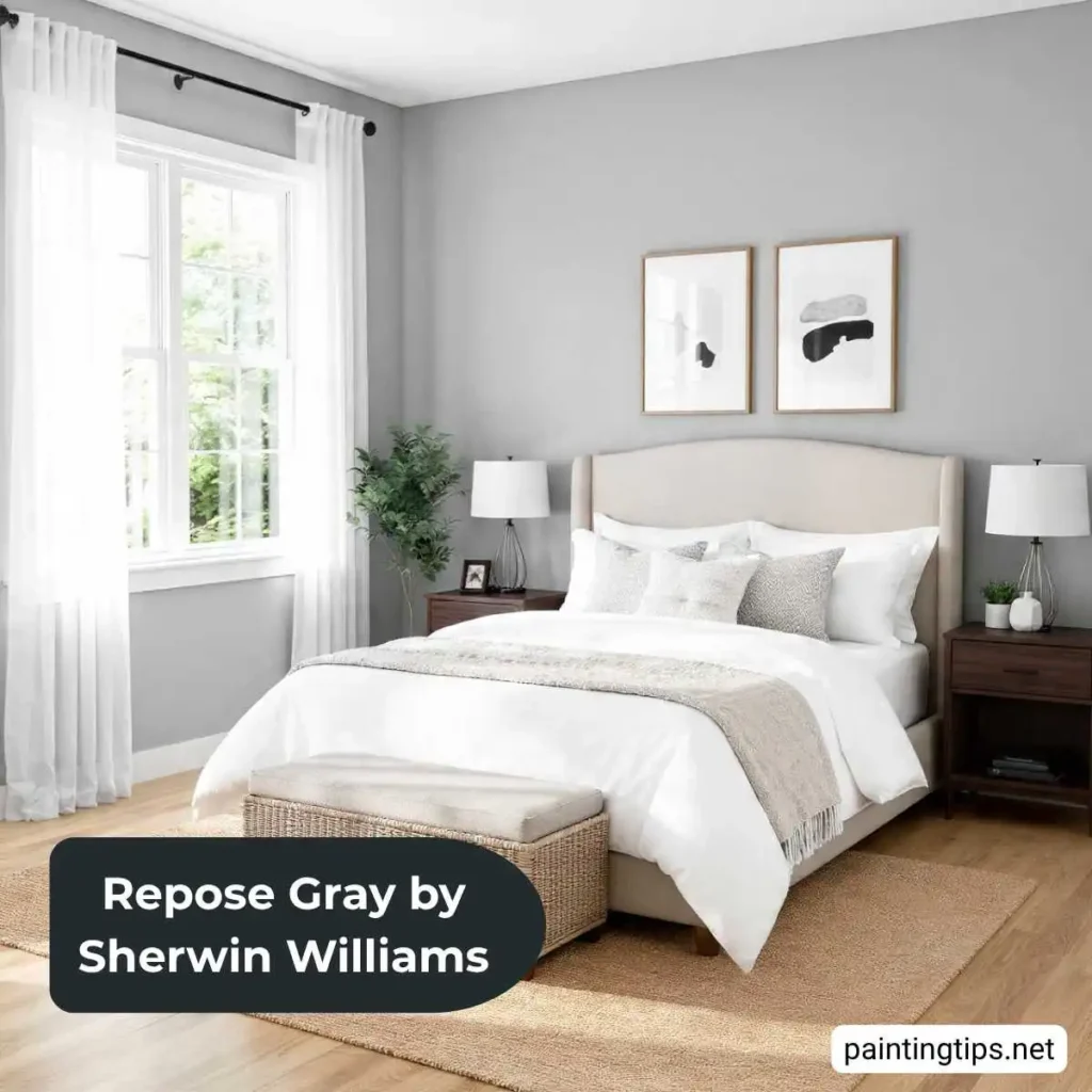
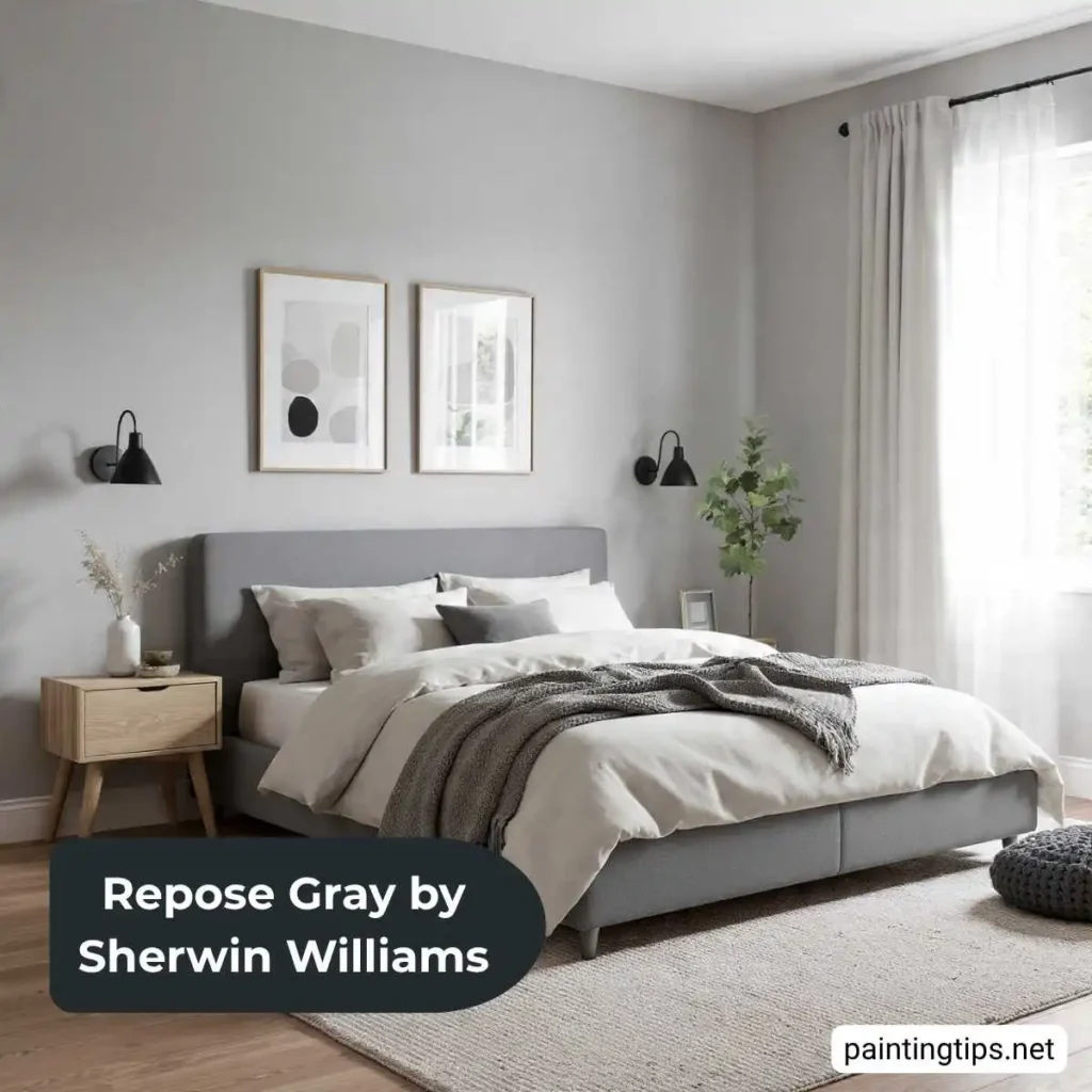
Repose Gray Bedroom
Repose Gray in a bedroom is one of the more reliable choices available. Its warm undertones prevent it from feeling cold in a space designed for rest, and it works in both large and smaller rooms without the lighting adjustments that lighter or darker colors often require.
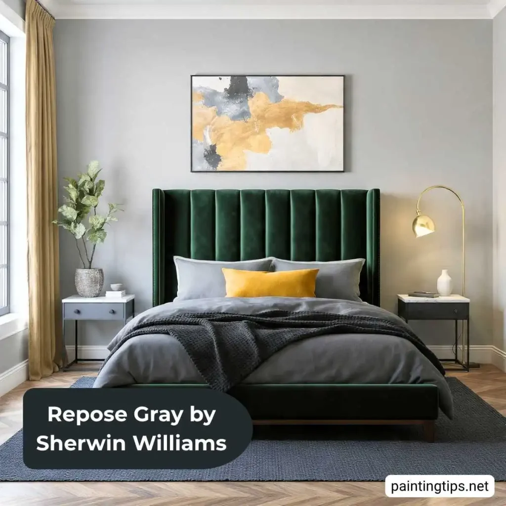
Under warm bedside lighting in the evening it reads as a soft, enveloping gray-beige. In morning light it reads cleaner and crisper. Warm wood bed frames, white or cream bedding, and warm-toned textiles in mustard, camel, or dusty rose all work well alongside it.
“For more options beyond Repose Gray, our guides on best colors to paint a small bedroom and best wall colors for bedroom are worth exploring before you decide.”
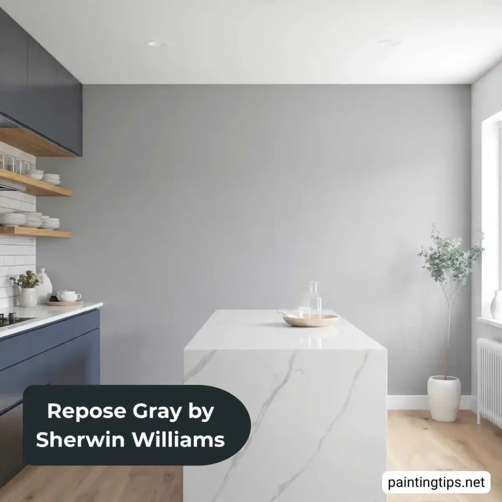
Repose Gray Kitchen
In a kitchen, Repose Gray on the walls creates a soft backdrop for both white and wood-toned cabinetry. Against white cabinets, it provides understated contrast that feels clean and contemporary. Against warm oak or walnut cabinets, the greige quality of the color creates a natural, cohesive palette.
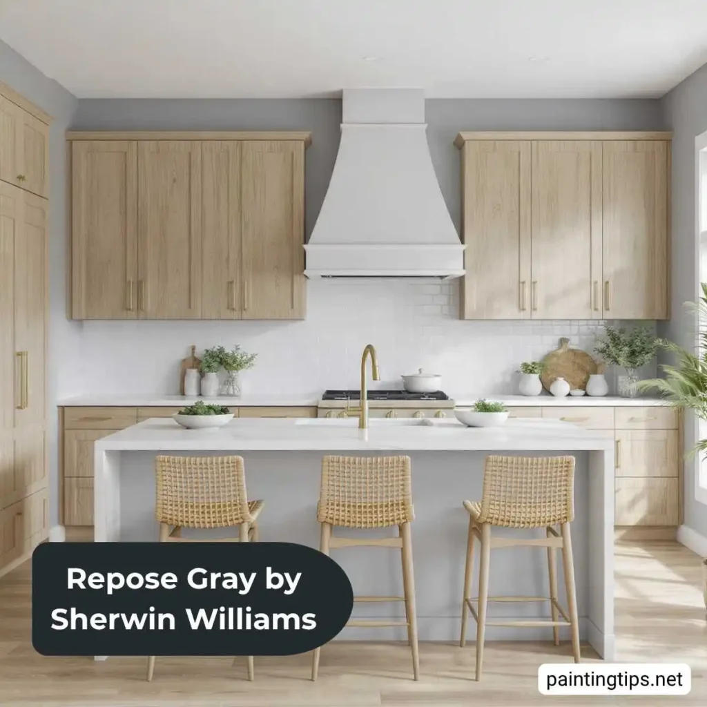
Repose Gray kitchen cabinets have become an increasingly popular choice — on a cabinet finish its warm undertones tend to read more consistently than on walls. Paired with white walls and warm wood hardware or open shelving, Repose Gray cabinets create a kitchen that feels current without committing to a bold color.
“If you’re still deciding on a kitchen wall color, our guide on best kitchen wall colors with white cabinets covers the strongest options across every style.”
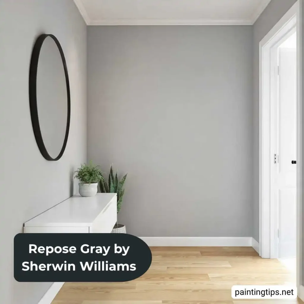
Repose Gray Entryway
An entryway painted in Repose Gray makes a strong first impression without overwhelming a typically narrow or transitional space. Its medium LRV keeps the entry feeling open, and its neutral quality means it transitions naturally into adjacent rooms — which matters more in an entryway than anywhere else in the house.
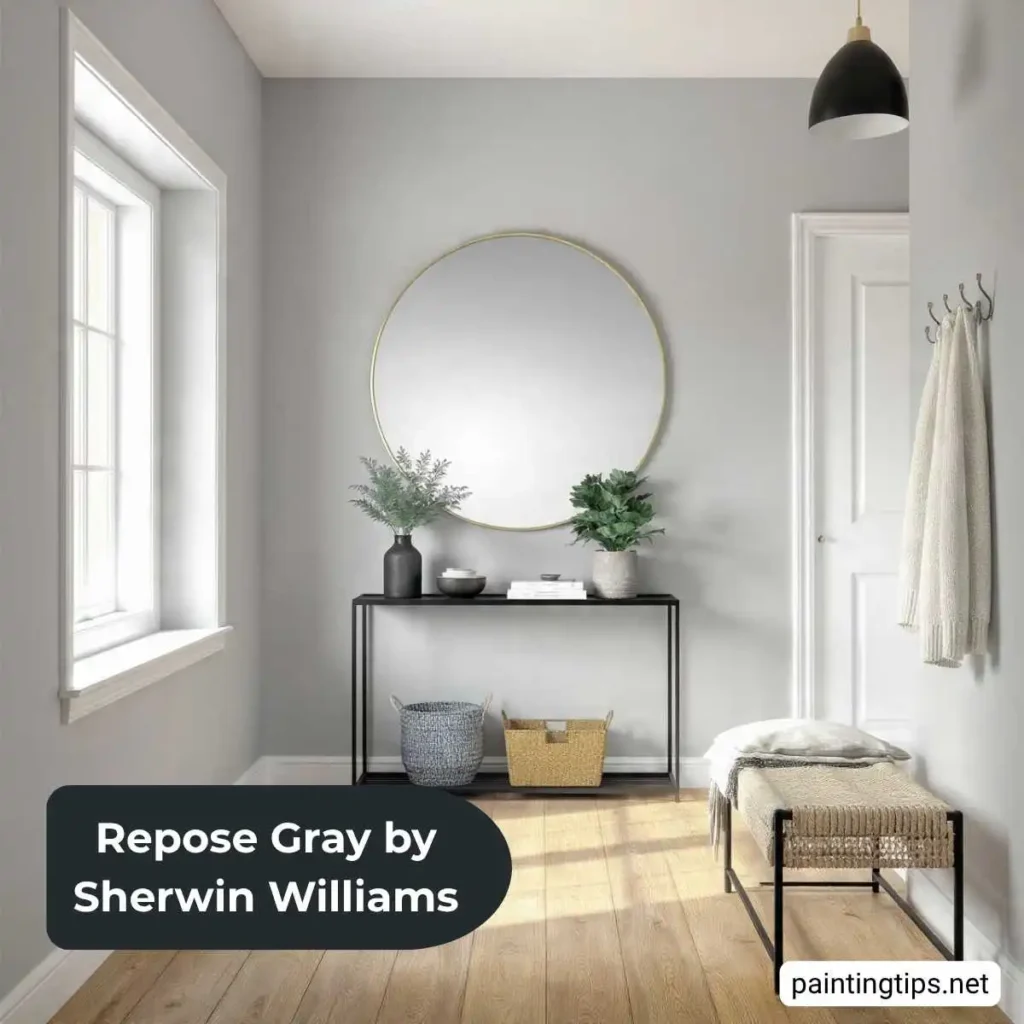
White trim sharpens the entry’s architectural details — door casings, baseboards, and crown molding all read clearly against Repose Gray. Warm wood flooring, a natural fiber rug, and warm metallic light fixtures are the most effective supporting elements. In smaller entryways with limited natural light, warm-toned bulbs are essential to prevent the purple undertones from dominating.
Repose Gray Coordinating Colors
The Repose Gray color palette coordinates most naturally with colors in the same warm-neutral family. The most practical pairings are:
- Mindful Gray (SW 7016) is slightly darker and warmer — a natural choice for adjacent rooms where you want subtle variation within a cohesive whole-home palette.
- Accessible Beige (SW 7036) is warmer and more beige-forward, useful in spaces where more warmth is needed alongside Repose Gray rooms.
- Worldly Gray (SW 7043) is slightly cooler and darker, well suited for spaces where a more decisive gray is appropriate — a home office or formal dining room adjacent to a Repose Gray living area.
- Pure White (SW 7005) is the most commonly paired trim and ceiling color with Repose Gray — clean, bright contrast that works in most rooms with consistent natural light.
- Alabaster (SW 7008) is the warmer trim alternative, and often the better choice in north-facing rooms or bathrooms where cool lighting pushes Repose Gray toward lavender.
Best Accent Color for Repose Gray
Colors that go with Repose Gray span a wide range — its neutral quality accepts bold and muted accents equally well. The most successful ones are:
- Navy blue provides the strongest accent against Repose Gray — the contrast is significant and the cool-warm balance between the two creates real visual interest. Navy cushions, a navy accent wall, or navy furniture all read well.
- Terracotta and rust add warmth that Repose Gray doesn’t supply on its own, particularly effective in living rooms and bedrooms where a warm, grounded atmosphere is the goal.
- Sage green works naturally within Repose Gray’s warm-neutral palette. Through accessories and textiles it’s versatile and low-risk.
- Warm brass and gold as metallic accents — through light fixtures, cabinet hardware, and mirror frames — add richness without introducing color conflict and are the metallic that works most naturally with Repose Gray’s undertone.
Best Trim Color for Repose Gray
- Repose Gray with Pure White (SW 7005) trim is the most widely used combination and works well in rooms with warm, consistent natural light. It provides clean, bright contrast without clashing.
- Repose Gray with Alabaster (SW 7008) trim is the better choice in rooms where cool lighting pushes the wall color toward lavender — the warmth of Alabaster counteracts the shift and keeps the palette cohesive.
- Extra White (SW 7006) works in rooms with strong natural light where maximum contrast is the goal. In lower light conditions it can feel slightly harsh against Repose Gray.
Test both Pure White and Alabaster in the actual room before deciding — the difference is subtle in isolation but meaningful when seen against the wall color.
Frequently Asked Questions
Below are answers to the most common questions about Repose Gray. If your question isn’t answered here, drop it in the comments and we’ll get back to you.
Is Sherwin-Williams Repose Gray Cool or Warm?
Repose Gray sits in the middle — it’s technically a warm gray with beige undertones, but it also carries subtle purple or violet undertones that become visible in cool or low light. In warm natural light, Repose Gray reads as a soft gray-beige. In cool or artificial light it can pull slightly lavender. It’s neither definitively warm nor cool, which is both its strength and its occasional challenge.
Why Is Repose Gray So Popular?
Repose Gray works reliably in almost any room without the adjustments that more distinctly warm or cool grays require. Its LRV of 58 keeps rooms open, its greige quality pairs with both warm and cool furniture tones, and it photographs consistently well. It became the go-to neutral for a generation of homeowners and has stayed there because it keeps delivering dependable results.
Is Repose Gray Outdated?
Repose Gray is no longer a fresh or unexpected choice — it’s been used so widely that it reads as the safe, reliable neutral of its era. For resale, Repose Gray remains a strong option because it appeals to the widest audience. For a more personal renovation, there are less ubiquitous directions in the current gray palette. It hasn’t dated the way trend colors date, but it has moved from distinctive to standard.