Agreeable Gray has been the go-to neutral for interior walls for years, and it’s no surprise that homeowners eventually start wondering how that same warmth would look on the outside of the house. Below, we break down what this color actually does on an exterior, which trim pairings work best, and where it fits among the modern facade trends we’re seeing right now.
Sherwin Williams Agreeable Gray Exterior Paint
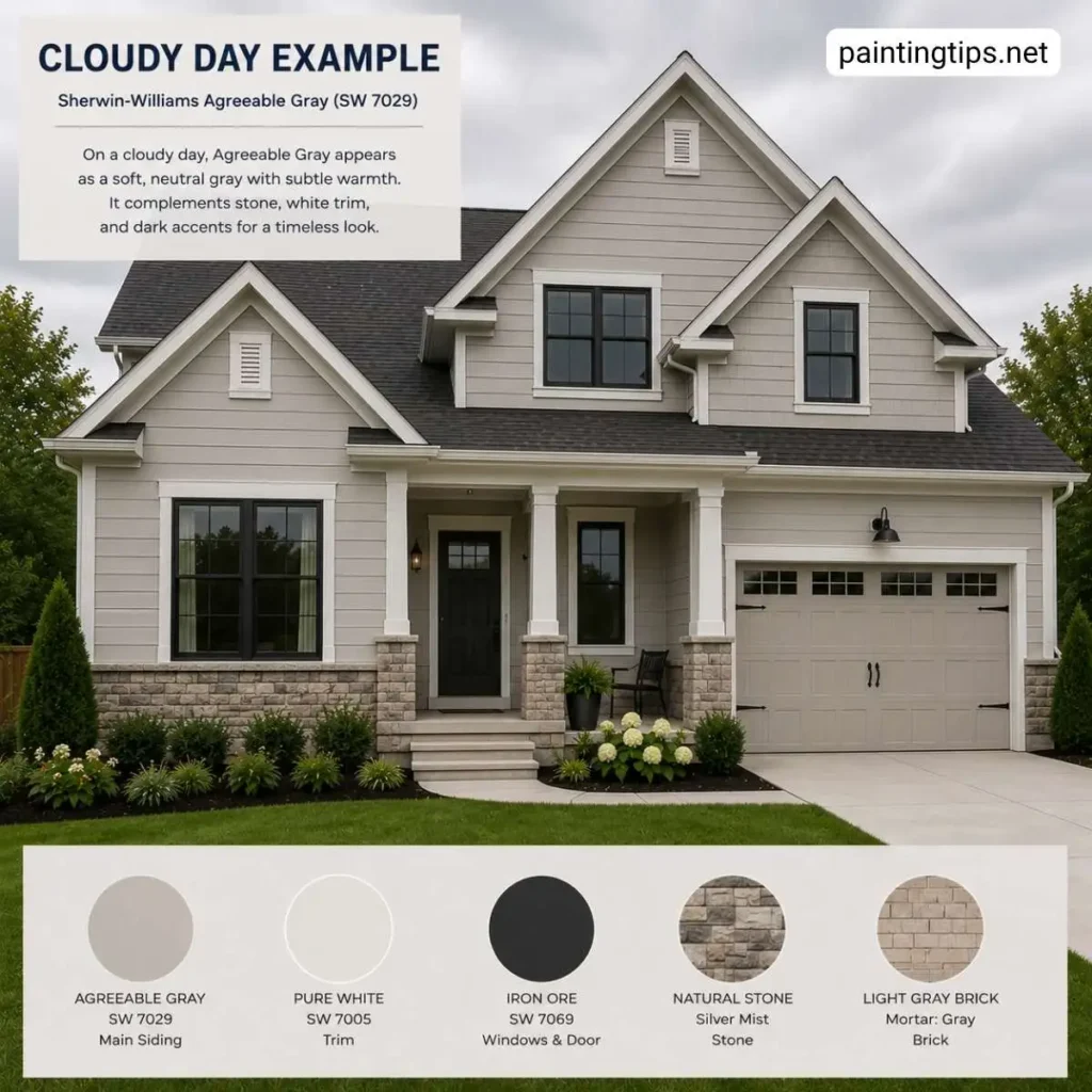
Agreeable Gray, SW 7029, is a warm greige with a soft beige undertone and an LRV of 60. It reads gray in bright light and softens toward beige in overcast conditions, which is part of why it translates so easily to exterior use.
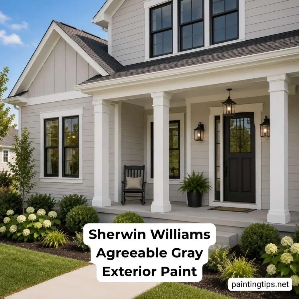
That said, it doesn’t get quite the same spotlight on a facade as it does elsewhere. Exterior gray trends have leaned cooler and more contrasted in the last several years, with colors like Repose Gray, Dorian Gray, and Iron Ore pulling more attention for facades. Agreeable Gray still shows up on plenty of homes, but it’s chosen less often, mainly because its warmth reads softer next to landscaping, roofing, and daylight than a true cool gray does.
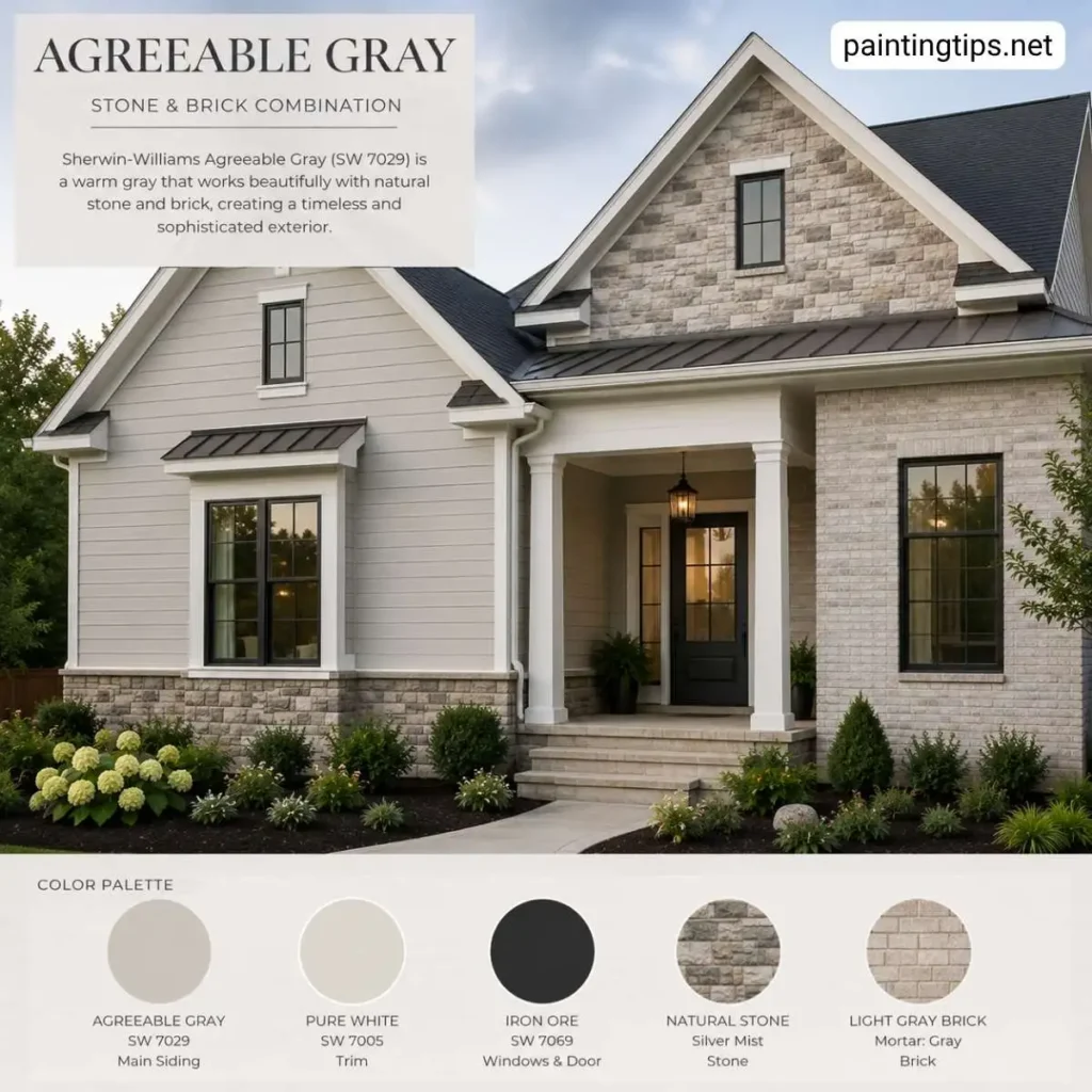
Still, it’s far from a poor exterior choice. Homeowners who want a neutral that feels warm and welcoming rather than stark tend to gravitate toward it, especially on homes with natural stone, brick, or wood accents already in the mix, since those materials usually carry warm undertones themselves.
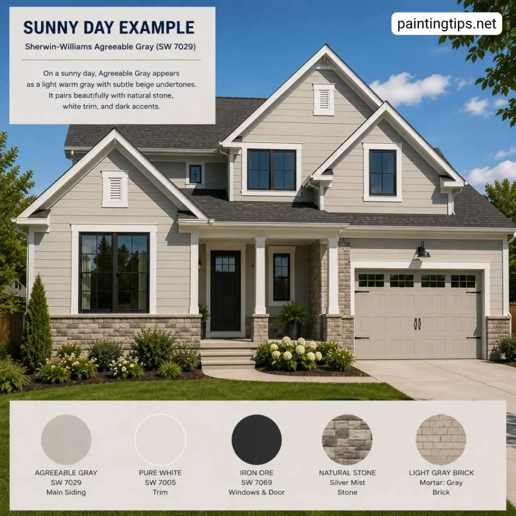
Agreeable Gray also works well in regions with strong, direct sunlight, where a cooler gray can start to look flat or blue by midafternoon. Cold, damp, or heavily shaded climates change the equation somewhat. Warm grays like this one can pick up a faint greenish or muddy cast under overcast skies, and consistent rain or humidity puts more demand on the paint film itself. A quality 100% acrylic exterior formula with built-in mildewcide handles that moisture exposure far better than a budget line, so the product matters as much as the shade in those regions.
Sheen is worth planning for before the color is even chosen. American exterior paints are typically sold in flat or matte, satin (sometimes labeled low-lustre), and gloss or semi-gloss finishes, and each one behaves differently once it’s on the wall.
Flat and matte sheens hide surface imperfections well and give Agreeable Gray a soft, chalky look that suits older siding or stucco, but they hold onto dirt and moisture more than higher sheens, which is a real drawback in humid or rainy climates. Satin is the middle ground most painters reach for on body color, since it sheds water and grime better while still looking soft rather than plasticky. Gloss and semi-gloss are usually reserved for trim, doors, and shutters, where the shine adds contrast and stands up to the extra handling those surfaces get.
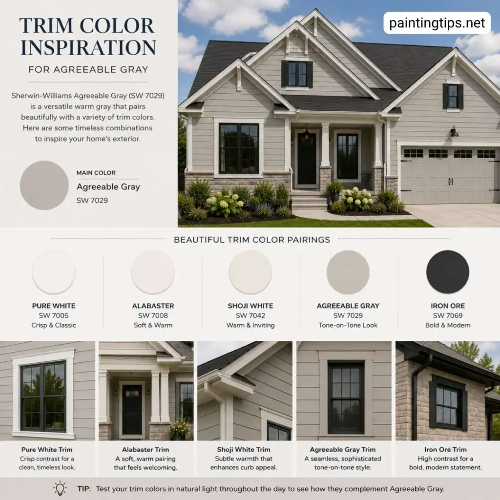
If the goal is a soft, timeless neutral that won’t fight with warm-toned landscaping or a brick chimney, Agreeable Gray earns its place on the shortlist. Trim is where this color really comes together. Crisp whites like Sherwin Williams Pure White SW 7005 or Extra White SW 7006 keep the look clean and modern, while a warmer white such as Alabaster SW 7008 leans into the greige undertone instead of fighting it.
For homeowners who prefer a Benjamin Moore trim on a Sherwin Williams field color, White Dove OC-17 pairs just as naturally. On the darker end, Tricorn Black SW 6258 or Iron Ore SW 7069 on shutters, the front door, and window frames adds the kind of contrast that keeps a warm gray exterior from looking washed out. Homeowners weighing this warmer greige against a true beige often end up comparing it directly to a close cousin, and our breakdown of accessible beige vs agreeable gray walks through exactly how the two behave once they’re outdoors.
Agreeable Gray Exterior Coordinating Colors
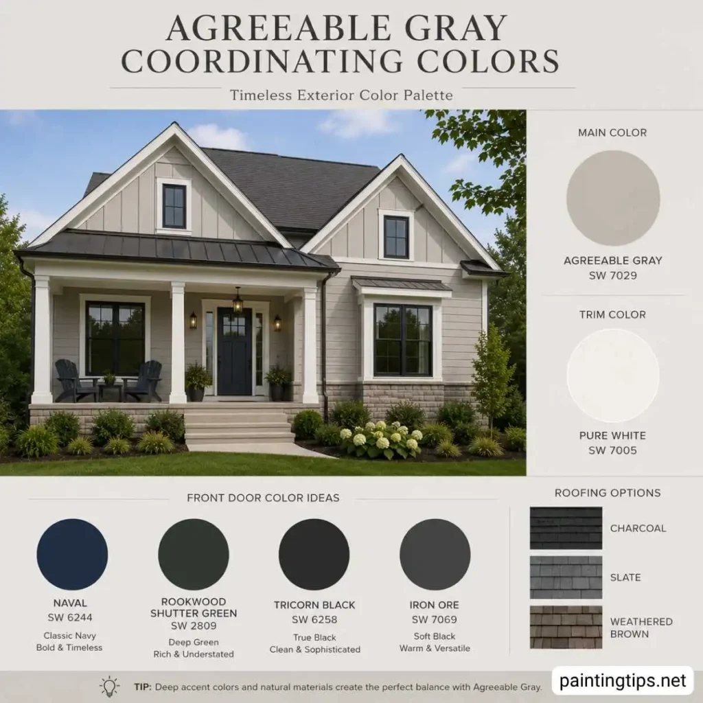
A full coordinating palette makes the biggest difference in how finished the house looks once the paint dries. For the front door, deep colors carry real weight against Agreeable Gray: a navy like Sherwin Williams Naval SW 6244, a near-black green such as Rookwood Shutter Green SW 2809, or classic black all read as intentional rather than accidental. Roofing in charcoal, slate, or a weathered brown ties in cleanly since Agreeable Gray’s warmth doesn’t clash with either cool or warm roof tones the way a true blue-gray sometimes does.
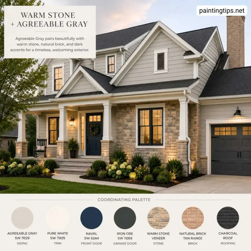
Stone veneer and brick are where this color shines as a coordinator rather than a standalone. Warm-toned stone, tan brick, and even some reddish brick sit comfortably next to Agreeable Gray because the paint isn’t cool enough to create that harsh, fighting contrast that shows up when a blue-based gray meets warm masonry.
For a full rundown of which specific shades to run alongside it on trim, fascia, and garage doors, our guide on trim colors for agreeable gray covers the pairings in more detail than we have room for here.
Is Agreeable Gray a Good Exterior House Color?
Yes. Agreeable Gray works well on exteriors that want a soft, warm neutral rather than a stark cool gray, and it pairs easily with brick, stone, and wood accents. It’s a weaker fit for homeowners chasing the high-contrast, cool-toned modern look currently popular on new construction.
There’s also a financial case for a warm neutral like this one. Zillow‘s paint color research has repeatedly found that greige exteriors sell for a noticeable premium over homes painted a plain tan or medium brown, since the color reads as updated and well maintained in listing photos without feeling overly personal. That broad, move-in-ready appeal is a large part of why warm grays and greiges keep showing up on resale-focused repaint jobs.
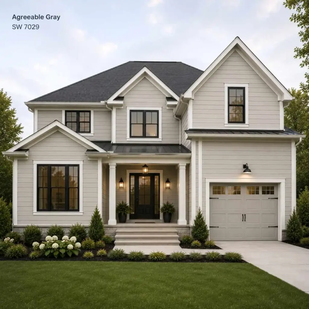
There’s more than one way to put this color to work on a facade, and the application matters as much as the color itself. Painting the entire exterior in Agreeable Gray gives a clean, cohesive look that suits ranch homes and traditional two-stories alike, especially with a dark roof and white trim holding everything together.
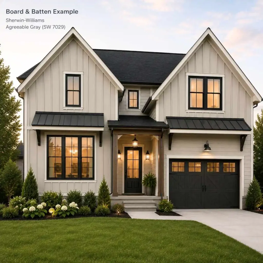
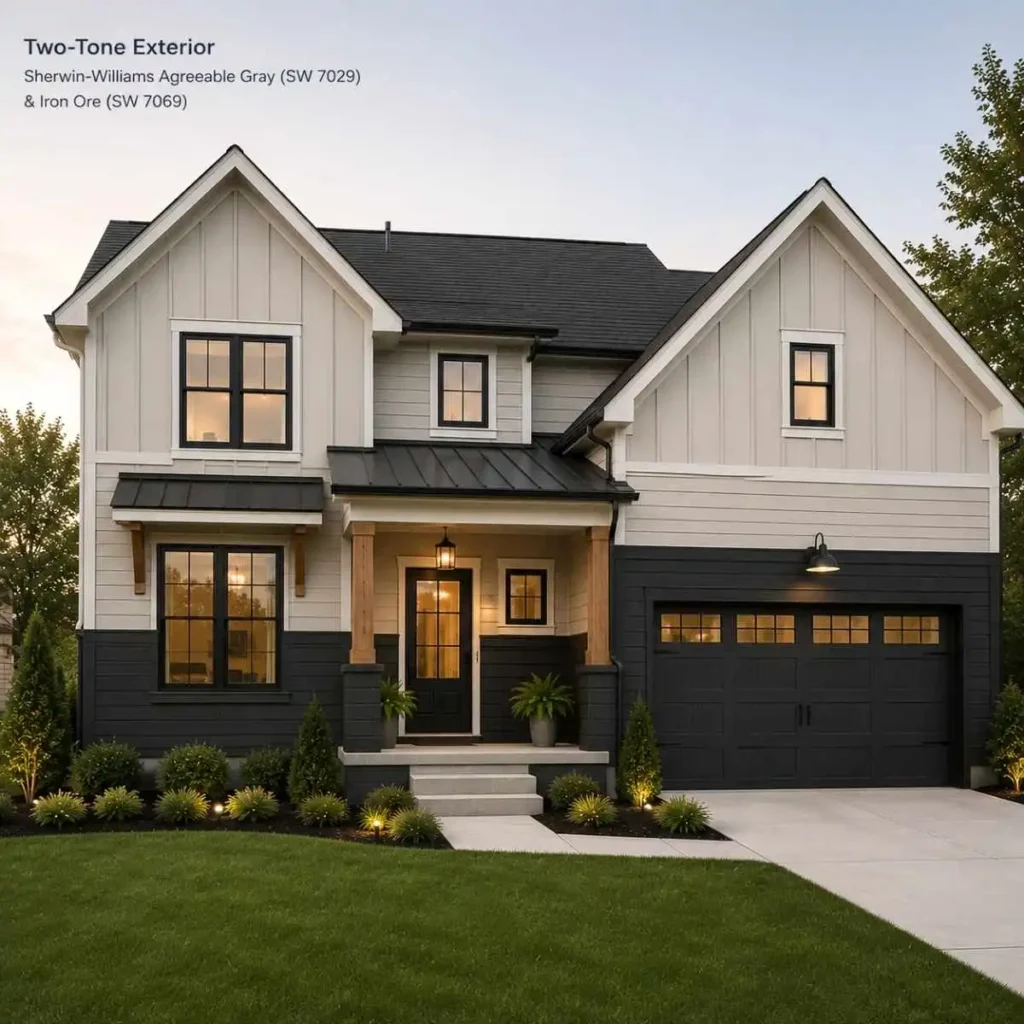
A two-tone approach, where the lower story or the foundation level carries a darker charcoal or black while Agreeable Gray takes the upper story, has become a favorite on modern farmhouse builds because it grounds the house visually without going fully dark. Some homeowners use it more sparingly, as an accent color only under the windows or across a lower gable, letting a brick or stone base carry most of the visual weight.
Vertical board-and-batten sections painted in Agreeable Gray, paired with a contrasting horizontal-lap main body, are showing up more often on new builds as well, and they photograph particularly well against black window frames.
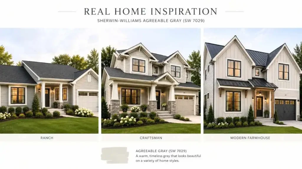
Before committing a full gallon budget to any of these layouts, it helps to see how the color has actually performed on other homes over time, not just on a swatch. Our collection of sherwin williams agreeable gray reviews pulls together real homeowner feedback on fading, undertone shifts, and how the color reads in different climates.
And since the paint itself only performs as well as the product behind it, our guide to the best exterior paint is worth a look before the project starts. If this is a first attempt at tackling the job without a contractor, our walkthrough on painting the exterior of a house covers prep, sequencing, and the mistakes that show up most often on DIY jobs.
